
Ok, let's have some fun here!
I've seen many "best box art" threads before, so I figured it's about time we had a "worst box art" thread.
Box art can make or break a game for many. Most Wii gamers aren't in the loop like we are, so they might have to base their purchases on what they see on the cover.
So, with that said, let's see your "favorite" worst box art! Forget about the quality of the actual game, we're talking art here.
For bouns points, tell us why you hate it.
Here's one of my favorites:

Why I hate it:
Capcom looked at what all "M" rated game covers have in common: Black, White, and Red. But they forgot the part where it's supposed to look like something.
Are those zombies in the corner? Where are my binoculars?
"Resident Evil" is written twice on the cover...In case I missed it the first time?
And what's with that giant square of red? If I want Jello, I'll head to Safeway. Thanks.
______________________________________________
Ok, now post yours!

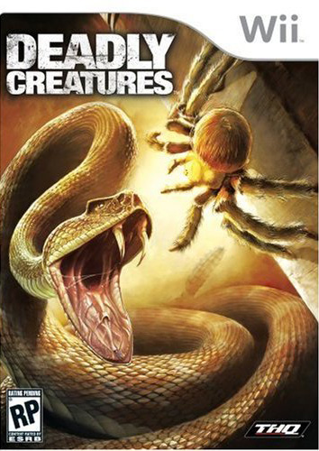
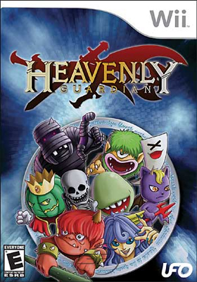
 I have no words. All I can say is "WTF"


 .
.


Log in to comment