Sig/Avatar/Banner...Rate/Request/Discussion Thread....Summer is almost here!

This topic is locked from further discussion.

Avatar image for solidruss
solidruss

24082

Forum Posts

0

Wiki Points

0

Followers

Reviews: 0

User Lists: 0

#1 solidruss
Member since 2002 • 24082 Posts
You all know what to do... rate away, and have fun!:)
Avatar image for Greatgone12
Greatgone12

25469

Forum Posts

0

Wiki Points

0

Followers

Reviews: 0

User Lists: 0

#2 Greatgone12
Member since 2005 • 25469 Posts
Rate and... stuff.
Avatar image for KiIIyou
KiIIyou

27204

Forum Posts

0

Wiki Points

0

Followers

Reviews: 0

User Lists: 0

#3 KiIIyou
Member since 2006 • 27204 Posts
Rate and... stuff.Greatgone12
Bee Plus.
Avatar image for Greatgone12
Greatgone12

25469

Forum Posts

0

Wiki Points

0

Followers

Reviews: 0

User Lists: 0

#4 Greatgone12
Member since 2005 • 25469 Posts
[QUOTE="Greatgone12"]Rate and... stuff.KiIIyou
Bee Plus.

I do likes bees. :)
Avatar image for KiIIyou
KiIIyou

27204

Forum Posts

0

Wiki Points

0

Followers

Reviews: 0

User Lists: 0

#5 KiIIyou
Member since 2006 • 27204 Posts
I do likes bees. :)Greatgone12
Sherlock Holmes did also, you two must be related somehow. : )
Avatar image for Greatgone12
Greatgone12

25469

Forum Posts

0

Wiki Points

0

Followers

Reviews: 0

User Lists: 0

#6 Greatgone12
Member since 2005 • 25469 Posts
[QUOTE="Greatgone12"]I do likes bees. :)KiIIyou
Sherlock Holmes did also, you two must be related somehow. : )

You know what they call me, GG Holmes.
Avatar image for Bluestorm-Kalas
Bluestorm-Kalas

13073

Forum Posts

0

Wiki Points

0

Followers

Reviews: 0

User Lists: 0

#7 Bluestorm-Kalas
Member since 2006 • 13073 Posts
How's mine? :)  I give the guy above me an 8.5/10, for sig, and 8/10 for avitar.
Avatar image for Cyrax-Sektor
Cyrax-Sektor

12060

Forum Posts

0

Wiki Points

0

Followers

Reviews: 18

User Lists: 0

#8 Cyrax-Sektor
Member since 2006 • 12060 Posts

How's my Super Smash Bros. Brawl banner? Second work with a C4D.

Avatar image for Greatgone12
Greatgone12

25469

Forum Posts

0

Wiki Points

0

Followers

Reviews: 0

User Lists: 0

#9 Greatgone12
Member since 2005 • 25469 Posts

How's mine? :) I give the guy above me an 8.5/10, for sig, and 8/10 for avitar.Bluestorm-Kalas
:(

Too much burned space to make it look pleasant, too many focal points, put sig off balance... Too big for what content it gives. 

Avatar image for Greatgone12
Greatgone12

25469

Forum Posts

0

Wiki Points

0

Followers

Reviews: 0

User Lists: 0

#10 Greatgone12
Member since 2005 • 25469 Posts

How's my Super Smash Bros. Brawl banner? Second work with a C4D.

Cyrax-Sektor

Just seems like a bunch of renders imposed on the C4D background, amirite?

If so, not very good, sorry. :( 

Avatar image for Cyrax-Sektor
Cyrax-Sektor

12060

Forum Posts

0

Wiki Points

0

Followers

Reviews: 18

User Lists: 0

#11 Cyrax-Sektor
Member since 2006 • 12060 Posts
[QUOTE="Cyrax-Sektor"]

How's my Super Smash Bros. Brawl banner? Second work with a C4D.

Greatgone12

Just seems like a bunch of renders imposed on the C4D background, amirite?

If so, not very good, sorry. :(

:lol: You're right! I was very lazy when making it. :P
Avatar image for Greatgone12
Greatgone12

25469

Forum Posts

0

Wiki Points

0

Followers

Reviews: 0

User Lists: 0

#12 Greatgone12
Member since 2005 • 25469 Posts
[QUOTE="Greatgone12"][QUOTE="Cyrax-Sektor"]

How's my Super Smash Bros. Brawl banner? Second work with a C4D.

Cyrax-Sektor

Just seems like a bunch of renders imposed on the C4D background, amirite?

If so, not very good, sorry. :(

:lol: You're right! I was very lazy when making it. :P

Wooh! I'm good.
Avatar image for slobbymac
slobbymac

616

Forum Posts

0

Wiki Points

0

Followers

Reviews: 0

User Lists: 0

#13 slobbymac
Member since 2005 • 616 Posts

what do you guys think of my newest sig


Avatar image for patriot069
patriot069

443

Forum Posts

0

Wiki Points

0

Followers

Reviews: 0

User Lists: 0

#14 patriot069
Member since 2006 • 443 Posts
rate......i think ill change mine...
Avatar image for Greatgone12
Greatgone12

25469

Forum Posts

0

Wiki Points

0

Followers

Reviews: 0

User Lists: 0

#15 Greatgone12
Member since 2005 • 25469 Posts

what do you guys think of my newest sig

slobbymac
Fits, but generic, colors are slightly overdone, a bit too tall and not enough subtance, not wide enough and too much subtance in that area, renders seems slightly too blended in with background.
Avatar image for Greatgone12
Greatgone12

25469

Forum Posts

0

Wiki Points

0

Followers

Reviews: 0

User Lists: 0

#16 Greatgone12
Member since 2005 • 25469 Posts
rate......i think ill change mine...patriot069
I'll rate what I can... good picture, crappy text.
Avatar image for slobbymac
slobbymac

616

Forum Posts

0

Wiki Points

0

Followers

Reviews: 0

User Lists: 0

#17 slobbymac
Member since 2005 • 616 Posts

thanks for you imput Greatgone12 i tried to alter it, made it wider/ shorer and tried to tone down the color and this is what i got for a V2


Avatar image for Greatgone12
Greatgone12

25469

Forum Posts

0

Wiki Points

0

Followers

Reviews: 0

User Lists: 0

#18 Greatgone12
Member since 2005 • 25469 Posts

thanks for you imput Greatgone12 i tried to alter it, made it wider/ shorer and tried to tone down the color and this is what i got for a V2

slobbymac
Better. Just change the text, and you've got a decent looking sig right there.
Avatar image for foxhound_fox
foxhound_fox

98532

Forum Posts

0

Wiki Points

0

Followers

Reviews: 13

User Lists: 0

#19 foxhound_fox
Member since 2005 • 98532 Posts
I need a critical review from Greatgone for my siggy and avy.
Avatar image for Greatgone12
Greatgone12

25469

Forum Posts

0

Wiki Points

0

Followers

Reviews: 0

User Lists: 0

#20 Greatgone12
Member since 2005 • 25469 Posts

I need a critical review from Greatgone for my siggy and avy.foxhound_fox
Samus is hot, as much as I hate myself for saying that.

Critical enough? Cool av, sig would look cooler if it was smaller, and text needs to be flashier, or else you look like a hobo on the internetzorz. >_> 

Avatar image for foxhound_fox
foxhound_fox

98532

Forum Posts

0

Wiki Points

0

Followers

Reviews: 13

User Lists: 0

#21 foxhound_fox
Member since 2005 • 98532 Posts
Samus is hot, as much as I hate myself for saying that.

Critical enough? Cool av, sig would look cooler if it was smaller, and text needs to be flashier, or else you look like a hobo on the internetzorz. >_>

Greatgone12


How exactly would I go about making the text flashier? Without changing the font... I lieks mah Bank Gothics ಠ_ಠ
Avatar image for Greatgone12
Greatgone12

25469

Forum Posts

0

Wiki Points

0

Followers

Reviews: 0

User Lists: 0

#22 Greatgone12
Member since 2005 • 25469 Posts
[QUOTE="Greatgone12"]Samus is hot, as much as I hate myself for saying that.

Critical enough? Cool av, sig would look cooler if it was smaller, and text needs to be flashier, or else you look like a hobo on the internetzorz. >_>

foxhound_fox


How exactly would I go about making the text flashier? Without changing the font... I lieks mah Bank Gothics ಠ_ಠ

I assume they have some tuts around somewhere.
Avatar image for Cyrax-Sektor
Cyrax-Sektor

12060

Forum Posts

0

Wiki Points

0

Followers

Reviews: 18

User Lists: 0

#23 Cyrax-Sektor
Member since 2006 • 12060 Posts
[QUOTE="Greatgone12"]Samus is hot, as much as I hate myself for saying that.

Critical enough? Cool av, sig would look cooler if it was smaller, and text needs to be flashier, or else you look like a hobo on the internetzorz. >_>

foxhound_fox


How exactly would I go about making the text flashier? Without changing the font... I lieks mah Bank Gothics ಠ_ಠ

Hobo! :lol:

I add stroke and outer glow to mine. 

Avatar image for foxhound_fox
foxhound_fox

98532

Forum Posts

0

Wiki Points

0

Followers

Reviews: 13

User Lists: 0

#24 foxhound_fox
Member since 2005 • 98532 Posts
How's this?

Avatar image for Bobakuzero
Bobakuzero

12162

Forum Posts

0

Wiki Points

0

Followers

Reviews: 9

User Lists: 0

#25 Bobakuzero
Member since 2005 • 12162 Posts

Tried a new style. comments?
Avatar image for K4ss3r
K4ss3r

8697

Forum Posts

0

Wiki Points

0

Followers

Reviews: 15

User Lists: 0

#26 K4ss3r
Member since 2004 • 8697 Posts

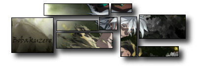
Tried a new st(yle) comments?Bobakuzero
Haha, I've seen that tutorial. Looks good, in some ways, but I prefer the traditional signatures instead, you can say. Not bad though. Putting it in boxes just keeps the attention from what's actually going on in the sig.
Avatar image for Bobakuzero
Bobakuzero

12162

Forum Posts

0

Wiki Points

0

Followers

Reviews: 9

User Lists: 0

#27 Bobakuzero
Member since 2005 • 12162 Posts

[QUOTE="Bobakuzero"]
Tried a new st(yle) comments?K4ss3r
Haha, I've seen that tutorial. Looks good, in some ways, but I prefer the traditional signatures instead, you can say. Not bad though. Putting it in boxes just keeps the attention from what's actually going on in the sig.

yeah I know what you mean. To avoid that I tried to keep it centered around the render, but over all the attention does seem to go to the boxes. I still like the look though. thanks for the comment. ;)
 this was my first tut sig. =)

Avatar image for Santafarmer
Santafarmer

1730

Forum Posts

0

Wiki Points

0

Followers

Reviews: 0

User Lists: 0

#28 Santafarmer
Member since 2007 • 1730 Posts
someone can rate my sig if they want
Avatar image for -Masterchef-
-Masterchef-

10244

Forum Posts

0

Wiki Points

0

Followers

Reviews: 1

User Lists: 0

#29 -Masterchef-
Member since 2007 • 10244 Posts
How's my Super Smash Bros. Brawl banner? Second work with a C4D.

 Cyrax-Sektor


Too crowded
what do you guys think of my newest sig

 slobbymac


The render is too small and there is too much free space on the left, you should shift the render to the left more

Avatar image for -Masterchef-
-Masterchef-

10244

Forum Posts

0

Wiki Points

0

Followers

Reviews: 1

User Lists: 0

#30 -Masterchef-
Member since 2007 • 10244 Posts
How's this?

 foxhound_fox

Too much free space on the left. If you want the text to be flashier, you could make it white and set it to "soft light"
Avatar image for vitriolboy
vitriolboy

4356

Forum Posts

0

Wiki Points

0

Followers

Reviews: 0

User Lists: 0

#31 vitriolboy
Member since 2005 • 4356 Posts

my 360 died so I had some free time to do a new sig


Avatar image for -Masterchef-
-Masterchef-

10244

Forum Posts

0

Wiki Points

0

Followers

Reviews: 1

User Lists: 0

#32 -Masterchef-
Member since 2007 • 10244 Posts

my 360 died so I had some free time to do a new sig


vitriolboy

The bg could be more advanced, it looks like a clouds filter.
Avatar image for vitriolboy
vitriolboy

4356

Forum Posts

0

Wiki Points

0

Followers

Reviews: 0

User Lists: 0

#33 vitriolboy
Member since 2005 • 4356 Posts
[QUOTE="vitriolboy"]

my 360 died so I had some free time to do a new sig


-Masterchef-

The bg could be more advanced, it looks like a clouds filter.

I did it with the smudge tool but it turned out like clouds and I thought it made the stormtrooper look pensive 

Avatar image for KJAX90
KJAX90

8809

Forum Posts

0

Wiki Points

0

Followers

Reviews: 5

User Lists: 0

#34 KJAX90
Member since 2006 • 8809 Posts
Could someone make me some userbars for Fo' Real Gamers Union? Could you make it look sort of like our Banner: http://www.gamespot.com/pages/unions/home.php?union_id=FRG
Avatar image for Santafarmer
Santafarmer

1730

Forum Posts

0

Wiki Points

0

Followers

Reviews: 0

User Lists: 0

#35 Santafarmer
Member since 2007 • 1730 Posts
someone can rate my sig if they wantSantafarmer
Avatar image for Fire_Ants
Fire_Ants

4256

Forum Posts

0

Wiki Points

0

Followers

Reviews: 2

User Lists: 0

#36 Fire_Ants
Member since 2005 • 4256 Posts
Someone give me a sig to make, im bored :?
Avatar image for michael_1234576
michael_1234576

8621

Forum Posts

0

Wiki Points

0

Followers

Reviews: 0

User Lists: 0

#37 michael_1234576
Member since 2004 • 8621 Posts
hows my new sig?
Avatar image for Santafarmer
Santafarmer

1730

Forum Posts

0

Wiki Points

0

Followers

Reviews: 0

User Lists: 0

#38 Santafarmer
Member since 2007 • 1730 Posts
hows my new sig?michael_1234576
eh,liked your first sig the best,this one's alright
Avatar image for FancyPantsMcGee
FancyPantsMcGee

214

Forum Posts

0

Wiki Points

0

Followers

Reviews: 0

User Lists: 0

#39 FancyPantsMcGee
Member since 2007 • 214 Posts

someone can rate my sig if they wantSantafarmer

I like it. Try to center it, though. (I say "try" because I know how impossible GameSpot's signature editor can be.)


What do you people think of my current getup?

Avatar image for Santafarmer
Santafarmer

1730

Forum Posts

0

Wiki Points

0

Followers

Reviews: 0

User Lists: 0

#40 Santafarmer
Member since 2007 • 1730 Posts

[QUOTE="Santafarmer"]someone can rate my sig if they wantFancyPantsMcGee

I like it. Try to center it, though. (I say "try" because I know how impossible GameSpot's signature editor can be.)


What do you people think of my current getup?

i just centered it :P

OMG OMG OMG! i LOVE your avatar and Sig,f****** brilliant! 

Avatar image for FancyPantsMcGee
FancyPantsMcGee

214

Forum Posts

0

Wiki Points

0

Followers

Reviews: 0

User Lists: 0

#41 FancyPantsMcGee
Member since 2007 • 214 Posts

OMG OMG OMG! i LOVE your avatar and Sig,f****** brilliant!

Santafarmer

Hah, wow. Thanks. I like yours too. 

Avatar image for Santafarmer
Santafarmer

1730

Forum Posts

0

Wiki Points

0

Followers

Reviews: 0

User Lists: 0

#42 Santafarmer
Member since 2007 • 1730 Posts

which avatar do you think i should use?


or current

? 

Avatar image for FancyPantsMcGee
FancyPantsMcGee

214

Forum Posts

0

Wiki Points

0

Followers

Reviews: 0

User Lists: 0

#43 FancyPantsMcGee
Member since 2007 • 214 Posts
I would go with the third one. The second one would be my second choice.
Avatar image for Santafarmer
Santafarmer

1730

Forum Posts

0

Wiki Points

0

Followers

Reviews: 0

User Lists: 0

#44 Santafarmer
Member since 2007 • 1730 Posts

fixed up the second one :D ,k now full fixed it! i think imma use this


[

Avatar image for playstation2004
playstation2004

4928

Forum Posts

0

Wiki Points

0

Followers

Reviews: 0

User Lists: 0

#45 playstation2004
Member since 2004 • 4928 Posts
Rate mines please. Im a noob at photoshop 7.0 so dont flame me. I dont know how to do those fancy stuff woth those twirly things and yea... :)
Avatar image for tmac200913
tmac200913

16647

Forum Posts

0

Wiki Points

0

Followers

Reviews: 2

User Lists: 0

#46 tmac200913
Member since 2006 • 16647 Posts

Rate mines please. Im a noob at photoshop 7.0 so dont flame me. I dont know how to do those fancy stuff woth those twirly things and yea... :)playstation2004

Its nice without those fancy stuff with those twirly things :)

Avatar image for yellosnolvr
yellosnolvr

19302

Forum Posts

0

Wiki Points

0

Followers

Reviews: 24

User Lists: 0

#47 yellosnolvr
Member since 2005 • 19302 Posts
oo..would someone like to rate my sig? :D
Avatar image for Kritical_Strike
Kritical_Strike

4123

Forum Posts

0

Wiki Points

0

Followers

Reviews: 1

User Lists: 0

#48 Kritical_Strike
Member since 2006 • 4123 Posts

Not bad yello. Simplicity works in it's favour 7.5/10. The background looks a bit too plain though.

 Can someone rate this? It's my first sprite sig!

And while your rating these, which is better the color or b/w version? I have yet to add a border and text.


Avatar image for financeranger
financeranger

5181

Forum Posts

0

Wiki Points

0

Followers

Reviews: 13

User Lists: 0

#49 financeranger
Member since 2005 • 5181 Posts

Nice sig, I love the light and how it centers on your render.  The text is a little lost though, but maybe that is how you roll (or the effect you wanted).

The others are ok, I liked color better, but the image seemed squashed.

Avatar image for Guiltfeeder566
Guiltfeeder566

10068

Forum Posts

0

Wiki Points

0

Followers

Reviews: 1

User Lists: 0

#50 Guiltfeeder566
Member since 2005 • 10068 Posts

Not bad yello. Simplicity works in it's favour 7.5/10. The background looks a bit too plain though.

 Can someone rate this? It's my first sprite sig!

And while your rating these, which is better the color or b/w version? I have yet to add a border and text.


Kritical_Strike

Nice, but can't really see the text.

Good, but it seems really messy. (colored is better IMO)