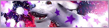
Sig/Avay/Banner...Rate/Request/Discussion Thread....Summertime at last!
This topic is locked from further discussion.


Which sig should I use?
KJAX90
Preferably neither, but I guess the blue one.
Rate my sig, please. easteast
1/10
You sure you had it a day? :P
I really like it man, nice use of brushes in the corner & whatnot. I'll give it a 10/10, seeing as I don't know how you could improve it =)
Could somebody possible make me a sig with Dante (in my avatar) from "devil may cry"? Anything will do =)
:shock: Well done! stick with it, you'll be a pro :wink:

I didn't get many ratings last time so... rate my avi plzKritical_Strike
I really like it, everything is in the perfect position, the light to the left of the character's face fills up the space well, plus the colours are good, 9/10 =)
Some I made for members on The Sims2 UK forums... v1v2
noblead16
I like the top one best, Sims is such a good game! The bottom one is good too...
[QUOTE="Kritical_Strike"]I didn't get many ratings last time so... rate my avi plzsquidder_doa
I really like it, everything is in the perfect position, the light to the left of the character's face fills up the space well, plus the colours are good, 9/10 =)
Some I made for members on The Sims2 UK forums... v1
I like the top one best, Sims is such a good game! The bottom one is good too...
Thank you very much :)Someone rate my signature and avatar. :D
K4ss3r
Nice avy, what's the pattern from?
& I'm in love with your sig :oops:
[QUOTE="Kritical_Strike"]I didn't get many ratings last time so... rate my avi plzsquidder_doa
I really like it, everything is in the perfect position, the light to the left of the character's face fills up the space well, plus the colours are good, 9/10 =)
Were you rating my avatar or my signature?
I'd like an AVATAR rating someone please!
[QUOTE="squidder_doa"][QUOTE="Kritical_Strike"]I didn't get many ratings last time so... rate my avi plzKritical_Strike
I really like it, everything is in the perfect position, the light to the left of the character's face fills up the space well, plus the colours are good, 9/10 =)
Were you rating my avatar or my signature?
I'd like an AVATAR rating someone please!
haha, i skipped the writing after the ellipses :oops:
You avatar isn't too bad, there's a little too much going on in it I think. The KS is pretty cool though.


Can somone plz resize this pic to the avatar size :

iv ben asking this forever
`thanks
Just got a new trippy avatar. Please rate it.IonescoF
Pretty cool!! 8/10

'Kay... New sig, rate.Greatgone12I don't like the text, but its simple. 6/10
New avatar, rate.
I don't like the text, but its simple. 6/10[QUOTE="Greatgone12"]'Kay... New sig, rate.ShuLordLiuPei
New avatar, rate.
Tried different text, a few, actually, all looked pretty crappy. So I just decided to keep my default text. If you can link me to text that would fit, that would be great. :P
IS my sig broken???sinarilias
no its not broken but its pretty freaking cool :)
Can somone plz resize this pic to the avatar size :
iv ben asking this forever
`thanks
TehFuneral
Edited sig... New text. Rate?Greatgone12
much better, but it would be still better without the text....
Edited sig... New text. Rate?Greatgone12You made it worse! :P
6/10 I like the text betterbut "12" just doesn't say enough.
[QUOTE="Greatgone12"]Edited sig... New text. Rate?Dr_Neptune
much better, but it would be still better without the text....
Yeah, that would be what I want, but I don't want it to get ripped.You made it worse! :P[QUOTE="Greatgone12"]Edited sig... New text. Rate?ShuLordLiuPei
6/10 I like the text betterbut "12" just doesn't say enough.
I'm just going to kill the text.[QUOTE="Dr_Neptune"][QUOTE="Greatgone12"]Edited sig... New text. Rate?Greatgone12
much better, but it would be still better without the text....
Yeah, that would be what I want, but I don't want it to get ripped.anyone who wanted to rip it could just spend half a minute in paint getting rid of the "12". it is unnecessary.
[QUOTE="Greatgone12"][QUOTE="Dr_Neptune"][QUOTE="Greatgone12"]Edited sig... New text. Rate?Dr_Neptune
much better, but it would be still better without the text....
Yeah, that would be what I want, but I don't want it to get ripped.anyone who wanted to rip it could just spend half a minute in paint getting rid of the "12". it is unnecessary.
I know... I'm killing it.Please Log In to post.
Log in to comment