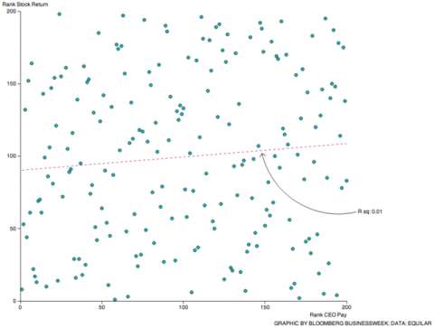
This is a chart of 200 different CEO pay compared to business stock return. If this chart just looks like a bunch of scattered dots, that's because it pretty much is. The correlation is pretty much non-existent.
http://thinkprogress.org/economy/2014/07/23/3463066/ceo-pay-stock-performance/
What do you think OT? Is this money for nothing, or the invisible hand at work?
Personally, I think there is some order in the chaos. Stocks don't mean everything, especially for the past few years.
Log in to comment