

It is just a damn shame, especially with how good the PSP game box arts always are, as well as the system packaging. Why did sony put so little effort into their PS3 box arts? This will forever boggle my mind.:cry:
The PSN logo should have "Playstation Network" in small text underneath the logo, with the logo bigger.
also, they should have incorporated the face button (triangle, square, ETC) embedded into the background in a watermark fashion, like the PSP voucher above does.
........................................................................
This is a bundle of the PSP. This box looks amazing. like it actually took time.

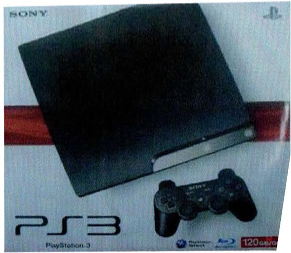
Look at how cheap and uninspired the PS3 box is compared to the PSP system packaging. You can tell the PSP marketing team put lots of time, money and effort into their box. That box makes me want to buy another PSP. That PS3 slim box is completely unenticing.
EDIT:

This picture above is a mock-up Ive made, based off of that GTpsp Voucher :D


Log in to comment