
Madworld for Wii-A black and white game is a good idea in theory, but Madworld makes such bad use of contrast that the overall effect is garish and makes my eyes bleed.

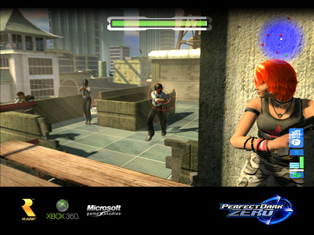
Perfect Dark Zero for the 360-Yeah, I know I'm supposed to give this game slack being a 360 launch title, but the game has a nasty cheap plastic look that is curiously devoid of detail.
Resistance: Fall of Man for PS3-Yes, another launch title, but considering the strength of the art design in Ratchet and Clank games, Resistance is weirdly flat and generally ugly looking. That being said, it looks alot better than PDZ and Resistance 2 and 3 did improve greatly in that area. The game still generally looks like ass tho.

The Conduit 1 & 2. I have no idea why people were hyping these games for their looks. No matter how technically advanced they may be (and to be honest, I have my doubts about that), the art design is about as bad as it gets for an FPS. The sunset in this screenshot looks nice, but everything else is pure ass.

Various PS3 exclusive JRPGs hyped by finalstar (Some of you might consider these shovelware, but when I say shovelware, I'm talking about games like Barbies horse adventure or M&Ms racing, etc.) The images speak for themselves:


Star Ocean: The Last Hope-The dungeons are fugly, but aside from that, the environments look okay. Still, this game wins a spot because of its fugly doll-like character models.


You get the point.
Shinobi for the 3DS-Now this might very well be a solid game in terms of mechanics, but good lord it looks like ass. The colors are nasty looking and the geometry and backgrounds are messy and devoid of detail.

Duke Nukem Forever-I know this game had its little cult following on SW a little while ago, but this is yet another plastic looking FPS that's tacky and garish to boot.

Anyway, what are the fugliest games of this gen IYO?


Log in to comment