So the new Zelda game is going to be TTP artstyle again... happy with this?
This topic is locked from further discussion.
Im really happy wiht this. TP was my favorite style for zelda.
I thought TP had an awesome art style, so this is good news to me
I am absolutely, I'm not a huge fan of WW's art style so im glad its retained the darker tone of some of the other games.
I wonder how it would look if it was cellshaded but with a TTP/OOT look.Honestly, I liked WW a lot more...but TP's style was good too.
But, I don't think we'll ever see WW sytle in a console zedla again. Sad really, becasue toon link had far more emotion and expresion than in any other zelda game combined.
goblaa

I dont mind at all and I cant wait till something is shown on this.

NEEDS MOAR PICS!!

Oh, and the girl is clearly the Master Sword's living form (or something)
I'm very please with the art style. It seems Zelda usually adopts a style for a few games and then switches to a new one. I'm still waiting for the cell shaded Zelda games to fade away. I like cell shade but it seems to be in every Zelda since Wind waker...at least on the DS.
wheres that pic form?

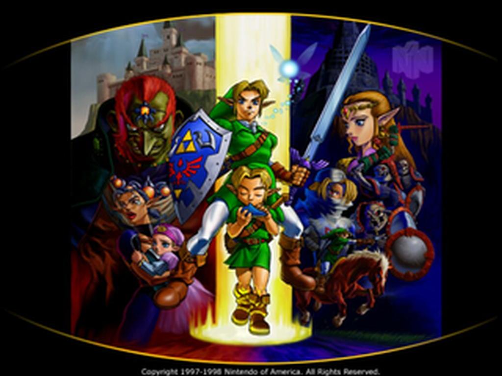
New Zelda, Nintendo released the conference art piecewheres that pic form?
WinterEvening

It actually reminds me more of the N64 game art.
[QUOTE="goblaa"]I wonder how it would look if it was cellshaded but with a TTP/OOT look. I would really like to see that. I wouldn't necessarily want them to ape Prince of Persia, but I think they need to move away from whatever they were doing with TP's art and try something fresh.Honestly, I liked WW a lot more...but TP's style was good too.
But, I don't think we'll ever see WW sytle in a console zedla again. Sad really, becasue toon link had far more emotion and expresion than in any other zelda game combined.
desmondsultanas
It actually reminds me more of the N64 game art.
hakanakumono
You mean the official concept art or just the game's art? Either way, I can't say I agree.
Which is a shame given that WW's style was designed for GCN and just doesn't look good on the DS. I'd have rather they tried a less detailed art style, or at least made the DS games 2D like Minish Cap (PH was 2.5D anyway, so it would have worked).It's clear that the console iterations of the Zelda series will feature the TP/OoT visual style, whereas the handheld iterations will use the Windwaker visual style.
Bentham
[QUOTE="WinterEvening"]New Zelda, Nintendo released the conference art piecewheres that pic form?
Thunderdrone
oh awesome thanks for sharing that
It actually reminds me more of the N64 game art.
hakanakumono
Artstyle? Not really

i think that if they were to use adult link, they should make it cell shaded in a similar direction that Prince of Persia took. I'm not saying to copy them, but Ubisoft did something pretty amazing in the graphical department. They managed to fuse realism and cell shading, which ended up looking pretty amazing (even though the game wasn't all that great).
A major complaint of Twilight Princess over Wind Waker was that the world felt dead and static. In WW, you had all of these environmental effects like wind, trees blowing, etc. However, TP missed out on all of that.
The fact is that the Wii cannot compete with the other consoles cannot compete in the graphics department with 360 or PS3; so if they just go for the purely realistic route, it's gonna get bashed just like TP's graphics. They should definitely be taking notes from PoP and Red Steel 2, those games look great!
Please Log In to post.
Log in to comment