Since graphics are obviously the selling point of a game seemingly here on System Wars, here is what I think the deal is with the whole graphics arguments. To start off, Killzone 2 looks amazing in motion without a doubt, but what I find questionable is the color scheme that it uses. Sure, it has blood, chamber fire and blueish grey lighting but when you look at the enviornments and character models theres not much going on, theres nothing vivid about its colors. In my opinion, its dull. Killzone is not the only one either, this generation it seems to be a trend that not everyone follows but when one has "realism" in mind, they seem to take the route of monotonic colors. From the games I've seen, it seems as though its easy to make a game look good or more "realistic" when your color pallette is thin as if thats some representation of reality..Its not, see Crysis:P
MGS3: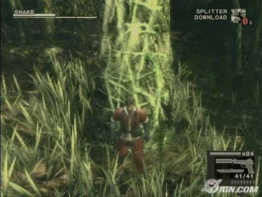
Shadow of Colossus: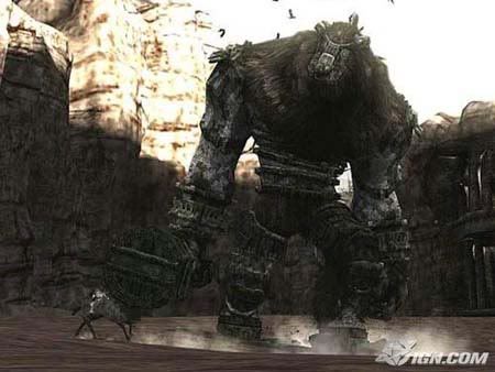
Riddick:
Resistance: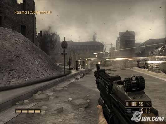
Resident Evil: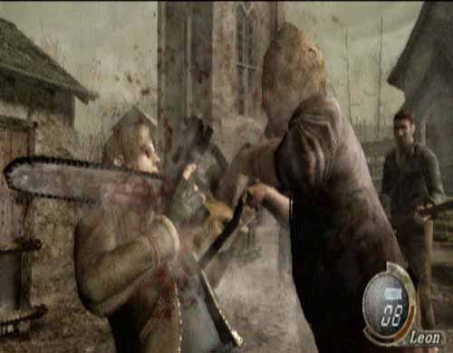
Killzone 2: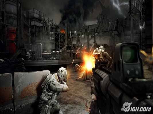
Killzone PS2: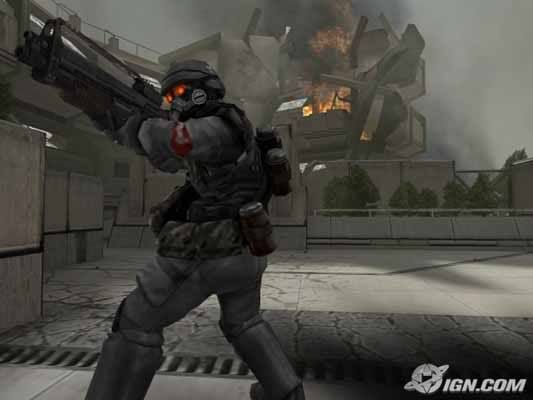
Gears of War: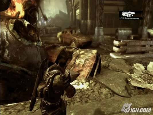
Assassins Creed: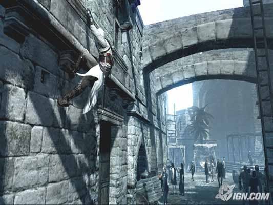
Now lets look at a game that is not so "realistic" and was even said to have a plastic toy look to it because of its vibrants in color.
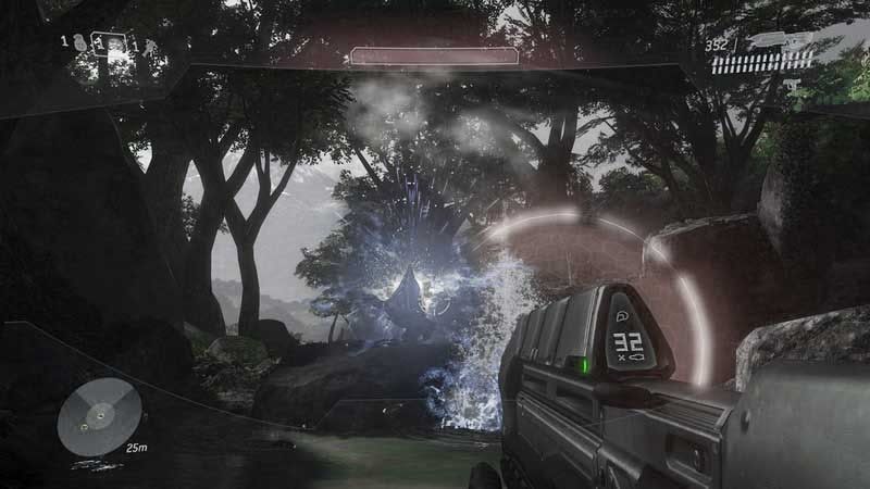
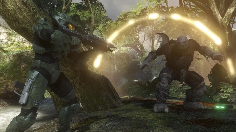
Halo 3: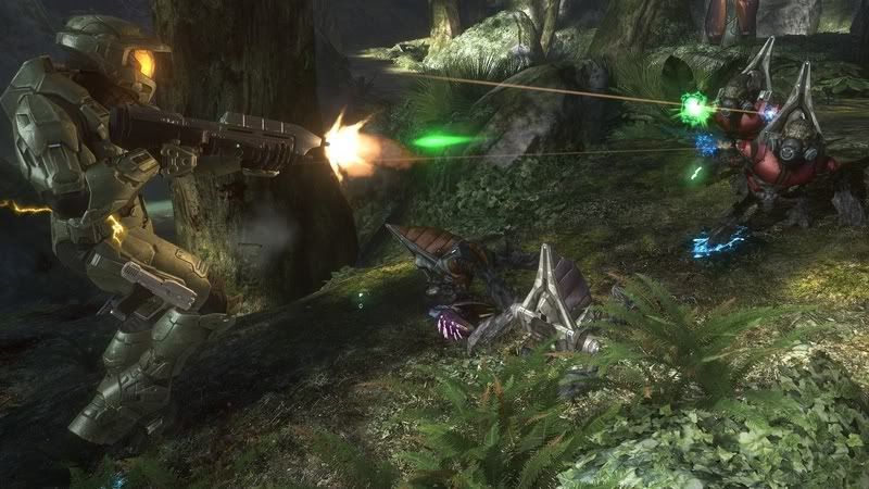
The reason why it doesn't look all Gears of War-ish is because of its color scheme and how it flows.. In Halo 3 you may have blue sparkle here and a bright neon yellow explosion over there. Theres a big color transition, not as gradual as other games but its not dull as other games. In my opinion it looks alot more fun when compared to the above games, this is why people where so excited to finally see Halo 3 not because it was head and shoulders above the rest graphically.
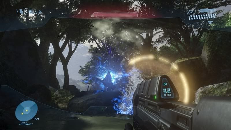
But what happens when you take the color out of Halo 3 and make it all Killzone-ish:
Halo 3 Killzone-ish-ness: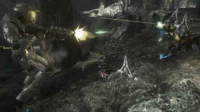
IMO, it looks worse...maybe it wouldn't have looked exactly like this if its graphics where more monotonic but it gives you an idea of how art-sty-le plays a just as big of a role as a games..poly count or resolution. This is why im not surprised when people say "[GAME] looks better than Crysis" even though it may be a stretch.


Log in to comment