Both of these games look great but which looks better?
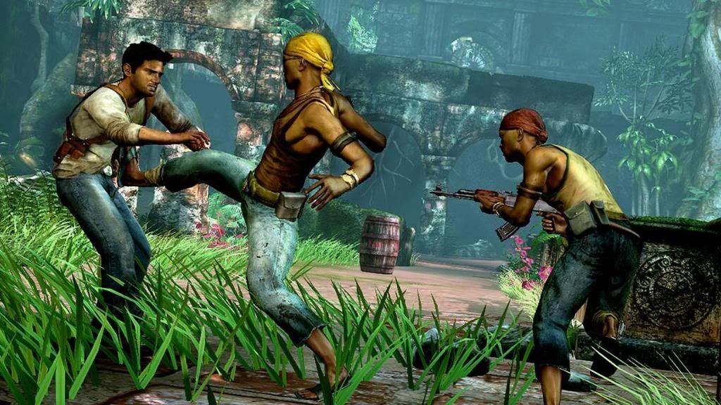
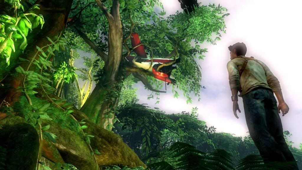
Uncharted:

Gears:

I tried to pick good shots of each game, if you want to post your own shots please do.
EDIT: resized the uncharted pic
This topic is locked from further discussion.
Both of these games look great but which looks better?
Uncharted:
Gears:
I tried to pick good shots of each game, if you want to post your own shots please do.
EDIT: resized the uncharted pic
Gears looks better, but Uncharted has better colors and looks more crisp (kinda like Halo 3)
Technically Gears but thats only because Uncharted is doing things that is harder to fool your eyes with since you have a real life reference points for jungles and people.
Its kind of like how great Jurrasic Park looked way back in the day because since you had never seen a dino it was easier to fool your eyes than if they had at the time attempted to computer generate a dog or something else you see on a day to day basis.
Gears looks better, but Uncharted has better colors and looks more crisp (kinda like Halo 3)
hockeyruler12
our XBL gamer icon's are ready to wage war :) ...btw is that from Madden 07? because mine is from 06 I think thats why I have the EA sports thing that I wouldn't mind doing away with
[QUOTE="hockeyruler12"]Gears looks better, but Uncharted has better colors and looks more crisp (kinda like Halo 3)
Medjai
our XBL gamer icon's are ready to wage war :)
bring it on :)
i have to admit the pats are gonna do well this year, Brady finally has some top notch recievers to throw to. They will be tough to beat
and yes the icon is from 07 (i think)


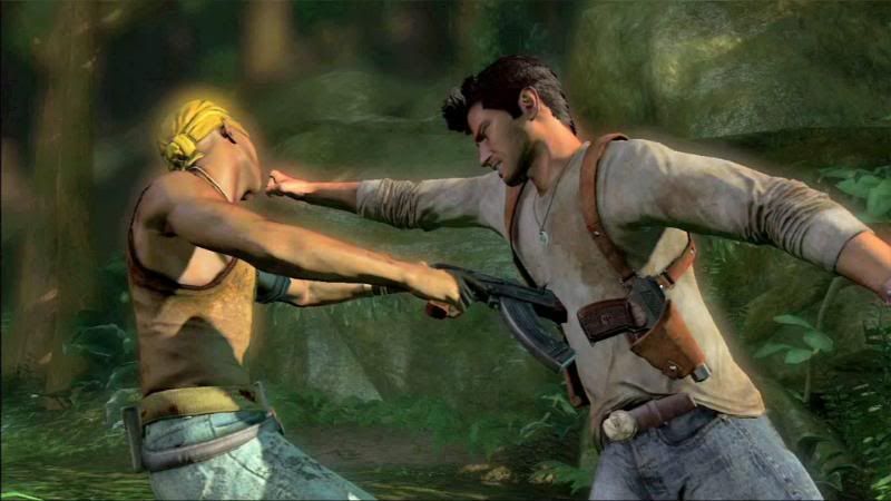
And a cut-scene pic for fun:)

I say Gears. And here is a screenshot that I think looks beautiful (this isn't mine, I took it from someone else's thread. I'm too lazy right now to look up whose it is, sorry).


Uncharted just looks really plasticy to me. Something about it looks weird. I voted gears.Sparky04
I tend to agree. But maybe the plasticy thing is just on screenshots. I watched the gameplay video, that looked better, but I would really have to see it on my HDTV to make a final comparison.
And yes, this has been discussed to death, and yes, it is a bad idea to graphically compare a game that is out to a game that is not.
Uncharted looks really GREAT just wait till they finish the game cuz its goin to be explosive!!
[QUOTE="Medjai"][QUOTE="hockeyruler12"]Gears looks better, but Uncharted has better colors and looks more crisp (kinda like Halo 3)
hockeyruler12
our XBL gamer icon's are ready to wage war :)
bring it on :)
i have to admit the pats are gonna do well this year, Brady finally has some top notch recievers to throw to. They will be tough to beat
and yes the icon is from 07 (i think)
yes they will be tough this year we got stacked in the off season...I am not going to say 16-0 straight to the superbowl just yet but on paper thier team(I say our like I am on it but people get mad) is scary good...but I thought we had you guys last year up 30-3 at the half but you can never count Manning and the Colts out :) ...thx I will go get the 07 I don't want to advertise for EA :)
sorry back on topic
Uncharted.
Reasons: Uncharted has nice, high res textures, great character models, and a lot of detail. There's a lot more color in Uncharted than Gears, larger areas and more going on screen at once.
In motion, thanks to the animation in Uncharted, it looks nice and fluid, while Gears, looks very stiff in comparison. The water in Uncharted and the facial expressions and animations look amazing. Gears is washed out while Uncharted has life.
E_x_i_l_e
Exactly Uncharted is a big game a lot of things is goin in it..everythin about it is beautiful..
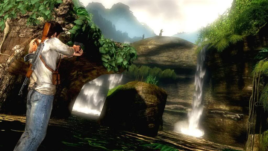
Based on those pics, Uncharted have way better draw distance.loco145
And that is why you don't base your opinion strictly off of pics. That in no way represents the draw distance.


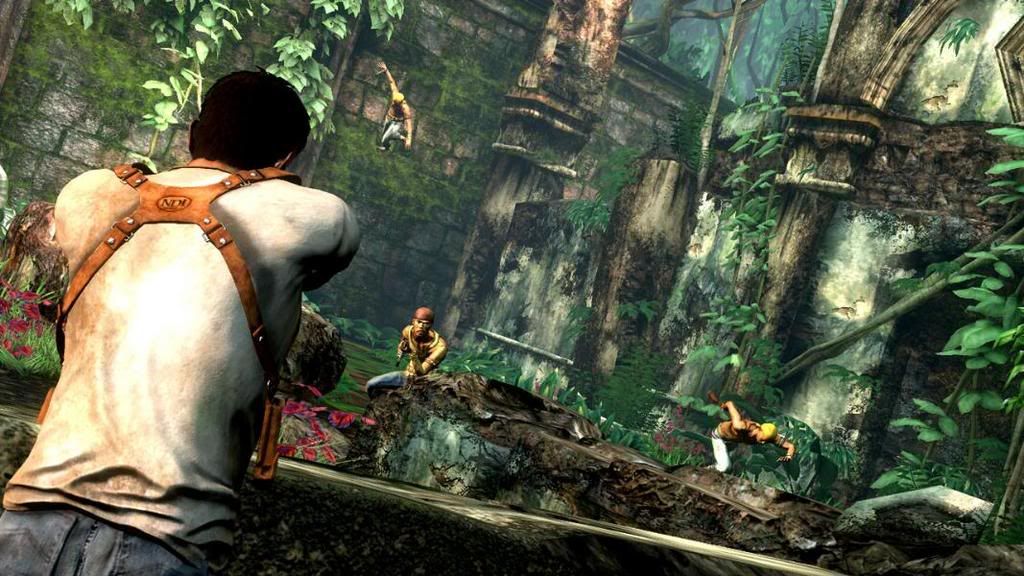
 these are some pretty cool pics...i cant wait for this game..right click on them and press view image
 [QUOTE="hockeyruler12"][QUOTE="Medjai"][QUOTE="hockeyruler12"]Gears looks better, but Uncharted has better colors and looks more crisp (kinda like Halo 3)
Medjai
our XBL gamer icon's are ready to wage war :)
bring it on :)
i have to admit the pats are gonna do well this year, Brady finally has some top notch recievers to throw to. They will be tough to beat
and yes the icon is from 07 (i think)
yes they will be tough this year we got stacked in the off season...I am not going to say 16-0 straight to the superbowl just yet but on paper thier team(I say our like I am on it but people get mad) is scary good...but I thought we had you guys last year up 30-3 at the half but you can never count Manning and the Colts out :) ...thx I will go get the 07 I don't want to advertise for EA :)
sorry back on topic
it was 21-6 at the half
and yeah their team will be good
ill start supporting EA if NHL 08 and Madden 08 are amazing
Gears easily. Why are people picking unchated? It looks like cell shaded graphics.rexoverbey
My guess is that they are picking it for one of two reasons. 1) They are cows. 2) They prefer the art direction of Uncharted. Color scheme and choice of setting seem to be the big things people are saying they like about Uncharted (that and the awesome character modeling). However, they don't seem to realize that such things would not have worked for a game like Gears, which needs the devastated beauty look to set the mood. I mean, bright colors and lush forests don't exactly say "Humanity is on the brink of being exterminated and must fight back the alien masses" to me.
[QUOTE="rexoverbey"]Gears easily. Why are people picking unchated? It looks like cell shaded graphics.aliasfreak
My guess is that they are picking it for one of two reasons. 1) They are cows. 2) They prefer the art direction of Uncharted. Color scheme and choice of setting seem to be the big things people are saying they like about Uncharted (that and the awesome character modeling). However, they seem to realize that such things would not have worked for a game like Gears, which needs the devastated beauty look to set the mood. I mean, bright colors and lush forests don't exactly say "Humanity is on the brink of being exterminated and must fight back the alien masses" to me.
You should read my first post in this thread. It pretty much sums it up.
[QUOTE="rexoverbey"]Gears easily. Why are people picking unchated? It looks like cell shaded graphics.loco145
Yep, Color is last gen.
Hmm, forest setting versus war-torn city. Which would logically have more color?
This coming from the person who thinks that the draw distance is virtually nonexistant in Gears. Stop being ignorant. Different settings require different color schemes. It is simple as that.
Uncharted.
Reasons: Uncharted has nice, high res textures, great character models, and a lot of detail. There's a lot more color in Uncharted than Gears, larger areas and more going on screen at once.
In motion, thanks to the animation in Uncharted, it looks nice and fluid, while Gears, looks very stiff in comparison. The water in Uncharted and the facial expressions and animations look amazing. Gears is washed out while Uncharted has life.
E_x_i_l_e
Gears doesn't have nice, high res textures? So when I look at the walls and the ground and am able to see very little indentations all over the place, that isn't high res? I'll be the the first to admit I know little about what certain technological phrases mean, so let me know if I am misinterpreting high res.
Stiffness. Hmmm, a large guywith body armor on versus a guy in a t-shirt. Which would look more fluid?
Again, as I said, you used the color argument.
Look at the water I posted in the screenshot. Beautiful.
Yet again, you use Gears is washed out. Thanks for reinforcing my point again. Again, a bright, vibrant war-torn city kinda seems wrong to me. They are going for the devastated beauty look. Why is that so hard to understand?
Actually, don't bother replying. I won't be back for two reasons: 1) I'm sick of Uncharted threads. This is probably the 5th or 6th one I've posted in. 2) It is depressing that so few people are able to see beauty in a simple color scheme. I'm guessing you don't like black and white photography, do you? Much prefer vibrant color photographs? Then yes, Gears probably won't look better to you. Personally, I think many black and white photographs are more elegant and beautiful, I don't need lots of color. It is all about how a person uses a color pallette. Why bother trying to explain this on System Wars though?
I honestly think uncharted looks better
and thats not the fanboy in me speaking
R-Dot-Yung
[QUOTE="E_x_i_l_e"]Uncharted.
Reasons: Uncharted has nice, high res textures, great character models, and a lot of detail. There's a lot more color in Uncharted than Gears, larger areas and more going on screen at once.
In motion, thanks to the animation in Uncharted, it looks nice and fluid, while Gears, looks very stiff in comparison. The water in Uncharted and the facial expressions and animations look amazing. Gears is washed out while Uncharted has life.
aliasfreak
Gears doesn't have nice, high res textures? So when I look at the walls and the ground and am able to see very little indentations all over the place, that isn't high res? I'll be the the first to admit I know little about what certain technological phrases mean, so let me know if I am misinterpreting high res.
Stiffness. Hmmm, a large guywith body armor on versus a guy in a t-shirt. Which would look more fluid?
Again, as I said, you used the color argument.
Look at the water I posted in the screenshot. Beautiful.
Yet again, you use Gears is washed out. Thanks for reinforcing my point again. Again, a bright, vibrant war-torn city kinda seems wrong to me. They are going for the devastated beauty look. Why is that so hard to understand?
First, never said Gears didnt have nice high res textures, please don't put words in my mouth.
Who cares if he's in body armor or not? There was little variety in the character animations when it came to gameplay. Even facial animation, where was it when Fenix took cover? The little things count you know.
The color argument is valid in comparison. I will agree these games have almost nothing in common aside from the cover system, however, the amount of color makes Uncharted feel more alive. The foliage in Uncharted's jungles looks great along with everything else.
In my comparison, I was just pointing out some small things. It seems that most next-gen games have great looking water.
Yes, their settings are different, that's not hard to understand. I'm not stupid ya know :) Just from a graphical/technical stand point: more colors, similar if not better textures/lighting and more on screen running smoothly, with the small details such as facial animation, all adds up.
Uncharted looks better.
Actually, don't bother replying. I won't be back for two reasons: 1) I'm sick of Uncharted threads. This is probably the 5th or 6th one I've posted in. 2) It is depressing that so few people are able to see beauty in a simple color scheme. I'm guessing you don't like black and white photography, do you? Much prefer vibrant color photographs? Then yes, Gears probably won't look better to you. Personally, I think many black and white photographs are more elegant and beautiful, I don't need lots of color. It is all about how a person uses a color pallette. Why bother trying to explain this on System Wars though?
Sorry that I'm someone on System Wars that actually makes sense and gives unbias views on different topics. Doesn't mean you have to run away. Uncharted wins in graphical and technical achievement, all explained above. I'm sure that plenty will agree with me.
Please Log In to post.


Log in to comment