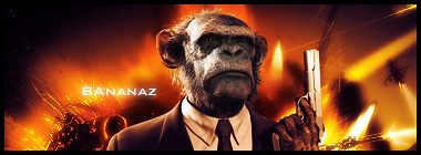
Just a few of my sigs :P


and the latest one..
@First sig: I don't like the font, but I like it....the subject matter seems like something Jason would come up with.:P
@Second sig: Floating head, and floating hand syndrome much.:P
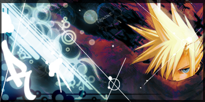
@Third sig: Floating head, and is a tad LQ, and the flow needs some work.
@Fourth sig: It's good, but kind of monotone.
@Fifth sig: It'd look epic if it didn't have so much dark space on the left.
@sixth sig: To messy, the flow needs work, and the render is almost to well blended. It could use better effects.
#1 You stole my render AND text idea :P Just kidding, but honestly, I had used this render and this text in a sig :|
#2 Bad render choice. Colors and lighting are good.
#3 The 2 different effect styles don't work very well together IMO. And the render placement is not good.
#4 Is awesome, I like the contrast but the border is not on the top so there are some effects on it.
#5 is just a render a gradient BG and text. :|
#6 Over-contrasted, over-blended, over-lightened and too many messy effects
Your works have a lot of potential, keep practicing

lolno#5 is just a render a gradient BG and text. :|
Jas0n94
He used some distort filters and stuff. Basic begginer technique.
Please Log In to post.


Log in to comment