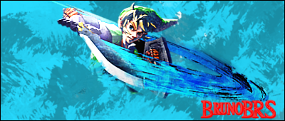
yes i'm aware of the text rules, i know them well, but that's the price to pay for deciding to mime the font from the original game

i tried making it smaller,but it wouldn't give the same effect, and putting it anywhere else would be even worse. as for the contrast... *points at boxart again* i know multiple focals is usually a no-no, but i tried to keep them both as close as possible without looking bad.
as for the lighting, i'm not sure there's really a place for it other than the render itself :P i'll see if i can light the borders and keep the center darkened, to give a "spin attack" look. and i'll use the whirl filter too... unless it doesn't look good.
it's a standard gimp brush, i was surprised to find it by accident, and spamming it gave it a nice look, so i thought "why not" :P


Log in to comment