i really like what i have here, but...

Avatar image for BrunoBRS
BrunoBRS

74156

Forum Posts

0

Wiki Points

0

Followers

Reviews: 6

User Lists: 0

#1 BrunoBRS
Member since 2005 • 74156 Posts

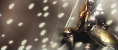
no, it's not a fancy title. i really like the sig i'm making, but it's... well, incomplete. i feel it's empty on the left. and i've tried and tried and can't come up with something to fill it. my last resort would be a quote, but that usually ruins the depth, so... help me please?


http://i242.photobucket.com/albums/ff51/brunobrs/demonssouls.png?t=1280637542

PS: oh go ahead and CCR what i have now.

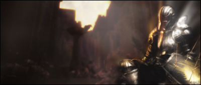
new version i stopped working halfway through

http://i242.photobucket.com/albums/ff51/brunobrs/demonssoulsv2.png?t=1280668311

Avatar image for Mr_Jenkins
Mr_Jenkins

14116

Forum Posts

0

Wiki Points

0

Followers

Reviews: 0

User Lists: 0

#2 Mr_Jenkins
Member since 2009 • 14116 Posts

You could try...umm...I'm too beginnerish to think of anything. :P  I just put something cool behind your light-leaf-thingies.

Looks like it's coming great.  The top left light might impede the render a tad. 

Avatar image for zeldafreak7
zeldafreak7

8036

Forum Posts

0

Wiki Points

0

Followers

Reviews: 5

User Lists: 0

#3 zeldafreak7
Member since 2008 • 8036 Posts
you could put in part of a scene like a bunch of dead bodies in a field, lower the opacity, and blur the edges of the scene.
Avatar image for loggens
loggens

1441

Forum Posts

0

Wiki Points

0

Followers

Reviews: 5

User Lists: 0

#4 loggens
Member since 2007 • 1441 Posts
Cant understand what the render is..and the white dits are not really doing any good there:P
Avatar image for zeldafreak7
zeldafreak7

8036

Forum Posts

0

Wiki Points

0

Followers

Reviews: 5

User Lists: 0

#5 zeldafreak7
Member since 2008 • 8036 Posts

Cant understand what the render is..and the white dits are not really doing any good there:Ploggens

the render is a soldier killed by arrow bombardments. 

Avatar image for loggens
loggens

1441

Forum Posts

0

Wiki Points

0

Followers

Reviews: 5

User Lists: 0

#6 loggens
Member since 2007 • 1441 Posts
Oh..i tought hes sitting on a horse:)
Avatar image for Mr_Jenkins
Mr_Jenkins

14116

Forum Posts

0

Wiki Points

0

Followers

Reviews: 0

User Lists: 0

#7 Mr_Jenkins
Member since 2009 • 14116 Posts

He's killed?  But the arrows are in his shield. :P


Avatar image for Dudersaper
Dudersaper

32952

Forum Posts

0

Wiki Points

0

Followers

Reviews: 38

User Lists: -3

#8 Dudersaper
Member since 2007 • 32952 Posts
It's really flat and blurry. Try adding a soling BG for this, like a wall or something like that. Because the BG doesn't fit the concept at all imo.
Avatar image for BrunoBRS
BrunoBRS

74156

Forum Posts

0

Wiki Points

0

Followers

Reviews: 6

User Lists: 0

#9 BrunoBRS
Member since 2005 • 74156 Posts

well i decided that i'll try something completely different, since what i really like is the render (duder: it's blurry on purpose, that's how the dead are in the game... kinda). but anyway, here's how V2 was going before i stopped

 http://i242.photobucket.com/albums/ff51/brunobrs/demonssoulsv2.png?t=1280668311

yeah, earlier today i decided to throw away all the brushes, before reading the thread.

Avatar image for BrunoBRS
BrunoBRS

74156

Forum Posts

0

Wiki Points

0

Followers

Reviews: 6

User Lists: 0

#10 BrunoBRS
Member since 2005 • 74156 Posts

BTW...

what's inspiring me

Avatar image for Dudersaper
Dudersaper

32952

Forum Posts

0

Wiki Points

0

Followers

Reviews: 38

User Lists: -3

#11 Dudersaper
Member since 2007 • 32952 Posts
In V2 the BG just needs some more detail. Alot more detail, but that's pretty much all that's missing.
And the lighting, which is completely off
Avatar image for BrunoBRS
BrunoBRS

74156

Forum Posts

0

Wiki Points

0

Followers

Reviews: 6

User Lists: 0

#12 BrunoBRS
Member since 2005 • 74156 Posts
In V2 the BG just needs some more detail. Alot more detail, but that's pretty much all that's missing.
And the lighting, which is completely off
Dudersaper
kinda hard to work with 2 lighting sources, which is why i said i'll go with something different
Avatar image for Jas0n94
Jas0n94

3990

Forum Posts

0

Wiki Points

0

Followers

Reviews: 15

User Lists: 0

#13 Jas0n94
Member since 2008 • 3990 Posts
For now I willonly say that the focal point doesn't look nice on the edge
Avatar image for zeldafreak7
zeldafreak7

8036

Forum Posts

0

Wiki Points

0

Followers

Reviews: 5

User Lists: 0

#14 zeldafreak7
Member since 2008 • 8036 Posts
i think its great but with higher quality background.