
i don't know if it's just me, but it kinda reminds me of the sig i made a while ago :|
and weird, i don't remember the original render looking like that when i saved... feels kinda LQ :?
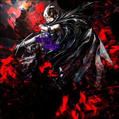
I really don't like the font color and the guys hair is weird. The top left is a tad odd, but I kinda like it anyway. I really like the red effects, they stand out yet don't take away from the render. I like the random blue spots, they add pizazz.

Lighting on the render itself is too strong.
I don't like the effects, especially the ones on the cape .
Text placement could be better
For some reason i like it too..maybe its just the render..can u post it plz:)?loggenssure. i went into the PR galleries and found it by accident, i have no idea who he is :P

BTW this is something i did to pass time on an airport, not exactly something i dedicated myself too much :P
isnt it a bit big for a sig..??
i like it.
I think that is a great work of yours Bruno. If you can clean the effects over there and get rid of that colour on the text I will be glad to see a new version :DJas0n94i just added the text for the heck of it, might as well throw it away :P
what effects need to be cleaned?
Please Log In to post.


Log in to comment