i am done with the whole planet thing now!!!!!!
this is the last and best one yet
i am done with the whole planet thing now!!!!!!
this is the last and best one yet

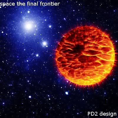
Planet still doesn't fit in because the colours don't match the BG.
But yeah it is the best one, the planet looks great.
Text is crappy though.
I think it looks really good... I mean space is usually represented by the colors he used. Planets don't have to match the background if the idea is to look relatively realistic and this one looks pretty realistic. So pokemondude, if you were going for the "realistic" look of space then it's spot on.Actually the colours directly near the planet had to be matching, because that is like a flamed planet exploding, which those, in their real form, create light, which is lacking in the bg here :P
jooja42animefan
follow these steps: Select the BG image layer > colors > hue-saturation > make it red.Jas0n94
i tried that and it looks really stupid
lololol
Does look kinda dumb though, for now, Jay if you fix a few adjustment layers in (gradient maps and curves and what not) you can pull it off.
The reason it looks weird to me is because the light source(that you can see) is top left and the planet is shaded on the top left. It's not your fault because there might be a closer star with brighter light to the bottom right that we can't see. Also the exploding planet creates light from the inside.
Overall it's looks cool and a lot better than the planet in the video you learned how to do this from.:)
i made it into a banner. it looks really good.
i did a gradient map on the bg and it is pretty sweet
Please Log In to post.


Log in to comment