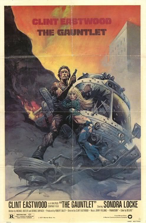
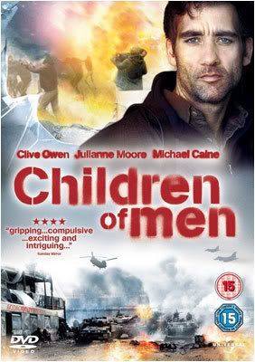
God I hate modern album/dvd covers that look like Photoshop vomited way too many ugly layers on top of each other. Not only is it visible on way too many music albums, these horrid stinkers have also made their ways to movies as well. I'd take a poster of Eastwood's "The Gauntlet" any day and proudly wear it on my wall, but there's no chance in hell I could even imagine putting a "Children of Men"-poster up there, even if it is a great film. Of course there has always been ugly covers, but somehow the photoshopped-ones always seem to catch my eye. Besides, those old covers usually have this sweet camp charm that I'm very fond of, I mean just look at Saint Vitus' Born Too Late album cover. It's really ugly but it still kicks butt. Also note that I'm not dissing Photoshop here, it's a great piece of program that has an incredibly amount of possibilities. What I am dissing is the lack of artistic value and originality, especially in these cases when the outcome just looks really lazy and uninspired. I long for the days when the cover art could be an actual piece of art instead of piece of crap, and instead of just being there because it's a must, it was an actual part of the album itself. But don't take my word for it... just look at these horrid pieces:
Megadeth - United Abominations

Now I really liked this album. It was a really pleasant surprise for me, since I was expecting it to suck hard, but all in all it was an incredibly catchy piece of music that at it's best, reminded me of Megadeth's golden days (which I'm a big fan of). But oh my god that cover "art" is ugly as hell. Also the title is really dumb, but that's just a part of Megadeth legacy.
Bryan Ferry - Dylanesque

Don't get me wrong, I have some intense dislike in stores for Bryan Ferry but even he doesn't deserve a craptastic attack of ugliness such as this horrid cover. Just look at it, and I mean LOOK at it. It's like staring straight at some dark void.
Plies - The Real Testament

I don't even have a comment for this one. It is pretty funny to see a rapper materializing out of smoke coming from the Holy Bible itself, but I'm confident enough to say that it will never make it to the list of greatest album covers.
Purified in Blood - Reaper of Souls
Pretty standard metalcore right here, though I must admit that there were few tunes I liked thanks to some very Slayerish riffing and few solos that reminded me of Iron Maiden. But surely they could have done much better with the cover? It's just really cheap, cheesy and overall depressing to look at.
Mystic Circle - The Bloody Path of God
This album sucks a hella lot, but it's the cover that really crosses the border of good-taste with it's color scheme that looks like someone threw up crayons. Also the whole concept is just really stupid. I guess they tried to make a statement of the horrible deeds done in the name of Christian faith, or maybe they just tried to pull some "evil" and "blasphemous" stuff out of their hats, but they failed... miserably, and when looking at it, it's easy to figure where the general opinion of metalheads came from.
And as for the movies:
I Spit On Your Grave

A notorious horror movie with a great line of original posters, with each making a possibly great cover for a DVD. But guess what they thought was the best way to publish this c.lassic? By wrapping it under an ugly re-make of the original cover that makes the whole movie look like a generic teen-slasher. I actually almost passed this one while going through movies in the store, simply because a quick look at the cover made me think of some dull teen horror. Thankfully I took a closer look at the title.
And guess what? They did the same thing to Bride of Re-Animator, a sequel to an amazing horror-flick. In a way, this cover art is even worse than the I Spit On Your Grave-one:

I don't know why, but the cover art makes Dr. Herbert West look... well... strange. It's almost like he's wearing a thin latex-mask or just way too much face powder. Gosh. I haven't seen the cover art for the original Re-Animator, so I can only hope that it hasn't fallen like the Bride here.
Blood On Satan's Claw

Another cult-favorite of mine, the new DVD cover is just plain ridiculous and generic BUT... there's a trick to it. Instead of forcing you to watch that painful mistake, you can just flip the cover paper and feast your eyes on an alternate cover that looks like an original movie poster or something like that. Sure it's very low-guality but that just compliments the movie's low-budget look and s.tyle, making it really easy to tell what kind of movie it is from simply looking at the cover. They really should pull out stunts like these more.
Yeah, maybe I'm making a big deal out of nothing. Take it as a drunken rambling if you want.