


 *INSERT A FEW MONTH BREAK*


 Okay... Now we've reached something I should point out. Those sigs above ^ were all GIMP sigs. The sigs from here on are PhotoShop sigs (I started using Photoshop earlier this month)


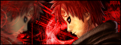
 I don't really know what to say about this one. :lol: I don't know how it ended up that bad, but it did. :P
 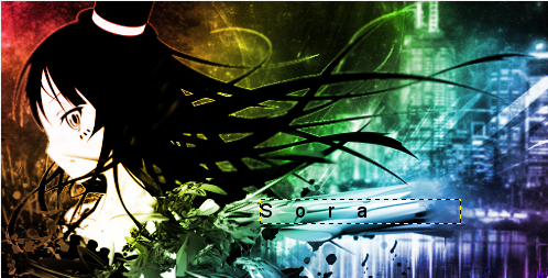 This was going to be my first LP-ish type thing. I was actually almost finished with it when GIMP crashed. Oh the failure. :cry:
  No comment. :lol:
  I believe I only posted this one when I got it ranked at MDL (the time where I went down from High Mod to Mod D: ) It was a lazy sig. I didn't put enough effort into it. D:
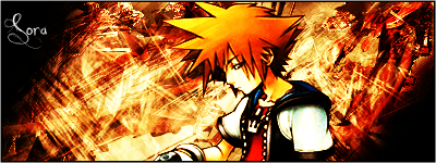
  Dat lighting. D:
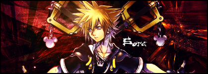
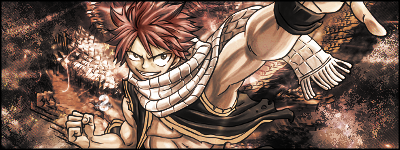
  This is the FIRST thing I did with PS. If I said that another design was my first, I lied. I did this sig right after installing PS. I'm not going to lie to myself, I had a bad start. :lol:
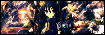
  Another PS sig that didn't come out well. :lol:
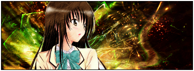
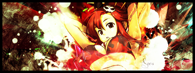
  It looks too much like my Mio sig. :P The colors don't fit the render or whatever. D:
  I feel like this sig almost had potential, but I ****ed up the colors and ruined the BG I had before with the Displace filter. Maybe I'll go back and rework it.
  Tried following a tut for this one, but I sorta messed it up. :lol: Well, there you have it! That's all of the rejects I have in my PB and my computer. I hope I didn't melt anyones eyes. D:
 Thanks for viewing and feel free to comment, but don't laugh at my failures. :P ~Sora