I love it.
This topic is locked from further discussion.
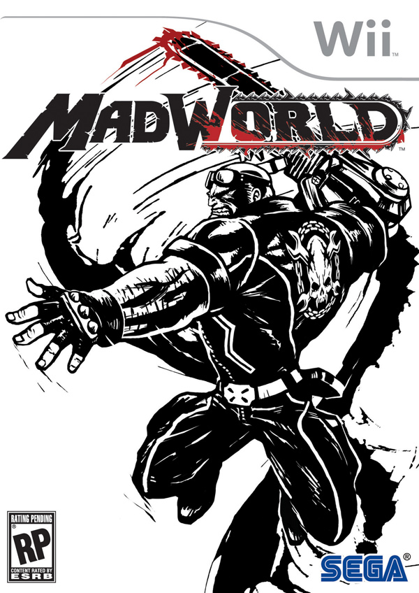
That Sega logo might hurt sales they better drop that.wooooode
lol true...


Am I the only one who thinks it looks kinda bad?
I mean, given the art direction they could've made it SO much better..
It looks kind of unfinished. I dont like it. Given the artistic scope of the game, and its obvious roots in comic books, they could have done a much MUCH better job.
Heres to hoping its a place holder.


this is what im trying to explain on my recent post

Hey...
Sometimes less is more.
yep sometimes simple is more, but what if its about Mad World, the World looks empty? i know its not a big deal because its only a cover, this is just pure opinion.
an example(I know this is not the real cover of Super Mario Galaxy i just use this because its easier faster to edit)
Imagine Super Mario Galaxy cover something like this?
krayziecupid
Ummm... the cover fits Madworld in my opinion.
Mario Galaxy is a completley different game, And it's a very colorful one, it would be stupid if they made a cover like that. --__--
[QUOTE="krayziecupid"]yep sometimes simple is more, but what if its about Mad World, the World looks empty? i know its not a big deal because its only a cover, this is just pure opinion.
an example(I know this is not the real cover of Super Mario Galaxy i just use this because its easier faster to edit)
Imagine Super Mario Galaxy cover something like this?
dtno132
Ummm... the cover fits Madworld in my opinion.
Mario Galaxy is a completley different game, And it's a very colorful one, it would be stupid if they made a cover like that. --__--
hahaha i pity you man, i just emphasize the lack of background on MadWorld cover knowing that it involves a World, and Since Mario Galaxy involves also a Place and it shows on the cover, i didnt event say that it should have lively color. I just edited that pic for only a few mins then you expect it would not look stupid?
[QUOTE="dtno132"][QUOTE="krayziecupid"]yep sometimes simple is more, but what if its about Mad World, the World looks empty? i know its not a big deal because its only a cover, this is just pure opinion.
an example(I know this is not the real cover of Super Mario Galaxy i just use this because its easier faster to edit)
Imagine Super Mario Galaxy cover something like this?
krayziecupid
Ummm... the cover fits Madworld in my opinion.
Mario Galaxy is a completley different game, And it's a very colorful one, it would be stupid if they made a cover like that. --__--
hahaha i pity you man, i just emphasize the lack of background on MadWorld cover knowing that it involves a World, and Since Mario Galaxy involves also a Place and it shows on the cover, i didnt event say that it should have lively color. I just edited that pic for only a few mins then you expect it would not look stupid?
I didn't even read your post, I just took a look at the pic :)
The cover looks AWESOME, anyone who says otherwise is wrong :P
No, seriously, its very good, very "ballsy" of them to make it look like that

I like the simplicity of it. Kind of like No More Heroes cover.staindcoldlp
Me too, I really like wii box art with simple backgrounds it goes well with the white box. 360 and PS3 boxart doesn't look as good if it remains too simple, but it looks great on the wii. I think it has something to do with that white box.
No, I do as wellAm I the only one who thinks it looks kinda bad?
I mean, given the art direction they could've made it SO much better..
Haziqonfire
The cover is crap now that I had a night to think it over.
First of all it's not going to help sales so once again we see a dev that does not want to sell games on the Wii.
Secondly the art itself is crap. While No More Heroes screwed up their cover art as well they at least cary over the same style of the game on the case art. Madworld on the other hand had a failed art student try to make a cover. I mean besides the black and white colors there's no connection. It looks more like Danny DiVito after hitting the gym rather then the character in the game.
You have artists like Darick Robertson out there that can hit this kind of art flawlessly and they pick some garbage artist.
[QUOTE="Haziqonfire"]No, I do as wellAm I the only one who thinks it looks kinda bad?
I mean, given the art direction they could've made it SO much better..
Jaysonguy
The cover is crap now that I had a night to think it over.
First of all it's not going to help sales so once again we see a dev that does not want to sell games on the Wii.
Secondly the art itself is crap. While No More Heroes screwed up their cover art as well they at least cary over the same style of the game on the case art. Madworld on the other hand had a failed art student try to make a cover. I mean besides the black and white colors there's no connection. It looks more like Danny DiVito after hitting the gym rather then the character in the game.
You have artists like Darick Robertson out there that can hit this kind of art flawlessly and they pick some garbage artist.
lol, you crazy?
How can you not see a connection? Maybe we Europeans like our covers simple (FF covers just with logo), but i rather have this cover over some super detailed background or pseudo 3D render crapfest. As a designer, i think its very good :P
I hope PALland gets this cover, PLZ...
Please Log In to post.


Log in to comment