[QUOTE="Mega-Mustaine"]
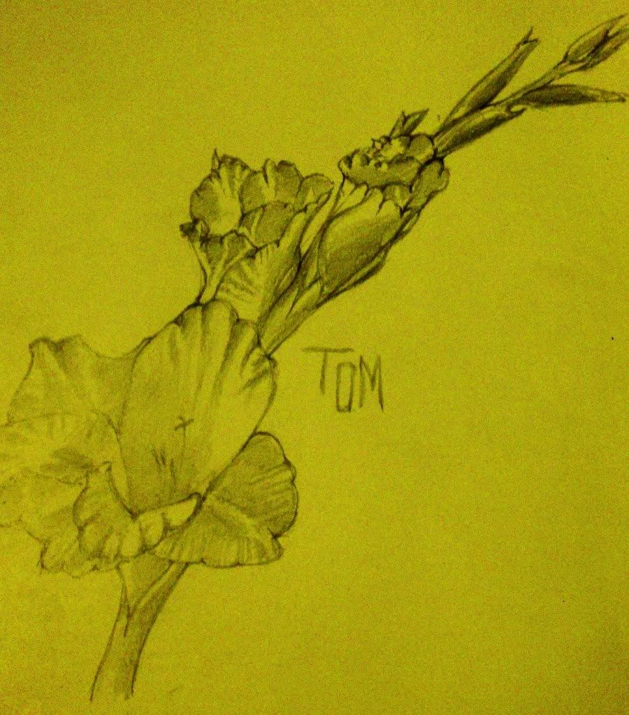
Some fanart drawn with pen tablet and photoshop elements. Requested by a kid I'm in class with... I rushed it so it doesn't look that good. v.v

SailorH, megaspider, everyone else who posted pics, post more, please.
MrGeezer
Looks good, but the framing really isn't working for me.
1) This just feels really unbalanced. It just seems far too heavily weighted to the right. Some of my primary issues with this are firstly that I only know English, so I'm approaching the picture from the left. Coming in from the left, I get greeted with a whole lot of negative space, with nothing really leading my eye INTO the picture. And then once I get to the woman, she's sort of walking right out of the picture. The actual drawing is simple, but it doesn't look "wrong". I hav absolutely no problem with how you drew the woman. I do have an issue with how you framed the whole composition. I think the piece would be more effective if the woman was on the left, so that I'm following her INTO the picture instead of right out of the picture.
2) And sort of on that note, I think it might help to just crop tighter. There's nothing inherently wrong with a whole lot of negative space, but I just don't see it working here. Maybe a tighter crop would help. Maybe that blank white space on the left needs something actually leading into the picture. But the composition isn't working for me. And I think I sort of see what you may have been going for. I mean...I absolutely notice that the woman is looking backwards (human eyes don't really work that way, but I'll accept that as just the ****that you were using), so that large segment of empty white space seems like it is SUPPOSED to be a critical element. It's just that there's not enough there for me to even be able to tell what's going on. I mean...I think there should be something there. Even the character in the drawing is acting like there's something there. But when I look there, I see nothing. If that part of the piece was supposed to be full of nothing, then maybe at least have beams of light (instead of a huge white empty field of light) directing my eye into the picture?
But then again, maybe that's just me.
And also let me restate that I'm fine with the actual drawing. I just think that it either needs a tighter crop, or needs something over on the left which is actually serving to direct my eye over to the woman. I mean, she really is WAY over there on the right. And once I get to her, she already looks like she's walking out of the picture. Lots of negative space can be fine in certain situations, it's just that I don't quite think it's working right in this case.
You, sir, are now a legend amongst me for being the very first person to give me a proper and very good critique. c:


Log in to comment