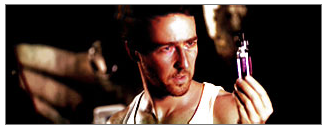
rate and critique
Kritical_Strike
it's a little big, but awsome.
9/10
This topic is locked from further discussion.
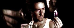
rate and critique
Kritical_Strike
it's a little big, but awsome.
9/10
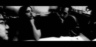
[QUOTE="club-sandwich"]could anyone please rate my sig? :Dmemorials
What clone said,1.
Also Conformest,do you use your last.fm anymore?
Not after I moved out. I don't have my own computer to register what I'm listening to so at the moment it's not a site that really takes advantage of my priorities.
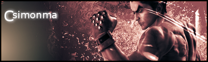
It's really quite a boring sig.rate and critique
Kritical_Strike
The problem with it is the fact that it is in black and white. It's saved somewhat by the red lines, but those red lines look horrible, so either you take them out and have a boring sig or you keep them and have a slightly less boring sig with ugly red lines. It's a lose-lose situation, on your part.
[QUOTE="Kritical_Strike"]It's really quite a boring sig.rate and critique
Cerussite
The problem with it is the fact that it is in black and white. It's saved somewhat by the red lines, but those red lines look horrible, so either you take them out and have a boring sig or you keep them and have a slightly less boring sig with ugly red lines. It's a lose-lose situation, on your part.
Thanks for the advice. Out of curiosity, what do you think of my current sig? It's totally B&W.
rate this unfinished hulk sig.
here's the stock:
memorials
I can't really say. You've increased the contrast on the first one. It doesn't make it look any better I'm afraid.
[QUOTE="Kritical_Strike"][QUOTE="memorials"]rate this unfinished hulk sig.
here's the stock:
memorials
I can't really say. You've increased the contrast on the first one. It doesn't make it look any better I'm afraid.
I've done more then just that. :|Oh, well whatever you've done, it's not looking that great. More effects perhaps?
Oh, well whatever you've done, it's not looking that great. More effects perhaps?
Kritical_Strike
Not having any brushes asides from starter brushes (...i'm using imageready) = .....no effects aside from what I can create.
My PS3 trial ran out..I'm trying to make simplistic type sigs..
[QUOTE="Kritical_Strike"]Oh, well whatever you've done, it's not looking that great. More effects perhaps?
memorials
Not having any brushes asides from starter brushes (...i'm using imageready) = .....no effects aside from what I can create.
My PS3 trial ran out..I'm trying to make simplistic type sigs..
Just go easy on the contrast, good luck.
[QUOTE="Cerussite"][QUOTE="Kritical_Strike"]It's really quite a boring sig.rate and critique
Kritical_Strike
The problem with it is the fact that it is in black and white. It's saved somewhat by the red lines, but those red lines look horrible, so either you take them out and have a boring sig or you keep them and have a slightly less boring sig with ugly red lines. It's a lose-lose situation, on your part.
Thanks for the advice. Out of curiosity, what do you think of my current sig? It's totally B&W.
It's more interesting, but I find that text in the background slightly annoying.Thx for not being an asshat, though, no matter how negative what I've said is.
ahhh what the hell.
this a good one?
i just made this,it's simple.
if you don't like it,I'll make a new one,just need to find a better picture..
memorials
It's cool, but I kinda wanted them performing in the pic.
Also want it to say The Magnetic Fields and then MoonSpoon in some other area with a badass font.
I have a problem. When I join Gamespot then I can't see my icons, banner. If I don't join then I can see them. Why?zak234
There's an option in your preferences that can disable images, I believe. Just click on "prefs" in the top right of the page, and it might be in there somewhere.
[QUOTE="memorials"]ahhh what the hell.
this a good one?
i just made this,it's simple.
if you don't like it,I'll make a new one,just need to find a better picture..
MoonSpoon
It's cool, but I kinda wanted them performing in the pic.
Also want it to say The Magnetic Fields and then MoonSpoon in some other area with a badass font.
alright dude,so, do you like the sig? (if i add the text and poopoo) Original stock...: [spoiler]
  [/spoiler] I will have her babies.
 [QUOTE="MoonSpoon"][QUOTE="memorials"]ahhh what the hell.
this a good one?
i just made this,it's simple.
if you don't like it,I'll make a new one,just need to find a better picture..
memorials
It's cool, but I kinda wanted them performing in the pic.
Also want it to say The Magnetic Fields and then MoonSpoon in some other area with a badass font.
alright dude,so, do you like the sig? (if i add the text and poopoo)I'm starting to think you don't read dude.
It's cool though.
My brother-in-law is mailing me a copy of Photoshop.
I dunno when it'll come, though.
Cerussite
I'd like to see what you're capable of. What version is it?
Any more rates...Sorry I'm just kinda disappointed as before I used to get a lot more rates.-kaz3-
Very nice, contrast is great and composition just right. Colourful too. I'd prefer it with a more slender border though.
[QUOTE="Cerussite"]My brother-in-law is mailing me a copy of Photoshop.
I dunno when it'll come, though.
Kritical_Strike
I'd like to see what you're capable of. What version is it?
Meh. I dunno. I think it's CS or CS2. I have a really old version lying around here somewhere, but I'm too lazy to install it. I'm not really sure where it is, either.[QUOTE="-kaz3-"] Any more rates...Sorry I'm just kinda disappointed as before I used to get a lot more rates.aliens1234
Very nice, contrast is great and composition just right. Colourful too. I'd prefer it with a more slender border though.
I'll agree with this, but I'd have to say, the focal point (which I assume is the man) blends in too much with the background, and it makes the sig look unbalanced. I think the lighting is to blame for that. I'd just mess around with the lighting until it gets a desired effect (at least, that's what I'd do).[QUOTE="-kaz3-"]Any more rates...Sorry I'm just kinda dissapointed as before I used to get a lot more rates.new one...
w/ border-kaz3-
[QUOTE="-kaz3-"][QUOTE="-kaz3-"]Any more rates...Sorry I'm just kinda dissapointed as before I used to get a lot more rates.
[QUOTE="memorials"][QUOTE="MoonSpoon"][QUOTE="memorials"]ahhh what the hell.
this a good one?
i just made this,it's simple.
if you don't like it,I'll make a new one,just need to find a better picture..
MoonSpoon
It's cool, but I kinda wanted them performing in the pic.
Also want it to say The Magnetic Fields and then MoonSpoon in some other area with a badass font.
alright dude,so, do you like the sig? (if i add the text and poopoo)I'm starting to think you don't read dude.
It's cool though.
well Ionly asked that because you said you'd rather have them performing :PHey can any of you guys be nice enough to make me a sig size 426 X 149 of this picture with bender in it?

I'd like a better quality pic if you can find one, I'd like my name at the bottom right hand corner, with 'They make me look cool' somewhere in the pic (without the quote marks). Thanks in advance.
[QUOTE="NyJeo723"][QUOTE="-kaz3-"][QUOTE="-kaz3-"]Any more rates...Sorry I'm just kinda dissapointed as before I used to get a lot more rates.
Please Log In to post.


Log in to comment