New sigs:
I'm going for something more minimalist....
Here's an edit of my guitar bow sig:
Greatgone12


love the guitar one
This topic is locked from further discussion.
New sigs:
I'm going for something more minimalist....
Here's an edit of my guitar bow sig:
Greatgone12
love the guitar one

no one wants to rate mine ?:cry:inyourface_12Hmm... Well, you included one of the best lyrics from the album. It's lacking somewhat on the artistic side though. :P In fact, I can't tell what it is. >.>
rate and comment about my sig
[QUOTE="inyourface_12"]no one wants to rate mine ?:cry:SolidSnake35Hmm... Well, you included one of the best lyrics from the album. It's lacking somewhat on the artistic side though. :P In fact, I can't tell what it is. >.>
lol ya im new to photoshop and it wasnt my first pick but people were misinterpreting it so i had to change. working on a new masterpice. it is the buggy from half life 2
It's simple and it works because of that, but I'm not too sure as to what you've actually done. I think it's a bit big and the empty space on the left isn't a good thing. 6/10rate and comment about my sig
AncientNecro
New sigs:Bottom 9.4/10 add a bored like you did for your SP Sig, and Radiohead, its ok i dont like it to much :\...and did you get a start on my nosferatu sig yet :?
I'm going for something more minimalist....
Here's an edit of my guitar bow sig:
Greatgone12
[QUOTE="AncientNecro"]It's simple and it works because of that, but I'm not too sure as to what you've actually done. I think it's a bit big and the empty space on the left isn't a good thing. 6/10 ya he should take out that dark space, you know so its invisible :shock: except for the moon and spawnrate and comment about my sig
SolidSnake35
its cool i guessrate and comment about my sig
AncientNecro
haha, check out this one I made (edited by RPG-er ).i approve :)
take that mods
Def_Jef88
haha, check out this one I made (edited by RPG-er ).Yes, whining about moderations is always a great way to waste your time, especially when in something meant to represent yourself (i.e. your signature). I applaud you.
take that mods
Def_Jef88
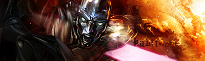 the compact version is my current sig. You can click it for the large version. Not your best, but still interesting.
 [QUOTE="Def_Jef88"]haha, check out this one I made (edited by RPG-er ).Yes, whining about moderations is always a great way to waste your time, especially when in something meant to represent yourself (i.e. your signature). I applaud you. True. I personally couldn't care less if I was modded, if I ever will be (I'm quite careful).
take that mods
ConformestClone
the compact version is my current sig. You can click it for the large version. Not your best, but still interesting. hey conformest,you actually still post here? Been out for a while, and this isn't exactly a coming back or anything. I'll continue to post but irregularly. the compact version is my current sig. You can click it for the large version. I don't really think the text looks great... and the pink bar or whatever... looks pretty odd if you ask me...the fire is nice though 8/10 [QUOTE="Def_Jef88"]haha, check out this one I made (edited by RPG-er ).Yes, whining about moderations is always a great way to waste your time, especially when in something meant to represent yourself (i.e. your signature). I applaud you.thanks :D
take that mods
ConformestClone
It is bad. :)I just made this , I could put your name on it if you want (its from "the darkness")
-Predak-
[QUOTE="inyourface_12"]ok got my new one done. do u like it?-kaz3-you could've cut out the guitar better:? surely paint can do that.
actually i left the edges cuz i liked the look of it after i solarized it. i take it you dont?
actually im usin ps but i just started close to a week ago so yeah
[QUOTE="inyourface_12"]ok got my new one done. do u like it?-kaz3-you could've cut out the guitar better:? surely paint can do that. That + background and text...
and what does that make yours?-Predak-Good comeback. Though, it isn't really a competition, but I'm pretty sure yours is incomparable to my own. At least in the minds of those who know what they're doing in terms of graphical design.
and what does that make yours?-Predak-superior. While it may not be the most elaborate of his sigs, at least the aspect ratio is correct. Kudos for the comback though.
you could've cut out the guitar better:? surely paint can do that.[QUOTE="-kaz3-"][QUOTE="inyourface_12"]ok got my new one done. do u like it?inyourface_12
actually i left the edges cuz i liked the look of it after i solarized it. i take it you dont?
actually im usin ps but i just started close to a week ago so yeah
magic wand/pen tool/magnetic lasso tool. try using those :) then get a picture...whatever you want. and paste that on teh bg instead of a simple gradient :)[QUOTE="-Predak-"]and what does that make yours?ConformestCloneGood comeback. Though, it isn't really a competition, but I'm pretty sure yours is incomparable to my own. At least in the minds of those who know what they're doing in terms of graphical design. Yes, next time, hold shift when resizing :) . It's goignto look FAR better if the aspect ratio is correct.
i turned the ratio balance off and blurred the picture, it wasn't blurred because of the resize
Besides, i wasn't asking for opinions, i did not use photoshop and this is my first try, if you don't like it, you can keep that to yourself.I'm sure your near 12000 posts showcases your superiority to me well enough.
can anyone make me a punisher (the comic character) as a sig....like one based on the movie that has an emphasis on dark colors...like with thomas jane (the guy that played frank castle) and the punisher skull? thanksLA_lakers_4lifeanyone please?
[QUOTE="-Predak-"]It is bad. :) You're all so mean. :P.... The render has been cut out fairly well, and the smoke effect in the background looks pretty good. I think you should add more detail to the background though, and then try blending the render into it more. The text needs a lot of work too.... Add a simple border while you're at it.I just made this , I could put your name on it if you want (its from "the darkness")
ConformestClone
Someone rate mine. I got tired of my old sig, so I moved to the animated userbar thing. Check out all the systems I own.SmashBrosLegendUmm... it would be much betterif you combined all of them into one... 4 animated userbars at different timings make them look like ads...
If it wasn't for criticism, what the hell did you post it for?i turned the ratio balance off and blurred the picture, it wasn't blurred because of the resize
Besides, i wasn't asking for opinions, i did not use photoshop and this is my first try, if you don't like it, you can keep that to yourself.I'm sure your near 12000 posts showcases your superiority to me well enough.
-Predak-
[QUOTE="-Predak-"]If it wasn't for criticism, what the hell did you post it for? I think he was offering it to anyone who wanted it.i turned the ratio balance off and blurred the picture, it wasn't blurred because of the resize
Besides, i wasn't asking for opinions, i did not use photoshop and this is my first try, if you don't like it, you can keep that to yourself.I'm sure your near 12000 posts showcases your superiority to me well enough.
Vfanek
[QUOTE="MattUD1"]Could someone use the last bit of my current sig "Kremlin Fried Chicken", use that part, have Col. Sanders in a Soviet Style hat thing, and say under it "Tastes like Capitalists" in Russian style lettering?Attention! Hello? Can someone make this for me?
And size has to be 450x150 pixels.
MattUD1
[QUOTE="ConformestClone"][QUOTE="-Predak-"]It is bad. :) You're all so mean. :P.... The render has been cut out fairly well, and the smoke effect in the background looks pretty good. I think you should add more detail to the background though, and then try blending the render into it more. The text needs a lot of work too.... Add a simple border while you're at it. Somehow, i doubt thats a render. IDK, i think its a stock, messed up ratio and blur. But then again, its not bad considering some of the stuff you see here...I just made this , I could put your name on it if you want (its from "the darkness")
SolidSnake35
Somehow, i doubt thats a render. IDK, i think its a stock, messed up ratio and blur. But then again, its not bad considering some of the stuff you see here...-kaz3-I just try being nice to everyone. I remember when I first started. I was really proud of what I'd made, despite it being absolutely awful, and everyone helped me out without saying anything too harsh. Anyway, what do you think of my new 'un? :P
GameSpot looks as though it's written in cursive... so does 'day'... And fill in the empty heart :P
made this one specialy for today...
Def_Jef88
Am I harsh in my reviews? Just curious...blackleechTo be honest, I haven't read many, but I don't think so. So long as your criticism is constructive.
To be honest, I haven't read many, but I don't think so. So long as your criticism is constructive.SolidSnake35I realise I usually say the same thing in my reviews... it's like close to a 100% that I'll say: contrast/lighting text odd background border That's in decreasing order of number of appearances... lol.
Would someone make a .gif for me?
Using this video
Using the part from :46 - :55. I was thinking you can let it run from :46-:55 and then reverse it and then let it go regularly again, back and forth and etc. It'd look really good if someone did it right, but only if your really good. If your not don't bother. Thanks
esb617
can someone please rate my Halo Sigkyleali11
i think it is an awesome/10 lol
Please Log In to post.


Log in to comment