BAoTY (Box Art of The Year)
This topic is locked from further discussion.

Fable 2.
EuroMafia
This and the Banjo box art are the best I've seen this year.
I want this badly!Mega Man 9...
Redgarl


Fable II boxart is pretty cool.
But Gears of War 2's boxart takes the cake.

 c'monMickeyTheNinja

Gears 2 and Fable 2
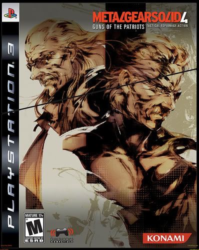
MGS4 AND resistance 2 for worst boxart of the year
the fanboyism is rampant with c4 yesyes
resistance maybe not the best but is definantly pretty awesome , and mgs4 is a contender for sure. gears 2 looks pretty epic but i sorta dont like fable 2 even with the cool monster thing on the bottom =]. Hmm honestly im gonna have to sayyyyyy oh dammit so hard =[ errr Little Big Planet IT HAS PRIMARY COLOURS!


So far this year: MGS4 LE and Ninja Gaiden 2
Rest of the year: Gears Of War 2
I like this one.
Sonir77
Yeah, me too.

Resistance 2 looks pretty cool, so does Fable 2. The mirror effect works quite well for both, because of Hale's "specialty" (as to not spoil it for those who don't know the story so far)
Gears 2 looks so very cliche for a shooter. the first one was way better. simple, yet very cool.
And I haven't seen WKC's yet, but I'd imagine it will be pretty good. We'll see! :D


Dead Space


Spore wins.
The box art has a nice variety of colors, has a good balance, and an excellent, eye-catching design.


I agree but only the Limited Edition boxart because it looks like this.[QUOTE="DragonFlyJ"]Metal Gear Solid 4Nintendo_Ownes7
That is amazing


This.
wood_duck
thats what inside the box.......
and this


The best of the best all on one cover? Hellz yeah!
Disgaea 3
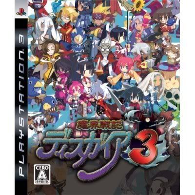
this one
AdrianWerner

My god is that incredibly lame. Sure, props for liking adventure games but hell that's just blatant advertising.
What does anything in that box art signify? Would you have known that the character on the cover is a vampire (Or is it? lol. Love how the game does the whole science vs myth thing but it's too obvious where they're going) without the words "Dracula" on it? Hell the red doesn't even call to mind blood or passion which is what red should stand for (especially with a vampire). It's like a stupid blockbuster poster you find in cinemas with a big picture of Tom Cruise's head. The only thing telling you abou the movie is the title itself.
1/10 (and it gets that mark coz it's an adventure game).
Seriously, the best boxart I've seen that actually does the job right is Banjo Kazooie: Nuts and Bolts

Here is a boxart that actually looks unique and explains what the game is about, which is what a real poster/boxart should do. If you guys want to see movie posters done right, look up John Alvin or Richard Amsel.
Sure, you can have something highly epic like this:

But it really adds up to nothing. What's the boxart telling you? There's a guy, and he's got a sword, and he probably has powers. That's it. Why is his face cropped? Probably coz it looks cool -- nothing else. I think the other version is more telling (the one with the image of the chained moon), and at least it looks like the image has ties with the title. This was just looks badass. How shallow.
But really, is the general concensus a telling tale that we're favouring sty1e over substance? No, I'm not saying sty1e as well as substance, because that's not what I'm really seeing here. It's seriously just a case of "Wow. That looks pretty. Yup, it's a winner". Using that sort of logic, it would be incredible box art if they put girl-on-girl action in the next WWE game.
EDIT: Wow that Motorstorm: Pacific Rift one looks really good. Another tell-tale piece of work that tells you what the game is all about.
It's just simple and effective cover design with very nice art. It just looks nice, which is more than I can say about the Banjo box. Not to mention....unique? is this the first platformer box art you've ever seen?My god is that incredibly lame. Sure, props for liking adventure games but hell that's just blatant advertising.
FrozenLiquid
Not to mention that you're comparing box arts to movie posters? Really? This doesn't make any sense at all.


[QUOTE="FrozenLiquid"]It's just simple and effective cover design with very nice art. It just looks nice, which is more than I can say about the Banjo boxMy god is that incredibly lame. Sure, props for liking adventure games but hell that's just blatant advertising.
AdrianWerner
I'm sure it's more than you can say about any game that's not on the PC, or has not been tainted by console development. It's AdrianWerner, right?
But really, it's not effective. How is it effective? It does absolutely nothing in terms of being box art. It's just a freakin' advertisement. You know, we're talking about "box art", not "box advertisement". If you can convince me how that design artistically reproduces the intentions the video game has, I'll stop hating on it. So far I can't see any of the aspects of that boxart working in harmony. Even the incredibly pathetic Halo 3 boxart used colour to redirect emotion.
All I can see it doing is trying to look "cool"
Why not compare box art to movie posters?

I'm sure it's more than you can say about any game that's not on the PC, or has not been tainted by console development. It's AdrianWerner, right? FrozenLiquid
Och.. come on.. we both know the only reason you bash that cover is because I like it :D
And there are many console games with great box arts this year, Banjo simply isn't one of them
But really, it's not effective. How is it effective?FrozenLiquid
It catches the eye, that's all it needs to do
That's all it needs. This is front art of a game cover, it doesn't need to be infomertial :)All I can see it doing is trying to look "cool"FrozenLiquid
because they have completely diffrent goals? Poster is all you will see, it needs to make you interested enough in the movie, tell you what it's about. Box art of a game just needs to grab your attention enough for you to pick up the box and read what's on the back side (you act like you forgot game boxes have back arts filled with info and screens).Why not compare box art to movie posters?
FrozenLiquid
And a box like Dracula definitly stands out on the shelf more than yet another cliche platformer box like Banjo, especialy since it's not even pretty. At least LBP has very nice art on it.

Please Log In to post.
Log in to comment