looks nice
Metroid Prime Official Box Art
This topic is locked from further discussion.
[QUOTE="Jrob2k8"][QUOTE="NorthlandMan"]looks pretty crapbryehngeocef
looks dumb-PS360-
Wow. :| The art itself is good, if you say otherwise, you're probably a fanboy.
The real problem is that the art really isn't that good at all. The layout is cluttered and the curruption logo plain stinks and is too small...the fan mock up looked a million times better.

bule electricity>>>purple/blue new box art :(
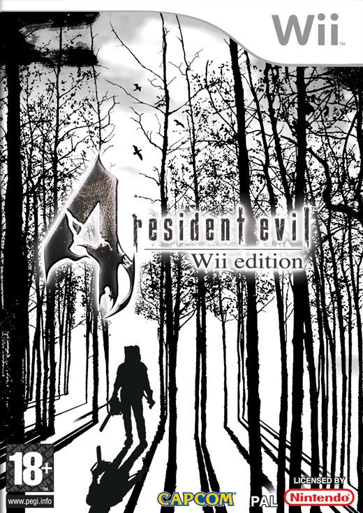
[QUOTE="NorthlandMan"]it just doesnt fit in with the standard wii aesthetic. It looks like it's aimed at 12 year olds, for a good example of a boxcover look at the euro Resi 4 boxcover. sublimesamusarmada
was that the monochrome one? 'cause if so...hell yeah :)
Yeah
minimalism at its finest

[QUOTE="samusarmada"][QUOTE="NorthlandMan"]it just doesnt fit in with the standard wii aesthetic. It looks like it's aimed at 12 year olds, for a good example of a boxcover look at the euro Resi 4 boxcover. sublimeNorthlandMan
was that the monochrome one? 'cause if so...hell yeah :)
Yeah
minimalism at its finest
Whoa! awesome! Why didn't they use this one?
This whole Light VS Dark thing is pretty tiresome. I hated Metriod Prime 2. Demetri_OS
There is a large difference between Light/Dark Aether and Corrupted/Uncorrupted Samus.
And I found Prime 2's setting to be quite refreshing. A good thing to do when you keep a series going for more than two decades.
[QUOTE="Demetri_OS"]This whole Light VS Dark thing is pretty tiresome. I hated Metriod Prime 2. foxhound_fox
There is a large difference between Light/Dark Aether and Corrupted/Uncorrupted Samus.
And I found Prime 2's setting to be quite refreshing. A good thing to do when you keep a series going for more than two decades.
The Dark World itself wasn't bad; I just didn't like the gameplay that was in it.
The Dark World itself wasn't bad; I just didn't like the gameplay that was in it.
-The-G-Man-
I actually like MP2, the panic you experienced in the dark world with your energy constantly depleting was something else.


Dang. I don't like it that much. I hope that the PAL boxart is going to be cooler.
It's too bright and...plain for my liking. I would like to see Dark Samus taking up the box or perhaps Kraid or Ridley. Or at least a better Samus picture.
[QUOTE="bryehngeocef"][QUOTE="Jrob2k8"][QUOTE="NorthlandMan"]looks pretty crapviralhunter
looks dumb-PS360-
Wow. :| The art itself is good, if you say otherwise, you're probably a fanboy.
The real problem is that the art really isn't that good at all. The layout is cluttered and the curruption logo plain stinks and is too small...the fan mock up looked a million times better.
bule electricity>>>purple/blue new box art :(
Ah, yes! That's more like it! Even a bit more "darker" and it would look even better. And replace the stringy things with Phazon. Blue wonderful, phazon.
[QUOTE="NorthlandMan"][QUOTE="samusarmada"][QUOTE="NorthlandMan"]it just doesnt fit in with the standard wii aesthetic. It looks like it's aimed at 12 year olds, for a good example of a boxcover look at the euro Resi 4 boxcover. sublimeJuggernaut140
was that the monochrome one? 'cause if so...hell yeah :)
Yeah
minimalism at its finest
Whoa! awesome! Why didn't they use this one?
I don't know, the European GC cover for RE4 is cool too.
looks horrible and ugly.
at least it matches the game itself.

looks horrible and ugly.
at least it matches the game itself.
tree-branch
Your replies are always the funniest to read... :lol:
Looks good. It's not standout, but well done.
Maybe I'm just bitter with what IGN posted as the Halo 3 boxart. I hope to god that's not it. Hopefully TeamXbox's one is the correct one. That looked awesome.

looks horrible and ugly.
at least it matches the game itself.
tree-branch
dude seriously, just leave system wars forever.
[QUOTE="tree-branch"]looks horrible and ugly.
at least it matches the game itself.
Fick1122
lol a Sonic avatar...he knows ALOT about quality games.
sonic is better then any game the wii has.
[QUOTE="Fick1122"][QUOTE="tree-branch"]looks horrible and ugly.
at least it matches the game itself.
tree-branch
lol a Sonic avatar...he knows ALOT about quality games.
sonic is better then any game the wii has.
Including Sonic and the Secret Rings?
That game was better than the craptastic Sonic the Hedgehog on 360/PS3.
That being said, most of the 3D Sonic games suck.
[QUOTE="Fick1122"][QUOTE="tree-branch"]looks horrible and ugly.
at least it matches the game itself.
tree-branch
lol a Sonic avatar...he knows ALOT about quality games.
sonic is better then any game the wii has.
Well... Sonic is on the Wii also. :?

6/10.
pretty uninspired, IMO.
[QUOTE="tree-branch"][QUOTE="Fick1122"][QUOTE="tree-branch"]looks horrible and ugly.
at least it matches the game itself.
Kaze_no_Mirai
lol a Sonic avatar...he knows ALOT about quality games.
sonic is better then any game the wii has.
Well... Sonic is on the Wii also. :?
:lol: i was gonna say that too.


Wow, and I didn't think Nintendo could top the original Metroid Prime's box in terms of flat out poor design.Timstuff
What are you talking about? metroid prime artwork has always been badass. Except this one.
It is the awesomeness of this new generation.briguyb13
a ugly cover box is the awsommes of this generation?
[QUOTE="briguyb13"]It is the awesomeness of this new generation.tree-branch
a ugly cover box is the awsommes of this generation?
You should stay in bed untill your foot in mouth disease is healed.Could have been better, but then again, your not playing the box.:Dsmokeydabear076can't disagree...but you'd think the artists would take more pride in it.
[QUOTE="smokeydabear076"]Could have been better, but then again, your not playing the box.:DDreams-Visionscan't disagree...but you'd think the artists would take more pride in it.
Especially since this is a major title.
[QUOTE="briguyb13"]It is the awesomeness of this new generation.tree-branch
a ugly cover box is the awsommes of this generation?
you have terrible grammar. In fact I think I'll look up some "awesome" sonic box art's
[QUOTE="tree-branch"][QUOTE="briguyb13"]It is the awesomeness of this new generation.Juggernaut140
a ugly cover box is the awsommes of this generation?
you have terrible grammar. In fact I think I'll look up some "awesome" sonic box art's
Irony FTL?
Please Log In to post.
Log in to comment