Avatar image for BrunoBRS
BrunoBRS

74156

Forum Posts

0

Wiki Points

0

Followers

Reviews: 6

User Lists: 0

#1 BrunoBRS
Member since 2005 • 74156 Posts

http://i242.photobucket.com/albums/ff51/brunobrs/awatingthegoldensun.png

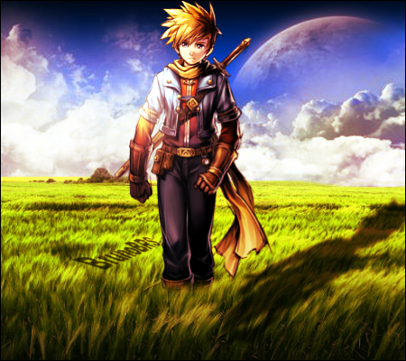
tried to do show light & shadow work, with some stock editing too *points at the grasson isaac's feet*

oh and i didn't do the BG... i wish i had the skill to do it, though >.>

V2 with and without text up. fixed: shadow opacity, shadow size, text (hopefully), grass in front of focal... i gotta say i prefer without the text, TBH.

 http://img28.imageshack.us/img28/8905/awatingthegoldensunv2tl.png

 http://img293.imageshack.us/img293/3051/awatingthegoldensunv2.png

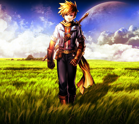
V3: gave up on the text, made the grass smaller, made the shadow more visible. most likely final version. suggestions/critiques still welcome, of course.

 http://i242.photobucket.com/albums/ff51/brunobrs/awatingthegoldensunv3.png

Avatar image for loggens
loggens

1441

Forum Posts

0

Wiki Points

0

Followers

Reviews: 5

User Lists: 0

#2 loggens
Member since 2007 • 1441 Posts

Looks bretty good but the shadow is in the wrong plase :D?

and maybe too big for the mesures of the backround..if u only move it more back the shadow is miles long lol:P

Avatar image for BrunoBRS
BrunoBRS

74156

Forum Posts

0

Wiki Points

0

Followers

Reviews: 6

User Lists: 0

#3 BrunoBRS
Member since 2005 • 74156 Posts

^now that you mention it, yeah, it's kinda long :P but it's supposed to be sunset, so i guess gigantic shadows (it looks about 10-15ft long to me) aren't exactly bad.

and why is the shadow in the wrong place?

and now that i look at it, i should've covered the shadow a little... which i didn't.

Avatar image for Dudersaper
Dudersaper

32952

Forum Posts

0

Wiki Points

0

Followers

Reviews: 38

User Lists: -3

#4 Dudersaper
Member since 2007 • 32952 Posts
It's my fave by you, just fix the shadow, and the text is really a down point.
Avatar image for BrunoBRS
BrunoBRS

74156

Forum Posts

0

Wiki Points

0

Followers

Reviews: 6

User Lists: 0

#5 BrunoBRS
Member since 2005 • 74156 Posts

It's my fave by you, just fix the shadow, and the text is really a down point.Dudersaper
i just added the text for the heck of it... should i make it smaller if i want to keep it?

by fixing the shadows you mean transparency, hide it behind the grass (which i'll do anyway) or making smaller?

BTW both shadows are going to be more transparent on the fixed version (stupid me didn't think of the consequences of merging +overlay)

Avatar image for BrunoBRS
BrunoBRS

74156

Forum Posts

0

Wiki Points

0

Followers

Reviews: 6

User Lists: 0

#6 BrunoBRS
Member since 2005 • 74156 Posts
V2 is up.
Avatar image for Mr_Jenkins
Mr_Jenkins

14116

Forum Posts

0

Wiki Points

0

Followers

Reviews: 0

User Lists: 0

#7 Mr_Jenkins
Member since 2009 • 14116 Posts

Wow Bruno, that's really beautiful. :D  I love the second version sans text it's wonderful.  Wouldn't change a thing. ;)


Avatar image for Dudersaper
Dudersaper

32952

Forum Posts

0

Wiki Points

0

Followers

Reviews: 38

User Lists: -3

#8 Dudersaper
Member since 2007 • 32952 Posts

You know what would be a good idea. the text being his shadow.

Instead of making a shadow, put in the text like you did at an angle and blur it a bit, may look good.

Avatar image for BrunoBRS
BrunoBRS

74156

Forum Posts

0

Wiki Points

0

Followers

Reviews: 6

User Lists: 0

#9 BrunoBRS
Member since 2005 • 74156 Posts

You know what would be a good idea. the text being his shadow.

Instead of making a shadow, put in the text like you did at an angle and blur it a bit, may look good.

Dudersaper
i know what you mean but... i'm not making an ad, i don't really want the shadows to stand out that much. it's more "looking more believable" than an effect i really want to be the main point. i can try, though. shouldn't take 5 minutes before i upload it. EDIT: i tried, and two issues happen with it: first, the shadow starts at his feet, so part of the text is hidden. second, the text doesn't "connect" with the feet, the shadow effect doesn't work really well.


@marriu-- i mean, jenkins - thanks :D i'll still change it a bit (maybe make the grass not as tall)


EDIT: V3 (most likely final) up

Avatar image for Flamesingh1
Flamesingh1

5362

Forum Posts

0

Wiki Points

0

Followers

Reviews: 0

User Lists: 0

#10 Flamesingh1
Member since 2007 • 5362 Posts
Lighting still doesn't make much sense. His shadow would suggest that the sun is in the right and to the front of Isaac, but the grass and various parts of Isaac suggest otherwise. Normally i wouldn't nitpick the lighting so much , but the lighting is extremely important in this piece . So i think i'm allowed to nitpick :P
Avatar image for loggens
loggens

1441

Forum Posts

0

Wiki Points

0

Followers

Reviews: 5

User Lists: 0

#11 loggens
Member since 2007 • 1441 Posts
V2 is the best:)
Avatar image for BrunoBRS
BrunoBRS

74156

Forum Posts

0

Wiki Points

0

Followers

Reviews: 6

User Lists: 0

#12 BrunoBRS
Member since 2005 • 74156 Posts
Lighting still doesn't make much sense. His shadow would suggest that the sun is in the right and to the front of Isaac, but the grass and various parts of Isaac suggest otherwise. Normally i wouldn't nitpick the lighting so much , but the lighting is extremely important in this piece . So i think i'm allowed to nitpick :PFlamesingh1
i'm trying to make the lighting come from the side, but behind the viewer's point (so behind you, to the left), with little success, as you can see :P
Avatar image for Jas0n94
Jas0n94

3990

Forum Posts

0

Wiki Points

0

Followers

Reviews: 15

User Lists: 0

#13 Jas0n94
Member since 2008 • 3990 Posts

All the elements on this piece look like the lighting source is on OUR left side looking at it. I repeat: on the SIDE, not behind us :P

btw, this is your best work so far and you have combined the render with the stock very well. Keep it up ;)

EDIT: V2 textless is the best

Avatar image for BrunoBRS
BrunoBRS

74156

Forum Posts

0

Wiki Points

0

Followers

Reviews: 6

User Lists: 0

#14 BrunoBRS
Member since 2005 • 74156 Posts

All the elements on this piece look like the lighting source is on OUR left side looking at it. I repeat: on the SIDE, not behind us :P

btw, this is your best work so far and you have combined the render with the stock very well. Keep it up ;)

Jas0n94

well our side means in front to the left for the render, which is what i've been trying to do. i just don't think it's perfected :P

and thanks :D