
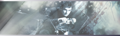
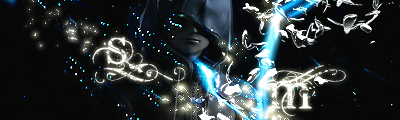
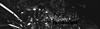
*sees your new sig* AAAGH!!!! MY EYES!!!! TOO BRIGHT TOO BRIGHT!!!!
seriously, it's hurting my eyes :P
This topic is locked from further discussion.


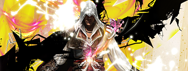
Might as well get my feet wet, :P I just noticed everything I used for a pic is in the middle, :lol:So the main things you should work on are contrast, decrease the opacity of the gradient maps, or in some casas just don't use them if not needed.
Contrast is bad, carefull when using gradient maps, they can burn the colours too much.
Never corner text, it will always look bad in a sig, and it takes aways from both focal and flow.
Lacks flow, creating flow is harder when using facing front renders in a centered focal.
Text is bad, try using pretty but simple fonts.
Same problem as the other with the contrast.
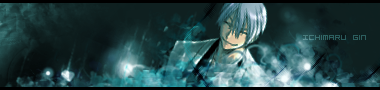
Text in corner = bad
Contrast is messed up. Careful with those gradient maps.
Colour balance between each side is too off.
Big focal in the center, which ends up unnapealing most times.
You should of probably tried pulling the flow in the other direction
The text in corner again.
Contrast, it's way too dark, and the focal got messed up due to that.
Huge focal in the center, makes the flow bad and unnapealing.
Text in corner,
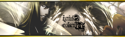
Colmillios
Text, you should look for some text tutorials at deviantart, I found a tut there that helped alot with font chosing/text placement.
Try to use less facing-front renders, and make the focals smaller, so you have more work space with the effects and flow.
Your sigs are pretty much based on what people call C4D spam, you should look up some tuts for new tecniques.
Rest (Rank choice) is with Dax.
might as well give it a shot


Your main things to work on are focal placement and creating flow, imo.might as well give it a shot
Text is hard to read and pretty big, which takes away from focal a bit.
Colours are off and unnapealing.
The flow is all over the place, needs more organization.
The sig size is pretty big for a small focal like that.
No focal point, even with abstract sigs it needs a focal point, or else people won't know where to look at, their eyes will be all over the place, making it unnapealing.
Colours are bad, try picking colours that go well together.
Kinda LQ
The blur needs work, you blurred it too much, then the blur goes to a sudden stop, so the depth got messed up.
Clipping mas isn't doing much there.
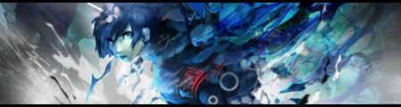
This is my fave btw. Everything pretty much well done, but the colour/contrast needs tuning, needs more effects overall. The focal can use a sharpen.
The black/blue smudge on the top right takes away focal a bit.
Text is not bad, but could still be better.
Lighting is off.
dragonfly110
Rest is to dax.
i really don't get the point of the second one :|BrunoBRS
art doesnt need a point, even if its bad art.
and kk thanks duder :D
i meant it looks more than unfinished, looks like you gave up on the background halfway through and forgot to do the rest.BrunoBRS
I honestly have 0 clue what your talking about, yea it has issues, but its not like there are huge blank gaps in the design :?
We don't care -.- This is a ranking thread not share your opinion thread, stop spamming, PM him if you want to give opinions on what people put in here.
Edit:
Unless your ranking, which I doubt it.
I guess I'll be ranked.


 .
.
You can be ranked as many times as you want.
It just won't be me doing it.
Because 1- I don't even rate anymore 2- I don't like rating better works than mine :P
Alright guys those of you who know have probably seen these but meh :P i'll try anyways
Colours are great, but it looks more like a WIP than a finished work, bring the text higher and closer to focal and focus on adding some effects, it would look really good with some more work.
Not digging the text in corner.
Bit too dark
You could use the burn/dodge tool to add depth
Monotoned, lacks depth.
I really don0t have much to say, other than the focal being mostly the effects and not the dude.
Not much to say either, just take away the gradient made you set on it. Cuz the colours got iffy.
Go for it
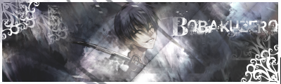
Plartus
I guess I'll be ranked.
Lacks depth, and the duplicates don't look IN the sig, they look ON it.
Drop shadow ruins it, the cuts are pxelated, can't really say anything else
*Grim sig*
Same as above
*Birdie sig*
The drop shadow ruins it.
Not much else I can point out
The whole thing lacks depth, is LQ, text is bad. colours of the effects and eyes don't fit.
The box idea didn't work, maybe it you create shadows with the burn tool.
And don't center your sigs next time you get rated ;_; was a pain to fix
Oyashiro1000
It's a bit messy, loks of diferent colours and effects going around, and the render imo doesn't fit.
I love this piece, just not much love for the white in the back on the left, rest is awesome.
That random splat next to his face looks like... :|
Nice colours but you could work with some lighting
Focal is hard to get at first sight, lots of stuff distracting it.
I don't know if it's just me but the focal looks disproportionally resized, and it has the floating head syndrome.
Lacks some lighting, try adding some orange shades/lights around the face.
xzemnes567
Go ahead dax.
And Tekno you can post your stuff :P


I don't know why this is making me so nervous, but here are my five works. :D Excited for my rating!
Please Log In to post.


 And since I can't get my sig for the Deathmatch critiqued yet (:() I'll throw this in:
Log in to comment