Fleeboi's forum posts
I'd like to see a second announced.
Where would this one be set though? I'm thinking a closed off suburb where you enter houses etc saving people would be sweet.
Co-Op's a must aswell imo
It's not BY MS, it's a show called GamerTV in the UK.[QUOTE="Fleeboi"][QUOTE="hazbazz"]You do know the M in MSN stands for Microsoft, right?CarlosPontinas
Gamer TV has Sony bias. Did you see the way they did a whole PS3 special, trying to make Mototstorm look good? At the en do f he show the guy actually says "go and buy a PS3".
Yep, some times I wonder who writes this show, it seems to flip flop on what's the greatest console every week.You do know the M in MSN stands for Microsoft, right?hazbazzIt's not BY MS, it's a show called GamerTV in the UK.
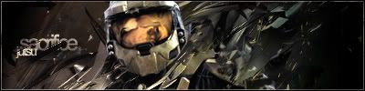
Made this earlier today. Rate please. :)
Bottom right is the light source. Instead of it being off the sig its in the area so to show this it needs to be over exposed. Lightning takes priority over contrast sense contrast is a way to show lighting.
If that is your light source then you need more contrast as you've shown how close the light source is to the render. Unless of course, the light source isn't bright, in either case, the sig still looks bland.[QUOTE="Greatgone12"][QUOTE="Bobakuzero"][QUOTE="Greatgone12"][QUOTE="Shadowlinex"]I don't think the color choice is the best, but it's a good sig.
A new sig for some zelda fans :P
Shadowlinex

Whao's I's like. For midna I would expect more of a barker themed color.. I dont know why. I dont know why. :lol: Very nice. The render should also be slightly more exposed, in my opinion. I also think that a darker shade of green, and some subtle blue and red would make it feel "mystic."
Went ahead and did an alternate coloring, while trying to keep a certain level of luminosity. There was red in blue in the original, but might be a little to subtle.

Log in to comment