7/10.rate this...
navigata
Nice but it would be much better without the diagonal lines.
This topic is locked from further discussion.

Please rate these sigs I made!iArab
Those are pretty good, I give you a 8.8.
two new sigs and an avatar. i know, i spoil you.Calpalg
I'd give it a 3.5. It just doesn't look good. It looks very messy and sloppily done. You might want to tryplanning out what you're going to dobefore making a sig. Also, work with lighting, depth, and color composition. Hope that helps.
Ty
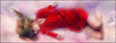
rate this...
navigata
I like it. I'll give it a 5.5/10 now, but I'd give it a 6.5/10 without the scan lines. Also, make the render blend in a bit more and try using more dramtic lighting to give it a good focal. A gradiant map on low opacity might be a good way to make the colors clash less.
[QUOTE="Calpalg"]two new sigs and an avatar. i know, i spoil you.champion_tyler
I'd give it a 3.5. It just doesn't look good. It looks very messy and sloppily done. You might want to tryplanning out what you're going to dobefore making a sig. Also, work with lighting, depth, and color composition. Hope that helps.
jealousy is a terrible thing you know
[QUOTE="champion_tyler"][QUOTE="Calpalg"]two new sigs and an avatar. i know, i spoil you.Calpalg
I'd give it a 3.5. It just doesn't look good. It looks very messy and sloppily done. You might want to try planning out what you're going to do before making a sig. Also, work with lighting, depth, and color composition. Hope that helps.
jealousy is a terrible thing you know
Unbelievable. I can't give you an honest critique about your work without you getting upset? I didn't say anything rude man. Trust me, I am not jealous....and I'm pretty sure you know that. You obviously need someone else's opinion. I'm sorry, but i really think it looks thrown together. I only gave you a 3.5 because it looked different and you didn't use anything you didn't make yourself (at least that's what it looks like). But it really should have been lower.
rate this...
navigata
This is really nice. Maybe just turn down the opacity of the scan lines a bit.
Can I get a rating, tryin out a tut:
csimonma
I really like this sig too. I think I've seen someone use this tut before.:lol:
Please rate these sigs I made!
iArab
Nice sigs. First and third are best. I don't really care for the midlle one.:?
[QUOTE="iArab"]Thanks for the ratings. :)_Tobli_
5/10 (sorry i'm strict)
It does look good. I think it lacks definition, the lighting is a bit off, and i don't like the colour flow in the background.
No prob, I made these like two years ago. I have never been that good at photoshop, it was just a hobby of mine. Thanks for the honest review. :)To the poster above, nice sig. I like the font, pic, and sig as a whole. I would give it a 7/10 for the overall look.
[QUOTE="_Tobli_"][QUOTE="iArab"]Thanks for the ratings. :)iArab
5/10 (sorry i'm strict)
It does look good. I think it lacks definition, the lighting is a bit off, and i don't like the colour flow in the background.
No prob, I made these like two years ago. I have never been that good at photoshop, it was just a hobby of mine. Thanks for the honest review. :)To the poster above, nice sig. I like the font, pic, and sig as a whole. I would give it a 7/10 for the overall look.
Thanks I love yours I would give it a 9.0/10 since I love the blurried background and the stunning blue behind the render, it makes some kinda cool depth of field effect.
[QUOTE="champion_tyler"][QUOTE="Calpalg"]two new sigs and an avatar. i know, i spoil you.Calpalg
I'd give it a 3.5. It just doesn't look good. It looks very messy and sloppily done. You might want to tryplanning out what you're going to dobefore making a sig. Also, work with lighting, depth, and color composition. Hope that helps.
jealousy is a terrible thing you know
Who wouldn't be jealous of a Llama?
Seriously though, I think he was slightly harsh on the sig (not the llama one), but it's not that great. 5/10, it lacks depth, with better execution it could be a lot better IMO
[QUOTE="Calpalg"][QUOTE="champion_tyler"][QUOTE="Calpalg"]two new sigs and an avatar. i know, i spoil you.Kritical_Strike
I'd give it a 3.5. It just doesn't look good. It looks very messy and sloppily done. You might want to tryplanning out what you're going to dobefore making a sig. Also, work with lighting, depth, and color composition. Hope that helps.
jealousy is a terrible thing you know
Who wouldn't be jealous of a Llama?
Seriously though, I think he was slightly harsh on the sig (not the llama one), but it's not that great. 5/10, it lacks depth, with better execution it could be a lot better IMO
I was slightly harsh on the sig, but i am like that for everyone. I pretty much never give anything a rating over 8/10. It has absolutely nothing to do with jelousy, Calpalg. Even the thought of that is rediculous. I'm sorry that you didn't like my critique, but I wouldn't have given it if you didn't ask for it.
[QUOTE="Kritical_Strike"][QUOTE="Calpalg"][QUOTE="champion_tyler"][QUOTE="Calpalg"]two new sigs and an avatar. i know, i spoil you.champion_tyler
I'd give it a 3.5. It just doesn't look good. It looks very messy and sloppily done. You might want to tryplanning out what you're going to dobefore making a sig. Also, work with lighting, depth, and color composition. Hope that helps.
jealousy is a terrible thing you know
Who wouldn't be jealous of a Llama?
Seriously though, I think he was slightly harsh on the sig (not the llama one), but it's not that great. 5/10, it lacks depth, with better execution it could be a lot better IMO
I was slightly harsh on the sig, but i am like that for everyone. I pretty much never give anything a rating over 8/10. It has absolutely nothing to do with jelousy, Calpalg. Even the thought of that is rediculous. I'm sorry that you didn't like my critique, but I wouldn't have given it if you didn't ask for it.
Why dont you just give comments on how to make the stuff better..? Ratings only seem to make people blind.... They will love you if you give it higher than a 7 and below that you suck ass.... But if you go step by step and tell them how you would make it better it might actually help people.... And that's awesome because most of the time you made a new friend who could help you out in the future... =^__^=Why dont you just give comments on how to make the stuff better..? Ratings only seem to make people blind.... They will love you if you give it higher than a 7 and below that you suck ass.... But if you go step by step and tell them how you would make it better it might actually help people.... And that's awesome because most of the time you made a new friend who could help you out in the future... =^__^=Alright then mistar.. time to help me out.. i wanna be as good as you are with sigs.. :P
enormousaxie
[QUOTE="enormousaxie"]Why dont you just give comments on how to make the stuff better..? Ratings only seem to make people blind.... They will love you if you give it higher than a 7 and below that you suck ass.... But if you go step by step and tell them how you would make it better it might actually help people.... And that's awesome because most of the time you made a new friend who could help you out in the future... =^__^=Alright then mistar.. time to help me out.. i wanna be as good as you are with sigs.. :P
TimothyGibbons
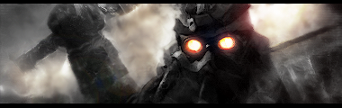
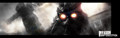
I hardly make sigs silly timmie... but I'll help you out.. I'm looking really closely to my screen and I like the little details you put into it at the sides... so that's a good thing... What I dont really like is the contrast between the face and the red glowing eyes... I know that it has to be present but the eyes are slightly oversharpened... If you still have the PSD you could use the leveling tool to fight the contrast.... but other than that I have to say good job... I call it ''5 minute photoshop art'' by Axel.

I hardly make sigs silly timmie... but I'll help you out.. I'm looking really closely to my screen and I like the little details you put into it at the sides... so that's a good thing... What I dont really like is the contrast between the face and the red glowing eyes... I know that it has to be present but the eyes are slightly oversharpened... If you still have the PSD you could use the leveling tool to fight the contrast.... but other than that I have to say good job... enormousaxieI know it's kinda overcontrasted.. but i lieked that.. Thanks anyways pamo.. It actually looks kinda crappeh on my own monitor...


Just combined a couple of stocks than edited... I don't remember the last time I had made a dark sig...>___>
Just becuase....:

Hey, im here to request an avatar, and maybe a Sig to go with it?
Im not much of a computer-artist, so yeah....
I was hoping for something "Halo-Related", that had my user (BelatedNoob) on both, the sig and the matching avatar.
Thanks! :)
FromScum, can you make me a sig?
I was a sig that has 2 Rappers and 2 Sports People..can you do it?
Jay-Z{Rapper} Beyonce{Rapper/GIRL RAPPER lol} Kobe Bryant{Sports} Kevin Garnett{Sports}
Alright then mistar.. time to help me out.. i wanna be as good as you are with sigs.. :P I hardly make sigs silly timmie... but I'll help you out.. I'm looking really closely to my screen and I like the little details you put into it at the sides... so that's a good thing... What I dont really like is the contrast between the face and the red glowing eyes... I know that it has to be present but the eyes are slightly oversharpened... If you still have the PSD you could use the leveling tool to fight the contrast.... but other than that I have to say good job...[QUOTE="TimothyGibbons"][QUOTE="enormousaxie"]Why dont you just give comments on how to make the stuff better..? Ratings only seem to make people blind.... They will love you if you give it higher than a 7 and below that you suck ass.... But if you go step by step and tell them how you would make it better it might actually help people.... And that's awesome because most of the time you made a new friend who could help you out in the future... =^__^=
enormousaxie
I don't agree with this advice at all, the contrast between the eyes and the rest of the sig is very good imo. The eyes are only slightly oversharpened, it's nothing big. What you should do, is strengthen the light coming from behind the Helgast, that would add more depth. Other than that it's a very good attempt.

Hey everybody :D rate my new Christmas banner in my profile...barely put it up the other day,I think it looks great,it turned out pretty much the way I wanted.Rate my sig too if ya want...its not new but I havent been on the forums lately so not many have seen it.
I don't agree with this advice at all, the contrast between the eyes and the rest of the sig is very good imo. The eyes are only slightly oversharpened, it's nothing big. What you should do, is strengthen the light coming from behind the Helgast, that would add more depth. Other than that it's a very good attempt. Kritical_Strike
 I added text too.. but nvm that.. i know it sucks :P
 Would anyone like to make a No One Lives Forever (PC) sig? Or NOLF/Crysis?
Anyone using GIMP? I was playing with it for the first time last night, and came up with this:

I could have gone with the campy flora theme of NOLF 1, but instead chose the darker colors of NOLF 2. H.A.R.M.'s sub is in the background (not easily visible).
I definitely need to spend some more time with the program though.
I was using the alpha channel method for transparency, and the character (Cate Archer) image keeps coming up "washed out". If possible, I'm wondering if I need to cut/crop around her image instead and then paste it on the background instead.
The other problem I was having is that no matter what I did, I wasn't able to push the crosshair layer underneath the character and title layers, it seemed to always "float" to the top and thus overlap those images.
Anyway, I'd definitely be interested in what you guys can come up with :) Or any tips!
Please Log In to post.


Log in to comment