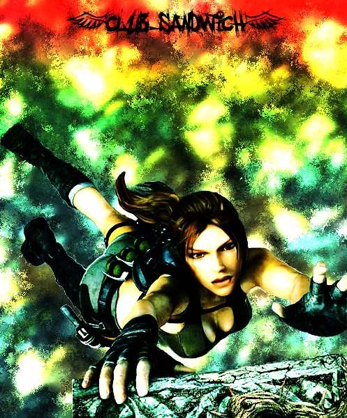
[QUOTE="nickyb628"]HEY. Could someone put santa hats on the guys in my sig please? Little Brother needs them. Their bald heads are cold :P.spyke412
Here you go.
Hahaha, you're the man :). Thank you!
This topic is locked from further discussion.
[QUOTE="spyke412"][QUOTE="nickyb628"]HEY. Could someone put santa hats on the guys in my sig please? Little Brother needs them. Their bald heads are cold :P.nickyb628
Here you go.
Hahaha, you're the man :). Thank you!
No problem. It only took me a couple of minutes.
[QUOTE="nickyb628"][QUOTE="spyke412"][QUOTE="nickyb628"]HEY. Could someone put santa hats on the guys in my sig please? Little Brother needs them. Their bald heads are cold :P.spyke412
Here you go.
Hahaha, you're the man :). Thank you!
No problem. It only took me a couple of minutes.
What program did you use? Photo Shop? GIMP?
[QUOTE="spyke412"][QUOTE="nickyb628"][QUOTE="spyke412"][QUOTE="nickyb628"]HEY. Could someone put santa hats on the guys in my sig please? Little Brother needs them. Their bald heads are cold :P.nickyb628
Here you go.
Hahaha, you're the man :). Thank you!
No problem. It only took me a couple of minutes.
What program did you use? Photo Shop? GIMP?
I use Gimp.
[QUOTE="nickyb628"][QUOTE="spyke412"][QUOTE="nickyb628"][QUOTE="spyke412"][QUOTE="nickyb628"]HEY. Could someone put santa hats on the guys in my sig please? Little Brother needs them. Their bald heads are cold :P.spyke412
Here you go.
Hahaha, you're the man :). Thank you!
No problem. It only took me a couple of minutes.
What program did you use? Photo Shop? GIMP?
I use Gimp.
How do you resize images. I'm such a newb when it comes to using GIMP.
I changed my Jamie pic, thoughts?Mythbuster4ever
He looks very serious. Awesome :D

Rate this new sig i made plz:D
Should i change anything? Is there something messed up that i don't see? I wanted to go for a "cosmosy" feel.Linkthedueler
It has no depth. My only suggestion is to delete it and try again.
I use Gimp.
spyke412
It shows. :(
Rate this new sig i made plz:DI like it, has a very friendly feel. Just work on your depth a little bit and add some substance to the left. Good job.
Should i change anything? Is there something messed up that i don't see? I wanted to go for a "cosmosy" feel.Linkthedueler
[QUOTE="spyke412"]I use Gimp.
ConformestClone
It shows. :(
Someones a dick.[QUOTE="Linkthedueler"]Rate this new sig i made plz:D
Should i change anything? Is there something messed up that i don't see? I wanted to go for a "cosmosy" feel.Guiltfeeder566
I like it, has a very friendly feel. Just work on your depth a little bit and add some substance to the left. Good job.
Thanks:DI did feel like adding something over there but i just didn't know what to add (i tried a heartless symbol but that looked bad) so i just decided to post it like this and see what to do. Thanks again:D
[QUOTE="spyke412"]I use Gimp.
ConformestClone
It shows. :(
Umm...The only thing I've posted in this thread recently was a sig already made (not by me) that I simply rendered a santa hat and pasted it on the guys' heads. And there's also my current sig. So please, dude, don't come in this thread and bash people. Make some constructive criticism on people's sigs instead of "delete it and try again." Seriously...

I've been using my current sig for awhile now. I didn't create the original image, just cropped out the parts you see and added my name on the wall. (pretty good photoshopping I do say... actually I lie, I use Illustrator)
Any thoughts or ratings?
[QUOTE="Linkthedueler"]Rate this new sig i made plz:D
Should i change anything? Is there something messed up that i don't see? I wanted to go for a "cosmosy" feel.ConformestClone
It has no depth. My only suggestion is to delete it and try again.
don't listen to this guy, it looks good (:rate this (: I know it's big and no, it's not a sig.
[QUOTE="spyke412"]I use Gimp.
ConformestClone
It shows. :(
I miss reading your comments and then the replies of the angry receiver....:([QUOTE="Linkthedueler"]Rate this new sig i made plz:D
Should i change anything? Is there something messed up that i don't see? I wanted to go for a "cosmosy" feel.ConformestClone
It has no depth. My only suggestion is to delete it and try again.
Or.. you could add some depth by blurring the background.. and sharpening the foreground.. >___>
I like how this one turned out...
Also, more stuff:


I like how this one turned out...
Also, more stuff:
slorg_king
I'm gonna be honest here, I don't see anything special, technically or artistically. You really need to expand on your unique style slorg :(
[QUOTE="ConformestClone"][QUOTE="Linkthedueler"]Rate this new sig i made plz:D
Should i change anything? Is there something messed up that i don't see? I wanted to go for a "cosmosy" feel.TimothyGibbons
It has no depth. My only suggestion is to delete it and try again.
Or.. you could add some depth by blurring the background.. and sharpening the foreground.. >___>And maybe some contrast. You know less mono-tone colors.
I am sorry to intrude, but I am still somewhat new to photoshop and I have been practicing making a few sigs. I would really appreciate it if you could tell me what I am doing right or wrong. I eventually want to get to the caliber that most of yall are at, but everyone has to start out being a noob, right :P.Not a bad start. Avoid huge text like that, it takes up more then half the sig :P. Mess around with some C4Ds,filters, and read a few tuts to learn the ropes. Here is a good place to start. You need to register, but it has alot of great renders and a fantastic community.
I would really appreciate any feedback I can get. I know that they all look somewhat the same, but the grunge look is the only thing that I can do half-way decent at the moment.The_Fat_Gamer
Not a bad start. Avoid huge text like that, it takes up more then half the sig :P. Mess around with some C4Ds,filters, and read a few tuts to learn the ropes. Here is a good place to start. You need to register, but it has alot of great renders and a fantastic community. Guiltfeeder566
Will check it out :). Thanks.
I do agree the text is somewhat big, but everytime I try to do small text, it just doesn't feel right. I guess I will have to play around with it even more.
What do you recommend...>__> I'm a little confused...>__>I'm gonna be honest here, I don't see anything special, technically or artistically. You really need to expand on your unique style slorg :(
Kritical_Strike
I like how this one turned out...
Also, more stuff:
slorg_king
I'm no PS expert but i like those a lot especially the one with the glasses. I find them really artistic but what do i know?
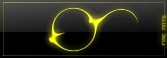
[QUOTE="Fire_Ants"]Comments :D
1)
or
2)
Fire_Ants
Somebody still needs to comment :(
Like the yellow ones, has a sexy simplistic style.
Hi...I've made a Christmas Sig...watcha think???...please no flaming...:)Gotta love those movie lens flares. :P I like the circle effect in the bottom corner too, but not the black parts in all corners. I'd give it a... mince-pie/10
(edit-the sig is below :P)Greenwhitegreen

my favorite sig....
I think that might actually be cooler than you.:|my favorite sig....
Omni-Slash
I think that might actually be cooler than you.:|*world implodes*...
slorg_king
Okay.....so.....I made a wallpaper. I would love some critique on it. I actually posted a screenshot of my desktop instead of just the wallpaper so it could have the icons too, which match it. It didn't quite turn out as well as I hoped. I mean, I think it looks fine, but I don't really like the focal, and I think i wanted more of a blue spash than a blue scribling-type deal. But since I made it I don't think I should be the one to judge it. So....yeah....critique the wallpaper....and the icons too if you want. The icons should be distinguishable. They are only on the top and bottom edges. I know it is fairly simple...but I wanted to make a simple wallpaper.
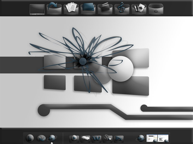
Link to full size image
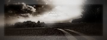
That's awesome. I love the border, and the lighting, and the scan lines, and pretty much everything about it. 9/10 :PRate?
Fire_Ants
[QUOTE="KillaHalo2o9"]Can you rate my sig?Fire_Ants
6/10...
kinda looks like all you did to it was add a border and text...
Yea, but its really how my real character looks in Halo 3. :)
Please Log In to post.

Log in to comment