Sig/Avay/Banner...Rate/Request/Discussion Thread.... "Dyn-o-mite" Edit
This topic is locked from further discussion.
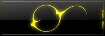
Rate?
Fire_Ants
That sig is heavenly orgasmic 9/10


[QUOTE="the_greenzero"]Rate my sig plz.Djammal86
6/10
rate my sig


 Looks good. I like the colours and overall design, but the text looks out of place. 7/10
 I know, I have such artistic talents. :P
Sorry, mods, I forgot about this sticky. Anywho, who likes my signature?
dreDREb13
Thats the third sig i've seen with round edges and a shadow. I like it espicially b/c of the round edges and shwadow lol. But the whole sig is really cool
double post :oops:
Rate these, not much but i made it with paint.net. They are all smoky sigs as you can see here is
1.
2.
3. is just my dunder mifflin sig
rate my banner


Could somebody make this into an 80x80 avatar while keeping the animation? Thanks.

rate my banner
banedonoes
just realized my post wasn't here: i think that you should get rid of the 6th render from the right and try to find a way to merge or blend all of those renders togheter because it might look cool if you do that. right now it looks jumbled and some renders have bad quality

http://img261.imageshack.us/my.php?image=seizureobokymr5.gifCould somebody make this into an 80x80 avatar while keeping the animation? Thanks.
THE_DRUGGIE
I can add a border if you would like.
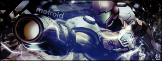
okay, been making sigs for like 2 years...i guess i'll show you guys my favorite stuff, which could be my most talented stuff too, rate please :P
http://i113.photobucket.com/albums/n234/LtOreo/Favs/MetroidSig.png
probably my favorite
http://i113.photobucket.com/albums/n234/LtOreo/Favs/CaptianAmericaSpriteB.png
rate please :D
[QUOTE="THE_DRUGGIE"]http://img261.imageshack.us/my.php?image=seizureobokymr5.gifCould somebody make this into an 80x80 avatar while keeping the animation? Thanks.
Oborozukiyo
I can add a border if you would like.
Nah, it's great as is. Thanks.
My sig is the best!
I know, I have such artistic talents. :P-_Jeremy_-
You're avatar and sig are 10/10!!!!! YES I'M BEING BIASED, BUT WHO CARES!?!?
A signature to fit the mood of my avatar would do nicely. The logo is from black metal band Mayhems latest release (Ordo ad Chao, meaning Order to Chaos). A dark, occult theme would do nicely. Keep it close ot the avatar though. Would be appreciated :) If you finish do it, or think of doing it, send a pm my way as my memory keeps failing me of requests I make :PVfanekI'll do it.
http://img182.imageshack.us/img182/3204/sigub2.png
also I've got a new banner.
since it sometimes takes a while to load so you can see it, I'll post it here.
http://img293.imageshack.us/img293/765/bannerdm8.png
plz rate.
[QUOTE="the_greenzero"]Rate my sig plz.memorials
Interpol's bad. You get a 2.
i made the one in my sig last night, rate please :DltoreoUseless filter(s) put onto the guitar,sloppy backround. Useless,not blended well "e". Text is out of place.
1
1.It's not that bad I agree, it's nothing amazing, but that doesn't meen his intention was for it to be amazing. 5-ish.
2. nothiong is useless. I think it looks fine. Is there anything wrong with it being sloppy? maybe if you listened to rock, or at least some kind of music you'd get it. it's definataly not worth a one.
You need to realize that nobady likes someone who intentionaly gives out crappy rattings. And you should remember thatthere could be more than one meaning to a picture,and that it doesn't have to be neat. Not much to expect from someone with 49 posts though. why don't you post some of your work?
9.2/10 woah,that's really nice.Rate?
Fire_Ants
Love the border.
Please Log In to post.
Log in to comment