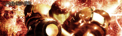
New sig. Rate away.
This topic is locked from further discussion.
Been a while since I made a siggy
Rate plz
Kritical_Strike
Cool dude i like how the redone turned out.


Yay...
May i ask you what font that is?
Please Rate, the Big W is only there to stop people stealing it
Whicker89
Cool dude i like how the redone turned out.
CoolSkAGuy
Thanks man I put everybodies advice to good use :D
Yay...
slorg_king
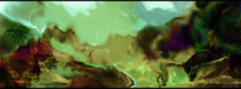
The forth one down is the best. I really like it, some of your best work IMO, but if I was to critique it I'd suggest you add a little bit of extra lighting on the bottom right side (next to those tentacle things).
Can someone make me a banner with my name and these pictures and whoever does it thank you in advance.
http://i188.photobucket.com/albums/z58/macrules_640/30098_L.jpg
http://i188.photobucket.com/albums/z58/macrules_640/banner.jpg
http://i188.photobucket.com/albums/z58/macrules_640/banner_residentevil4.jpg
http://i188.photobucket.com/albums/z58/macrules_640/banner_small.jpg
http://i188.photobucket.com/albums/z58/macrules_640/mob159_1145011574.jpg
http://i188.photobucket.com/albums/z58/macrules_640/thelegendofzelda014fl.jpg
slorg_kingLast one doesn't show up for me... I don't know I'm thinking blue/green will make it look nicer :P
 Some bits were hand brushed... the most of it isn't.
 Sharpened and some new colors.


HEREs My First EVER SIG
I know its not that great but it my first time using Photoshop
Please r/c
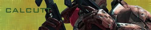
Calcutt
Not bad esp for your first time...i sucked HARD my first time. 8/10. I just don'tlike the text...looks kinda outa place. But i like the backround a lot.

What exactly kind of program or whatever do you use to make a sig?zman32Photoshop is used by most.
[QUOTE="zman32"]What exactly kind of program or whatever do you use to make a sig?SolidSnake35Photoshop is used by most.
Although the free alternative is a program called 'TheGimp'
Sharpened and some new colors.
slorg_king
An improvement, Slorg, go with the one on top.
anyone need a userbar? I make exceptional userbars. Anyone? :)_LiquidFlame_
you asked.
how about one called Gimp User, and one called Gaming Unison Union. you have creative freedom, thanks
Rate my current sigcanana
8.7
Original:


Amazing as always Axel.Sim_geniusthanks man... ^__^ working on a poster for an art tour...
a little example: 
Rate my current sigcanana
3/10
Not original and not polished either, and yeah I don't like fiddy :P
Latest work.. :)Original:
Shopped:
enormousaxie
There is WAY to much contrast on the outcome.
I really like that poster you made though :wink:
i made another crap-assed sig >_>3DayFinisher
You got that right
Nah jk man, it actually looks really good, and it stays consistant with the style you used for that GITS: SAC sig.
[QUOTE="enormousaxie"]Latest work.. :)I'd say the dark parts are... too dark... > > Other than that... well, honestly it doesn't seem on par with your usual standard...Original:
Shopped:
Kritical_Strike
[QUOTE="enormousaxie"]Latest work.. :)Original:
Shopped:
Kritical_Strike
There is WAY to much contrast on the outcome.
I really like that poster you made though :wink:
ah ok... And thank you.. also working on a flyer... it's for the same project so the style is kinda the same... will post it as soon as it looks kinda decent...[QUOTE="Silchas"] It feels half-done.. suggestions?Kritical_StrikeOk see that text thingy in the bottom left? I suggest you get rid of it because it totally ruins the flow of the sig...err...or what ever it is. Also get rid of the lines at the top, and think about adding an outer glow to some of the arrows and try adding a small white light source near the bottom right. Of course these are all suggestions, take it or leave it :wink: I'm just gonna test this text to see if it works...[ IMG]http://i16.tinypic.com/4ouwchj.png[/IMG] EDIT: Sweet is does! Still needs some work though...Great, thanks for the help :)
[QUOTE="Kritical_Strike"][QUOTE="enormousaxie"]Latest work.. :)I'd say the dark parts are... too dark... > > Other than that... well, honestly it doesn't seem on par with your usual standard... yeah.. I tried to do to much with it.. just should have left it on the more peaceful side... =/Original:
Shopped:
blackleech
Newest sig.. :)

Nice,what's the BG?cananaIt's a wall.. :)

[QUOTE="Kritical_Strike"][QUOTE="canana"]Rate my current sigcanana
3/10
Not original and not polished either, and yeah I don't like fiddy :P
Please be honest with your rating
Alright 6.5/10
IMO the focal (fiddy) should be smaller in comparison to the BG, and the text needs to be fixed/removed. The BG is well done though.
[QUOTE="enormousaxie"]It's a wall.. :)[QUOTE="canana"]Nice,what's the BG?canana
Oh,it's true.Thanks for sharing:)
hey no problem man... ^_^Please Log In to post.


Log in to comment