 overcontrated at some parts.
 Sig/Banner/Avatar/Etc. - Rating/Discussion/Etc - Be My Valentine? edition
This topic is locked from further discussion.
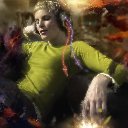 http://i51.photobucket.com/albums/f380/firestorm304/BRANDNEWcopy.jpg okay there it is, dont ask what i was thinking, i dont know what i was doing so i did a bit of everything. please tell me what you guys think. oh an btw heres the original stock so you can see what ive done.
 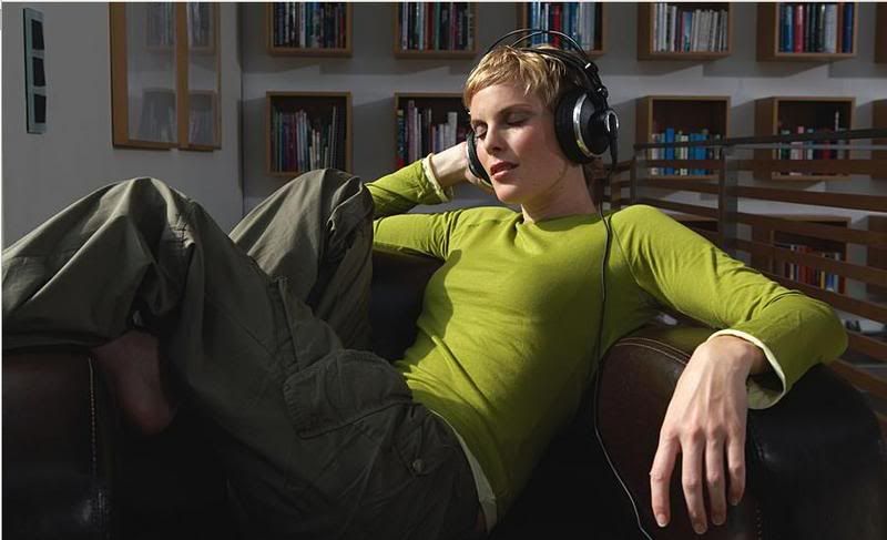 http://i51.photobucket.com/albums/f380/firestorm304/H2OPEOPLE74.jpg cheers ________________________________________________ Impressive. =O Very abstract very crazy.
  Rates and Comments? Rates and Comments? 8.5/10 Nice background... Again I suggest that you try adding lighting...
 To be honest... not too fond of it... the text doesnt really seem to go and the render doesn't really stick out... 7/10rate and comments please.HydraX7
Someone please rate my avatar.ViennoiserieI'm probably going to be the one who rates it the highest... 8/10... looks like a logo...
[QUOTE="-kaz3-"]got a new profile banner...nothing special, just a pratice on layer management/colors/simplicity. firestorm304I like it, the text could be a little higher but other than that its great. I agree... the text could be placed higher...
Leech if you can tell me where lighting should go and how I will do it.Bobakuzero*ironic considering I've never made a sig and I'm giving advice > >* I was thinking of positiong the light source at the bottom right hand corner... either that or the top-left hand corner... And hmm... try making the light facing the opposite corner... but well, adjust the angles a little to make it look more natural...
Leech if you can tell me where lighting should go and how I will do it.BobakuzeroOne good way to add lighting is by taking a 200 px soft round brush and brushing around the edges of the sig, or where the render already has light shining on it. (If it has any)
blackleech. how bout some input on my revision?inyourface_12The background is better... but still... try to get a background that fits... ie. make the text, render(s) and background look like 1 picture instead of 3 parts...
[QUOTE="inyourface_12"]blackleech. how bout some input on my revision?blackleechThe background is better... but still... try to get a background that fits... ie. make the text, render(s) and background look like 1 picture instead of 3 parts...
i have no idea how to do that seeing as they are different brightnesses and stuff. o well time to start working on a new one anyway. im gonna make a good backround this time
i like the background already as a dark one...:D oh well, i have a question, do someone have all the emblem pictures?:)icecrusher44
click browse under the thing under pictures in preferences. they are all their
You can always adjust the color/tone + using lighting to play tricks on the eyes ;)i have no idea how to do that seeing as they are different brightnesses and stuff. o well time to start working on a new one anyway. im gonna make a good backround this time
inyourface_12
i like the background already as a dark one...:D oh well, i have a question, do someone have all the emblem pictures?:)icecrusher44I don't, but they have all of it in the Welcome Newbies emblem guide...
[QUOTE="icecrusher44"]i like the background already as a dark one...:D oh well, i have a question, do someone have all the emblem pictures?:)inyourface_12
click browse under the thing under pictures in preferences. they are all their
no, not Icons, emblems, like on your profile, goto the emblems union and look for the guide[QUOTE="inyourface_12"][QUOTE="icecrusher44"]i like the background already as a dark one...:D oh well, i have a question, do someone have all the emblem pictures?:)Zap-O-Matic
click browse under the thing under pictures in preferences. they are all their
no, not Icons, emblems, like on your profile, goto the emblems union and look for the guideo sry im an idiot. i always get those two confused


not bad. in fact its quite good for a newbie :D 8.5/10Hey everyone, I got photoshop a few days ago and i'm just getting used to it, can you please rate if this is ok for a newbie? (also dooes anybody have a suggestion for how to make a good border for this?)
-Predak-
I dislike it, even though it is a work of a newbie.. (Sorry.) The left side is way too repetitive, just the same brushstrokes all over again, and a character popped in there. And, the right side lacks some action.. It's just him, and a white background.. (Also, the text hits his face = Not good.)Hey everyone, I got photoshop a few days ago and i'm just getting used to it, can you please rate if this is ok for a newbie? (also dooes anybody have a suggestion for how to make a good border for this?)
-Predak-
please rate my new avatar.dissonantblackYou + your avatars = 1337ness :P 9.5/10
omfg...c4d render number 2.Cool 8) really much better like you said lol.
link
you won't be dissapointed. Much better than my first -kaz3-

omfg...c4d render number 2.that c4d s t3h pwn4g3 some photoshop work on that and you could have a masterpeice on your hands
link
you won't be dissapointed. Much better than my first -kaz3-
[QUOTE="Viennoiserie"]Someone please rate my avatar.blackleechI'm probably going to be the one who rates it the highest... 8/10... looks like a logo... Yes, it's a logo - the logo of Igloo - my favorite Romanian design magazine. :) I once made a blog on it.
Yes, it's a logo - the logo of Igloo - my favorite Romanian design magazine. :) I once made a blog on it.ViennoiserieI see :P I think I may have read that blog before, but it was way before I started commenting though...
blackleech. how bout some input on my revision?inyourface_12Much better. The darkness made the text more visible and the overall look of the sig more complementing to the lava Star Wars logo.
I'm not the one who rated... but well... try having variation in the background... and if you do lighting and add some contrast... it should work well...Do you have any suggestions on what i can add to the left side, or ways to change it?
-Predak-
What kind of variations?-Predak-Use different brushes?
No problem :)ok thanks
-Predak-
hi! just dropping by to say HELLO!:Dicecrusher44please do this kinda crp in Roll Call

wHAdu ya guys think of my sig?atrain4i can't see it >______________>
Please Log In to post.
Log in to comment