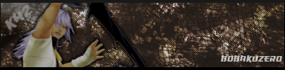
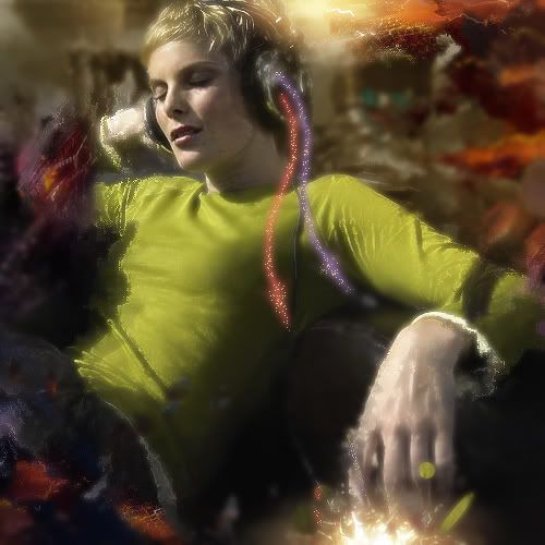
 Rates? looks abit dark. but i prefer the 2nd sig. 1st:7/10 2nd:8/10
 This topic is locked from further discussion.
Can anyone make me a sig with Alter bride and nirvana and in small words saying my username??cory4513
i would but u prolly dont want it to suck lol
[QUOTE="TheHimura"][QUOTE="inyourface_12"][QUOTE="inyourface_12"]
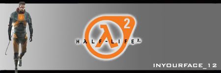
here we go i refined the half life 2 one with input from whosnext. thanks for that man. please rate =)
also please rate my current star wars boba fett sig.
inyourface_12
just a bump for the new page
The render is really small and goes into the border, the text doesn't fit the sig, the border doesn't really go well with it either, the background is just a simple gradient, the whole right side of the sig is empty and the left side has some empty space since the render is small... I could give you some tips on how to make a simple background for your sigs if you want me to. (Only if you use Photoshop though)please do =) also it was supposed to be pretty simple
Ah, I just had a big explanation on how to do it, but GS lagged and it closed out. Since I really don't have the patience to re-type it, just look at this tutorial.[QUOTE="inyourface_12"][QUOTE="TheHimura"][QUOTE="inyourface_12"][QUOTE="inyourface_12"]
here we go i refined the half life 2 one with input from whosnext. thanks for that man. please rate =)
also please rate my current star wars boba fett sig.
TheHimura
just a bump for the new page
The render is really small and goes into the border, the text doesn't fit the sig, the border doesn't really go well with it either, the background is just a simple gradient, the whole right side of the sig is empty and the left side has some empty space since the render is small... I could give you some tips on how to make a simple background for your sigs if you want me to. (Only if you use Photoshop though)please do =) also it was supposed to be pretty simple
Ah, I just had a big explanation on how to do it, but GS lagged and it closed out. Since I really don't have the patience to re-type it, just look at this tutorial.haha thanks
[QUOTE="TheHimura"][QUOTE="inyourface_12"][QUOTE="TheHimura"][QUOTE="inyourface_12"][QUOTE="inyourface_12"]
here we go i refined the half life 2 one with input from whosnext. thanks for that man. please rate =)
also please rate my current star wars boba fett sig.
inyourface_12
just a bump for the new page
The render is really small and goes into the border, the text doesn't fit the sig, the border doesn't really go well with it either, the background is just a simple gradient, the whole right side of the sig is empty and the left side has some empty space since the render is small... I could give you some tips on how to make a simple background for your sigs if you want me to. (Only if you use Photoshop though)please do =) also it was supposed to be pretty simple
Ah, I just had a big explanation on how to do it, but GS lagged and it closed out. Since I really don't have the patience to re-type it, just look at this tutorial.haha thanks
I just made this to show you how your sig might look after the tut.
[QUOTE="inyourface_12"][QUOTE="TheHimura"][QUOTE="inyourface_12"][QUOTE="TheHimura"][QUOTE="inyourface_12"][QUOTE="inyourface_12"]
here we go i refined the half life 2 one with input from whosnext. thanks for that man. please rate =)
also please rate my current star wars boba fett sig.
TheHimura
just a bump for the new page
The render is really small and goes into the border, the text doesn't fit the sig, the border doesn't really go well with it either, the background is just a simple gradient, the whole right side of the sig is empty and the left side has some empty space since the render is small... I could give you some tips on how to make a simple background for your sigs if you want me to. (Only if you use Photoshop though)please do =) also it was supposed to be pretty simple
Ah, I just had a big explanation on how to do it, but GS lagged and it closed out. Since I really don't have the patience to re-type it, just look at this tutorial.haha thanks
I just made this to show you how your sig might look after the tut.im workng on that kind of backround like in the tut. idk if ill be showing u guys anytime soon though. lol
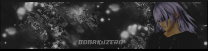
Anyone care to comment on my sig? :) Did it last night.billnye69Pretty nice, but I think it could use even more contrast especially at the left and right ends... 9/10 [QUOTE="Bobakuzero"]
Rates? 1: 7.5/10 I don't see anything much to it... and the black streak looks odd... 2: 8.5/10 Pretty nice but could use some lighting I like mine, not so much for the graphics, but for the message it sends.ranger_wahaThe background doesn't really seem to go with the render... neither does the text...
[QUOTE="esb617"]could somone touch up my sig with some nice effects and a thin border please. And in cool text have it say "They shall pay. With rivers of blood!" and Shogun Assassin somwhere. Thnx in advance.an abstract background will look terrible on that for whoever decides to take this one. Blood isn't particularly easy to recreat in a nice way, and the current image is pretty low-res. Just trying to get your request as easy as possible.Oh ok, who is the best with photoshop
Also if it's not to much trouble try one with an abstract background or whatever you guys use. So two but the first one is what I mostly want
-kaz3-
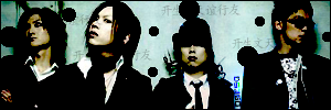
Rates? First one is very repetitive in the background, the character is not well blended in at all and sticks out way too much for my taste.. 4/10. Decent background, however it lacks some lightning which would make it stand out more.. Again, the character is not blended in that well. 6/10. :) 
Rate my new updated sig.boboboja lot better than the original, the render is a lot clearer but work on the text? ok? okay made some adjustments please tell me what you guys think now.
 cheers
 [QUOTE="-kaz3-"][QUOTE="esb617"]could somone touch up my sig with some nice effects and a thin border please. And in cool text have it say "They shall pay. With rivers of blood!" and Shogun Assassin somwhere. Thnx in advance.an abstract background will look terrible on that for whoever decides to take this one. Blood isn't particularly easy to recreat in a nice way, and the current image is pretty low-res. Just trying to get your request as easy as possible.Oh ok, who is the best with photoshop
Also if it's not to much trouble try one with an abstract background or whatever you guys use. So two but the first one is what I mostly want
esb617
10/10!! both of them.-DeathDealer-xD ty
Rate the signature. :oops:K4ss3reither crop it or do something to the left, the negative space doesnt go down to well for me
[QUOTE="billnye69"]Anyone care to comment on my sig? :) Did it last night.blackleechPretty nice, but I think it could use even more contrast especially at the left and right ends... 9/10 [QUOTE="Bobakuzero"]
Rates? 1: 7.5/10 I don't see anything much to it... and the black streak looks odd... 2: 8.5/10 Pretty nice but could use some lighting thats his sword ;) and, i don't like em as much as your usual ones.. wanna rate my new one now that more people ar on? out of ten please. im working on backrounds so please dont hate on my gradient too muchinyourface_12
no one?
[QUOTE="inyourface_12"]wanna rate my new one now that more people ar on? out of ten please. im working on backrounds so please dont hate on my gradient too muchinyourface_12
no one?
Looks the same as last time.hi all. Can someone make a 200x120 and 760x140 banner for my website purposes!
So you make one banner but make it in two sizes!
the website: http://totalpcnet.freeprohost.com/ It's a website covering everything about PC; hardware, software and games!
So use your imagination, i have no reccomendations or images to give you. Just make sure you put hardware, software and game elements!
Thanks in advance!
[QUOTE="inyourface_12"][QUOTE="inyourface_12"]wanna rate my new one now that more people ar on? out of ten please. im working on backrounds so please dont hate on my gradient too muchCyrax-Sektor
no one?
Looks the same as last time.thats cuz u already rated it. u were the only one/. anyone else??
rate and comments pleaseYou sure you did that? :o It's cool :D But it would be even better if you can apply the effects on the foreground on the text :) 9/10HydraX7
Me ^ ^ 7.5/10 Try working on your background and text now, it'll help a lotthats cuz u already rated it. u were the only one/. anyone else??
inyourface_12
Very first one doesn't seem much... besides added Chinese characters... I don't suppose your'e Chinese are you? The same phrase anyway :P NA/10 Second one... hmm.. the text doesn't really seem to fit the style... 7.5/10 Third one... 8/10 Could use some depth... and the text doesn't add to the feel of it...
care to rate :)
ds360fn
[QUOTE="HydraX7"]rate and comments pleaseYou sure you did that? :o It's cool :D But it would be even better if you can apply the effects on the foreground on the text :) 9/10nah i didnt make it. i am bad at designing:( it was actually a banner but i edit it into a sig coz somebody wants it. so i just want to know if its ok.
nah i didnt make it. i am bad at designing:( it was actually a banner but i edit it into a sig coz somebody wants it. so i just want to know if its ok.HydraX7Ah... no wonder why it seemed like a giant leap in your standards... :P Don't worry though I'm sure that with practice you'll get better at it ^ ^
[QUOTE="HydraX7"]nah i didnt make it. i am bad at designing:( it was actually a banner but i edit it into a sig coz somebody wants it. so i just want to know if its ok.blackleechAh... no wonder why it seemed like a giant leap in your standards... :P Don't worry though I'm sure that with practice you'll get better at it ^ ^ i am too busy and lazy to learn or practice :(
got a new profile banner...nothing special, just a pratice on layer management/colors/simplicity. -kaz3-I like it, the text could be a little higher but other than that its great.
[QUOTE="inyourface_12"]Me ^ ^ 7.5/10 Try working on your background and text now, it'll help a lotthats cuz u already rated it. u were the only one/. anyone else??
blackleech
wow i got over a 7 from u. lol. but yeah im working on a new backround and the text idk lol
 http://i51.photobucket.com/albums/f380/firestorm304/BRANDNEWcopy.jpg okay there it is, dont ask what i was thinking, i dont know what i was doing so i did a bit of everything. please tell me what you guys think. oh an btw heres the original stock so you can see what ive done.
 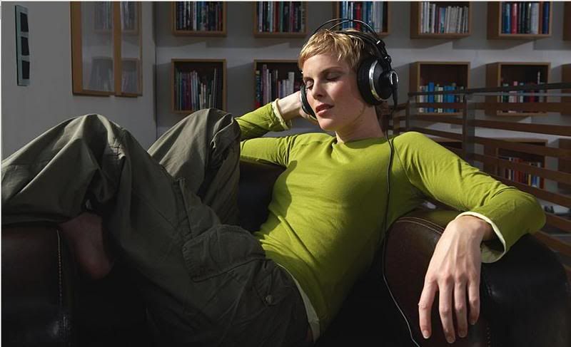 http://i51.photobucket.com/albums/f380/firestorm304/H2OPEOPLE74.jpg cheers ________________________________________________
 1st. NA/10. couldve did more to the stock... 2. NA/10, you know why, I told you already.... 3. 7.7/10... shouldve erased some C4D from around the render and used better text..
care to rate :)
ds360fn

Please Log In to post.


Log in to comment