Sig/Banner/Avatar/Etc. - Rating/Discussion/Etc - Be My Valentine? edition
This topic is locked from further discussion.

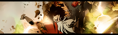
Cool background! The music notes match so well. Nice blue touch too!
Someone rate this sig :D
Djammal86

[QUOTE="blackleech"][QUOTE="tomxizor"]How is my new Battle Royale sig? tomxizorUmm... I'm sure there's a more artistic way of doing that...
I could go to Liquid Designs and get a PS version, but it took me three weeks to get results last time I went there. So, I made my own with Paint.
u could go to another designer union


Heys guys I need your opinion. Which sig do you think looks better, because right now I can't choose between these two.I think the second one...
Renegade_Fury
[QUOTE="Renegade_Fury"]Heys guys I need your opinion. Which sig do you think looks better, because right now I can't choose between these two.I think the second one...
blackleech
Is it because of Gore, or do you just like the design itself better?
Is it because of Gore, or do you just like the design better?I don't know a thing about American football... so it's about the design...
Renegade_Fury
[QUOTE="Renegade_Fury"]Is it because of Gore, or do you just like the design better?I don't know a thing about American football... so it's about the design...
blackleech
Alright then, thanks for your input. If anyone else would like to throw in their opinion as well it'd be very appreciative. :)
[QUOTE="Bobakuzero"][QUOTE="Owned_Noob"][QUOTE="Zap-O-Matic"][QUOTE="Owned_Noob"]yea i used the render and then i added a border and the text Owned_NoobDefiine ''render'' first off ( i know what it means, but i wanna see if he knows) I mean did you use JUST the picture, or the picture and the backrodndude screw off ur not even in this.mind your own buisness and render is the shading and texturing of a picture:lol: A render is the cut of the subject used in the sig. So in your case it would be wolverine. Thats a render. :lol: you lost this, you did rip that sig. well hey im sorry i dont usually make sigs and i dont know the definitions of the words Oh I see. You don't make them, so you simply steal whatever you come across.. :lol:
Oh I see. You don't make them, so you simply steal whatever you come across.. :lol:K4ss3rHave you been hibernating when it comes to sigs? :P
[QUOTE="K4ss3r"]Oh I see. You don't make them, so you simply steal whatever you come across.. :lol:blackleechHave you been hibernating when it comes to sigs? :P Certainly not, I have something called a 'Real life' which needs taking care of once in a while. :P I made this one 'bout a week ago.. I'm not too fond of the result though, therefor I didn't show it here. :oops:
 And, I've downloaded a bunch of C4D's last night, so I'm going to try to experiment with using them in signatures.. It'll be interesting. :o And, I've downloaded a bunch of C4D's last night, so I'm going to try to experiment with using them in signatures.. It'll be interesting. :o To me, it looks pretty good save for the circles and the 'crosses'... and the first line of text looks kind of odd too... can tell why you didn't show it here :P Good luck on your other signatures... and don't neglect your 'real life' ;)
 As I said, I didn't completely like it. But now that we're at it, rate it. :PK4ss3r8/10 :)
1st sig looks cool 8.5/10. 2nd sig and 3rd one looks the same dude...they are the same:| i just added one filter to make a slight difference in texture. Look, the first one is smoother and the other is dirtier...[QUOTE="-kaz3-"][QUOTE="HydraX7"][QUOTE="-kaz3-"]New sig:
Topaz vivacity plug-in FTW. Make that 2 sigs:
both are anime...I don't even watch anime...at all.Shadowlinex
Hate to say it, but most wont notice a change so subtle. The first is very nice, but the border doesn't do it for me.
i know...you do know that a lot of people (I guess those who make sigs more occasionally) create diff. versions of one sig (like with diff. coloring, you know...minor changes). a lot sometimes have 6 or 7 versions of one sig...:lol: I used to think it was really stupid before..but I actually think otherwise now:?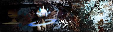 That's a really different style o_O from your usual one... I love both sides of the background... but the sprite looks kind of not-matching the background... but still... lovely :) 9/10 That's a really different style o_O from your usual one... I love both sides of the background... but the sprite looks kind of not-matching the background... but still... lovely :) 9/10 Yeah, you're right.. Seems it's not blended in that well.. I'm glad you like it though. :)
 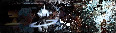 Yeah that's much better :) 9.5/10 ^ ^
 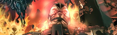 its boring imo Seems as though it's inspired from a comic or something... and looks really comic-bookish... BUT the right side seems to beg to differ... 8.5/10
 i actually hate the left side...its looks tacky to me...i love the smudging tho :P -kaz3-It seems the other way to me > >
 its boring imo Seems as though it's inspired from a comic or something... and looks really comic-bookish... BUT the right side seems to beg to differ... 8.5/10 dont really like it the effects arent really clear, maybe some clear lighting and just a little bit more depth to the right.
 i actually hate the left side...its looks tacky to me...i love the smudging tho :P -kaz3-
The problem I see mostly with your sigs man is you lose the feel of it, by adding to much that doesn't fit what your going for. Like a painter who throws paint at a canvas.
how u guys like my very simple new sig? /10inyourface_12The border should be thinner... and the render used for the crowbar is of rather low resolution... 7/10 Anyway, I'd like to ask... for those non-C4D, non-brush backgrounds for signatures (eg. kaz's current signature) where do you people get the images from?
[QUOTE="inyourface_12"]how u guys like my very simple new sig? /10blackleechThe border should be thinner... and the render used for the crowbar is of rather low resolution... 7/10 Anyway, I'd like to ask... for those non-C4D, non-brush backgrounds for signatures (eg. kaz's current signature) where do you people get the images from?
thanks. yeah i couldnt get the crowbar to look better for some reason. i think it was b/c i used a screenshot where i used no aa to begin with
Ah I see... and couldn't find another screenshot off sites like GS with the crowbar (since you rarely use it you know..) for use either?thanks. yeah i couldnt get the crowbar to look better for some reason. i think it was b/c i used a screenshot where i used no aa to begin with
inyourface_12

how u guys like my very simple new sig? /10inyourface_12Not bad. One of your best, in my opinion. 7/10
size - 75 x 75 pixles
pic - http://img503.imageshack.us/img503/562/rockets23qe2.jpg

[QUOTE="inyourface_12"]how u guys like my very simple new sig? /10SolidSnake35Not bad. One of your best, in my opinion. 7/10
thanks. all these 7/10's make me feel good
To be honest... I usually don't feel good giving people anything below an 8 > >thanks. all these 7/10's make me feel good
inyourface_12
[QUOTE="inyourface_12"]To be honest... I usually don't feel good giving people anything below an 8 > > It's rare to see you give a low score as well. You're usually the gentle person when it comes to rating. :P New thingie. Ratie ratie!thanks. all these 7/10's make me feel good
blackleech
[QUOTE="inyourface_12"]To be honest... I usually don't feel good giving people anything below an 8 > >thanks. all these 7/10's make me feel good
blackleech
Why? I don't rate people its too restrictive, instead I give advise, For his I think it needs to have a lot of work because right now theres nothing interesting or eye catching becuase everything he put in his sig has the same weight.
Nice lighting the only thing I don't like is the line thats opposite the others. On the right side, I think it ruins the flow.
[QUOTE="blackleech"][QUOTE="inyourface_12"]To be honest... I usually don't feel good giving people anything below an 8 > >thanks. all these 7/10's make me feel good
Shadowlinex
Why? I don't rate people its too restrictive, instead I give advise, For his I think it needs to have a lot of work because right now theres nothing interesting or eye catching becuase everything he put in his sig has the same weight.
thanks i really suck at photoshop but i cant find any even halfway decent tutorials
[QUOTE="Shadowlinex"][QUOTE="blackleech"][QUOTE="inyourface_12"]To be honest... I usually don't feel good giving people anything below an 8 > >thanks. all these 7/10's make me feel good
inyourface_12
Why? I don't rate people its too restrictive, instead I give advise, For his I think it needs to have a lot of work because right now theres nothing interesting or eye catching becuase everything he put in his sig has the same weight.
thanks i really suck at photoshop but i cant find any even halfway decent tutorials
www.good-tutorials.com
www.pixel2life.com
Your Welcome :P
[QUOTE="blackleech"][QUOTE="inyourface_12"]To be honest... I usually don't feel good giving people anything below an 8 > > It's rare to see you give a low score as well. You're usually the gentle person when it comes to rating. :P New thingie. Ratie ratie!thanks. all these 7/10's make me feel good
K4ss3r
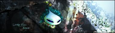
that sprite looks like a chao from sonic. lol
[QUOTE="inyourface_12"][QUOTE="Shadowlinex"][QUOTE="blackleech"][QUOTE="inyourface_12"]To be honest... I usually don't feel good giving people anything below an 8 > >thanks. all these 7/10's make me feel good
Shadowlinex
Why? I don't rate people its too restrictive, instead I give advise, For his I think it needs to have a lot of work because right now theres nothing interesting or eye catching becuase everything he put in his sig has the same weight.
thanks i really suck at photoshop but i cant find any even halfway decent tutorials
www.goodtutorials.com
www.pixel2life.com
Your Welcome :P
thanks.
Yeah... there're probably more 10s I've given than 6.5 and belows... > > Doing sprites huh? :P It's pretty nice, but the text is slightly illegible (especially your username) and the right edges on the end of the square grid don't seem to be blended in that well...9/10 A lot of people ask me to rate after I comment to... so, well, why not :P As for the advice part... I think most of my 'advice' if it's even 'advice'... well... is pretty simple stuff > >Why? I don't rate people its too restrictive, instead I give advise, For his I think it needs to have a lot of work because right now theres nothing interesting or eye catching becuase everything he put in his sig has the same weight.
Shadowlinex
[QUOTE="K4ss3r"]
Nice lighting the only thing I don't like is the line thats opposite the others. On the right side, I think it ruins the flow.
Thanks.. I used a while on the lightning, and it proved to be harder then I woud've thought.. Could you be more specific what line it is? :)[QUOTE="Shadowlinex"][QUOTE="K4ss3r"]
Nice lighting the only thing I don't like is the line thats opposite the others. On the right side, I think it ruins the flow.
Thanks.. I used a while on the lightning, and it proved to be harder then I woud've thought.. Could you be more specific what line it is? :)The big fat one coming from the top to the lower right corner separating the lights from the darks. It gives a hard edge instead of a nice smooth transition.
[QUOTE="inyourface_12"]To be honest... I usually don't feel good giving people anything below an 8 > >thanks. all these 7/10's make me feel good
blackleech
hey man u saw my old sigs right? im happy to get a 7 :P
[QUOTE="K4ss3r"]It's rare to see you give a low score as well. You're usually the gentle person when it comes to rating. :P New thingie. Ratie ratie!Yeah... there're probably more 10s I've given than 6.5 and belows... > > Doing sprites huh? :P It's pretty nice, but the text is slightly illegible (especially your username) and the right edges on the end of the square grid don't seem to be blended in that well...9/10
Well, I did want the text to be tiny enough so that wouldn't be the first thing to catch attention. Oh, and the square thing.. Done on purpose. :P
[QUOTE="K4ss3r"]
that sprite looks like a chao from sonic. lol
Well, it might just be, I'm not exactly sure. :o
[QUOTE="K4ss3r"][QUOTE="Shadowlinex"][QUOTE="K4ss3r"]
Nice lighting the only thing I don't like is the line thats opposite the others. On the right side, I think it ruins the flow.
Thanks.. I used a while on the lightning, and it proved to be harder then I woud've thought.. Could you be more specific what line it is? :)The big fat one coming from the top to the lower right corner separating the lights from the darks. It gives a hard edge instead of a nice smooth transition.
Oooooh that one.. Well, I'll see if I can smooth it out a bit.. :oPlease Log In to post.
Log in to comment