 Topaz vivacity plug-in FTW. Make that 2 sigs:
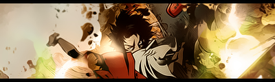
 both are anime...I don't even watch anime...at all.
 This topic is locked from further discussion.
Topaz vivacity plug-in FTW. Make that 2 sigs: both are anime...I don't even watch anime...at all. You serious they're from you? :? I've never seen you do this sort of signature... + the subjects... But in any case, 10/10 for the first one it's really cool 8) I can't tell the difference between the second and third one... but for both 8.5/10 The yellow on the extreme right looks kind of odd... Topaz vivacity plug-in FTW. Make that 2 sigs: both are anime...I don't even watch anime...at all.1st sig looks cool 8.5/10. 2nd sig and 3rd one looks the same dude...they are the same:| i just added one filter to make a slight difference in texture. Look, the first one is smoother and the other is dirtier... [QUOTE="HydraX7"][QUOTE="-kaz3-"]New sig:1st sig looks cool 8.5/10. 2nd sig and 3rd one looks the same dude...they are the same:| i just added one filter to make a slight difference in texture. Look, the first one is smoother and the other is dirtier...
Hate to say it, but most wont notice a change so subtle. The first is very nice, but the border doesn't do it for me.
1st sig looks cool 8.5/10. 2nd sig and 3rd one looks the same dude...they are the same:| i just added one filter to make a slight difference in texture. Look, the first one is smoother and the other is dirtier...[QUOTE="-kaz3-"][QUOTE="HydraX7"][QUOTE="-kaz3-"]New sig:
Hate to say it, but most wont notice a change so subtle. The first is very nice, but the border doesn't do it for me.
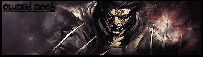
after looking at it more, i see the difference :)can someone make an assassins creed sig for me?Owned_Noob2/10...its just a pic :?
[QUOTE="Shadowlinex"]1st sig looks cool 8.5/10. 2nd sig and 3rd one looks the same dude...they are the same:| i just added one filter to make a slight difference in texture. Look, the first one is smoother and the other is dirtier...[QUOTE="-kaz3-"][QUOTE="HydraX7"][QUOTE="-kaz3-"]New sig:
Hate to say it, but most wont notice a change so subtle. The first is very nice, but the border doesn't do it for me.
after looking at it more, i see the difference :)can someone make an assassins creed sig for me?Owned_Noob2/10...its just a pic :? well what is it suposed to be
[QUOTE="Zap-O-Matic"][QUOTE="Shadowlinex"]1st sig looks cool 8.5/10. 2nd sig and 3rd one looks the same dude...they are the same:| i just added one filter to make a slight difference in texture. Look, the first one is smoother and the other is dirtier...[QUOTE="-kaz3-"][QUOTE="HydraX7"][QUOTE="-kaz3-"]New sig:
Hate to say it, but most wont notice a change so subtle. The first is very nice, but the border doesn't do it for me.
after looking at it more, i see the difference :)can someone make an assassins creed sig for me?Owned_Noob2/10...its just a pic :? well what is it suposed to be add SOMETHING to it....like a border...
[QUOTE="Owned_Noob"][QUOTE="Zap-O-Matic"][QUOTE="Shadowlinex"]1st sig looks cool 8.5/10. 2nd sig and 3rd one looks the same dude...they are the same:| i just added one filter to make a slight difference in texture. Look, the first one is smoother and the other is dirtier...[QUOTE="-kaz3-"][QUOTE="HydraX7"][QUOTE="-kaz3-"]New sig:
Hate to say it, but most wont notice a change so subtle. The first is very nice, but the border doesn't do it for me.
after looking at it more, i see the difference :)can someone make an assassins creed sig for me?Owned_Noob2/10...its just a pic :? well what is it suposed to be add SOMETHING to it....like a border... i DID look carefully around the side
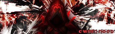
[QUOTE="Owned_Noob"][QUOTE="Owned_Noob"]hey guys what sig do you think looks better?tell me wich is better please?someone hey, the first sig is mine, nice job jacking it and putting your name in it. OOoooooo Scandelous!
this
OR
(yes i will resize it but im to lazy to right now:P)
ARandoMan
[QUOTE="Owned_Noob"][QUOTE="Owned_Noob"]hey guys what sig do you think looks better?tell me wich is better please?someone hey, the first sig is mine, nice job jacking it and putting your name in it. what ar you talking about i found that picture on google...its not yours
this
OR
(yes i will resize it but im to lazy to right now:P)
ARandoMan
[QUOTE="ARandoMan"][QUOTE="Owned_Noob"][QUOTE="Owned_Noob"]hey guys what sig do you think looks better?tell me wich is better please?someone hey, the first sig is mine, nice job jacking it and putting your name in it. what ar you talking about i found that picture on google...its not yours :roll: not you!
this
OR
(yes i will resize it but im to lazy to right now:P)
Owned_Noob
[QUOTE="ARandoMan"][QUOTE="Owned_Noob"][QUOTE="Owned_Noob"]hey guys what sig do you think looks better?tell me wich is better please?someone hey, the first sig is mine, nice job jacking it and putting your name in it. what ar you talking about i found that picture on google...its not yours Well, if you searched Google and found the signature, then decided to use it, then you stole it. If you only found the render, and then made the signature, then everything is fine.. I'm curious to see who's right and who's wrong.
this
OR
(yes i will resize it but im to lazy to right now:P)
Owned_Noob
yea i used the render and then i added a border and the text Owned_NoobDefiine ''render'' first off ( i know what it means, but i wanna see if he knows) I mean did you use JUST the picture, or the picture and the backrodn
[QUOTE="Owned_Noob"]yea i used the render and then i added a border and the text Zap-O-MaticDefiine ''render'' first off ( i know what it means, but i wanna see if he knows) I mean did you use JUST the picture, or the picture and the backrodndude screw off ur not even in this.mind your own buisness and render is the shading and texturing of a picture
This is getting out of control!Sparradoxhaha you think?its not my fault this kid is anoying me but whatever im just gonna ignore him
[QUOTE="Zap-O-Matic"][QUOTE="Owned_Noob"]yea i used the render and then i added a border and the text Owned_NoobDefiine ''render'' first off ( i know what it means, but i wanna see if he knows) I mean did you use JUST the picture, or the picture and the backrodndude screw off ur not even in this.mind your own buisness and render is the shading and texturing of a picture:lol: A render is the cut of the subject used in the sig. So in your case it would be wolverine. Thats a render. :lol: you lost this, you did rip that sig.
if you dont give a **** then **** off you bastardOwned_Noobawww, looks like someone needs a chill pill :roll:
[QUOTE="Owned_Noob"][QUOTE="Zap-O-Matic"][QUOTE="Owned_Noob"]yea i used the render and then i added a border and the text BobakuzeroDefiine ''render'' first off ( i know what it means, but i wanna see if he knows) I mean did you use JUST the picture, or the picture and the backrodndude screw off ur not even in this.mind your own buisness and render is the shading and texturing of a picture:lol: A render is the cut of the subject used in the sig. So in your case it would be wolverine. Thats a render. :lol: you lost this, you did rip that sig. *salutes* got to it before it did :( :D
[QUOTE="Owned_Noob"][QUOTE="Zap-O-Matic"][QUOTE="Owned_Noob"]yea i used the render and then i added a border and the text BobakuzeroDefiine ''render'' first off ( i know what it means, but i wanna see if he knows) I mean did you use JUST the picture, or the picture and the backrodndude screw off ur not even in this.mind your own buisness and render is the shading and texturing of a picture:lol: A render is the cut of the subject used in the sig. So in your case it would be wolverine. Thats a render. :lol: you lost this, you did rip that sig. well hey im sorry i dont usually make sigs and i dont know the definitions of the words
:lol: That would happen to be for a certain contest would it? I like it. ;)
Someone rate this sig :D
Djammal86

I really like parts of it, a lot, but the render on the right looks out of place. The colours don't match, and the fact that you have two renders at opposite sides means there's no focal point. The render on the right should be under the border too. I like the music notes though, and most of the left side of the sig. Overall, not bad and it has potential, but there are a few big problems that need sorting out. 6/10
Someone rate this sig :D
Djammal86
[QUOTE="Bobakuzero"][QUOTE="Owned_Noob"][QUOTE="Zap-O-Matic"][QUOTE="Owned_Noob"]yea i used the render and then i added a border and the text Owned_NoobDefiine ''render'' first off ( i know what it means, but i wanna see if he knows) I mean did you use JUST the picture, or the picture and the backrodndude screw off ur not even in this.mind your own buisness and render is the shading and texturing of a picture:lol: A render is the cut of the subject used in the sig. So in your case it would be wolverine. Thats a render. :lol: you lost this, you did rip that sig. well hey im sorry i dont usually make sigs and i dont know the definitions of the words Its alrite. Just dont use work thats not yours or from google it makes trouble. And know words before you get into fights. ;)
[QUOTE="Owned_Noob"][QUOTE="Bobakuzero"][QUOTE="Owned_Noob"][QUOTE="Zap-O-Matic"][QUOTE="Owned_Noob"]yea i used the render and then i added a border and the text BobakuzeroDefiine ''render'' first off ( i know what it means, but i wanna see if he knows) I mean did you use JUST the picture, or the picture and the backrodndude screw off ur not even in this.mind your own buisness and render is the shading and texturing of a picture:lol: A render is the cut of the subject used in the sig. So in your case it would be wolverine. Thats a render. :lol: you lost this, you did rip that sig. well hey im sorry i dont usually make sigs and i dont know the definitions of the words Its alrite. Just dont use work thats not yours or from google it makes trouble. And know words before you get into fights. ;)Or Wiki words while in the fight.
Decent, your style is different from others though the render doesnt match.... 7/10.... Anyone wanna rate my current...
Someone rate this sig :D
Djammal86
 I think I'm starting to grow a fetish for black and white sigs............ Damn it , skipped again. Damn, again. I think I'm starting to grow a fetish for black and white sigs............ Damn it , skipped again. Damn, again. 6.5/10 bad text placement... and not much really going on from what I see...
 [QUOTE="Djammal86"]I really like parts of it, a lot, but the render on the right looks out of place. The colours don't match, and the fact that you have two renders at opposite sides means there's no focal point. The render on the right should be under the border too. I like the music notes though, and most of the left side of the sig. Overall, not bad and it has potential, but there are a few big problems that need sorting out. 6/10
Someone rate this sig :D
SolidSnake35
Decent, your style is different from others though the render doesnt match.... 7/10.... Anyone wanna rate my current...damelokidd124Not bad... but I think it could use even more depth... and the text looks kind of 'thin'... doesn't really suit the style of the signature... other than that, it's pretty good. :) 8.5/10
 rate plz
Looks odd if you ask me... especially the background when paired with this style of render... well... 7/10
dragpumk88
How is my new Battle Royale sig? tomxizorUmm... I'm sure there's a more artistic way of doing that...
[QUOTE="tomxizor"]How is my new Battle Royale sig? blackleechUmm... I'm sure there's a more artistic way of doing that...
I see... but wow that bad... 3 weeks :(
I could go to Liquid Designs and get a PS version, but it took me three weeks to get results last time I went there. So, I made my own with Paint.
tomxizor
Please Log In to post.

Log in to comment