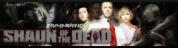
 cheers _______________________________________________________actually i like it 8.5/10
 Sig/Banner/Avatar/Etc. - Rating/Discussion/Etc - Be My Valentine? edition
This topic is locked from further discussion.
 Not that fun to render. =( Aside from that, this is the best I could do with it.
 I agree with SK - It's just a screenshot that you sized to fit, blurred it up and added text. Oh, and while we're at the "Gears of War" theme banners, rate mine. :oK4ss3r*rated it before* :P [QUOTE="firestorm304"]Rate this one please i had to rush is so sorry if its a bit sh*t in areas
cheers _______________________________________________________ Doesn't look that rushed compared tom some other signatures I've seen... the extreme left part looks odd... so does the top-right-hand-corner... due to the odd lighting? But the center is really nice... 8/10  Yo, leech input? Not that fun to render. =( Aside from that, this is the best I could do with it. Could You take out the Zap-O-Matic text?
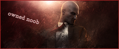
 so who thinks i should get a new bannerOwned_Noob*raises hand* Yeah. I can't really see the text and the left side of the sig is bland and gray.
Not that fun to render. =( Aside from that, this is the best I could do with it. Could You take out the Zap-O-Matic text? If it were 3 hours earlier andI still had it open, yes. =( Not that fun to render. =( Aside from that, this is the best I could do with it. Could You take out the Zap-O-Matic text? If it were 3 hours earlier andI still had it open, yes. =( man, cause i love it without the text......:( and whaddya mean nt that fun to render? Not that fun to render. =( Aside from that, this is the best I could do with it. Could You take out the Zap-O-Matic text? If it were 3 hours earlier andI still had it open, yes. =( man, cause i love it without the text......:( and whaddya mean nt that fun to render? It cut easy enough but all the red and white was hard to get out. And making it fit took alot of work. :P 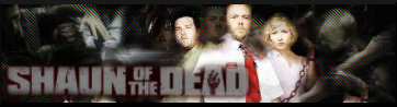 How's this?
 cheers _______________________________________________________
Rate this one pleasecheers _______________________________________________________firestorm304
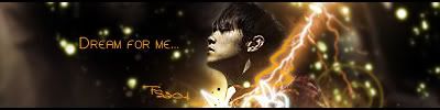
I don't like the lightning. (it looks a bit sloppy) The font could use
a little touch. Try setting it on smooth. (depending on what program you use)
All in all, it's not bad. 7/10
RCC please. ^_^
 I think I'm starting to grow a fetish for black and white sigs............ Damn it , skipped again.
  What do you think of this? I can't see anything you make.:( It is just empty space. What do you think of this? I can't see anything you make.:( It is just empty space. Look for a few seconds, carefully. You'll see the words 'You're going insane." popping up once in a while. :o I could star at it all day and I wouldn't see anything. Same goes for his sig (if he has one) and avatar.
 [QUOTE="firestorm304"]Rate this one please cheers _______________________________________________________CrystalFox
I don't like the lightning. (it looks a bit sloppy) The font could use
a little touch. Try setting it on smooth. (depending on what program you use)
All in all, it's not bad. 7/10
RCC please. ^_^
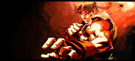
why do you make the size so small?? its good but to small 8.2/10Please rate mine.
 (yes i know the fonts not the best but i can mess with that)
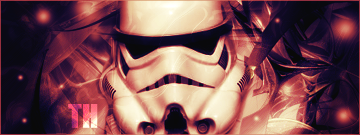 Just made this. Do you people make those backgrounds yourself? Because if so I need to know how. Sorry, I'm not that great with PS. Just made this. Not bad... but not used to seeing a reddish Trooper... :? 8/10 Just made this. Do you people make those backgrounds yourself? Because if so I need to know how. Sorry, I'm not that great with PS. No. "We" use these things called C4Ds. (named that because the program used to make them is called Cinema 4D) C4Ds are pretty much 3D abstract images used to make your signature look better. Go here to see what I'm talking about.
I don't use them often because they can also make a sig look ugly if you use one that doesn't fit with the signature.
No. "We" use these things called C4Ds. (named that because the program used to make them is called Cinema 4D) C4Ds are pretty much 3D abstract images used to make your signature look better. Go here to see what I'm talking about.C4Ds... is it me or were you the one trying to learn it not too long ago? I remember Shadowlinex showing off one of his works and... well, I think you were the one :P
I don't use them often because they can also make a sig look ugly if you use one that doesn't fit with the signature.
TheHimura
[QUOTE="TheHimura"]No. "We" use these things called C4Ds. (named that because the program used to make them is called Cinema 4D) C4Ds are pretty much 3D abstract images used to make your signature look better. Go here to see what I'm talking about.C4Ds... is it me or were you the one trying to learn it not too long ago? I remember Shadowlinex showing off one of his works and... well, I think you were the one :P Probably. I just started using them a few weeks ago. :P
I don't use them often because they can also make a sig look ugly if you use one that doesn't fit with the signature.
blackleech
Not bad... but not used to seeing a reddish Trooper... :? 8/10blackleechHaha, yeah I tried a few different colors. That one just looked the best to me.
In need of some more commenting on this one. >.>
Too much black on the left... make it brighter... but if you added some white text there it MAY look good too... Other than that, pretty nice :) 9.5/10
In need of some more commenting on this one. >.>
CrystalFox
rate the 3 Racing Cars Union tag that i have.HydraX7The orange and silver ones are nice... 9/10 for both... the rest... not really appealing... 7/10
[QUOTE="blackleech"][QUOTE="HydraX7"]rate the 3 Racing Cars Union tag that i have.HydraX7The orange and silver ones are nice... 9/10 for both... the rest... not really appealing... 7/10thanks, i think the same too and the silver one is the best :) I agree the silver is best
Hey guys i was hoping one of you artists would make me a GRAW sig. Add the text nickricatic it would be greatly appreciated :). Thanks in advance!.

New sig check it outPretty nice, but I don't like the white glow at the bottom right hand corner + the font chosen... 8.5/10
Also if it's not to much trouble try one with an abstract background or whatever you guys use. So two but the first one is what I mostly want
could somone touch up my sig with some nice effects and a thin border please. And in cool text have it say "They shall pay. With rivers of blood!" and Shogun Assassin somwhere. Thnx in advance.an abstract background will look terrible on that for whoever decides to take this one. Blood isn't particularly easy to recreat in a nice way, and the current image is pretty low-res. Just trying to get your request as easy as possible.
Also if it's not to much trouble try one with an abstract background or whatever you guys use. So two but the first one is what I mostly want
esb617
 Topaz vivacity plug-in FTW.
 Please Log In to post.
Log in to comment