My list for fav Box art:
1. Gears of War 2
2. Fallout 3
3. Saints Row 2
Those are picked on Box office art alone based on cheer art direction etc... Nothing to do with the actual game or console it's on lol
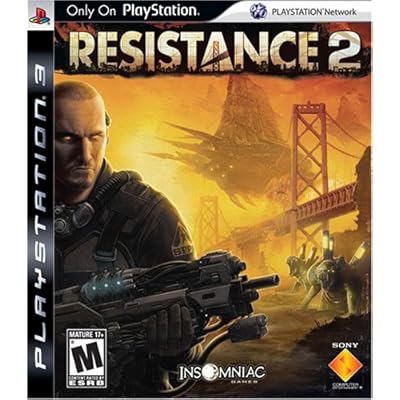
And I think resistance is bad. It's too spaced out and looks average from an artisitc point of view in terms of using the dimensions you're working with and where you eyes go to. Gears of War has the kind of cover people use for those star wars LOTR kind of big posters.
Fallout's is good as well as Saints Row 2 artistically. As usually though it's Gear's amazing arti direction and use of colours and blends that makes it the best IMO.
I understand some may not like it but to say it's the worst is hilarious and just more about liking to hate a big game rather then actual judgement on an artistic merit.
As far as the worse. That Dead Space one is pretty darn bad lol
Fifa 09 is pretty bad too..
I also think COD's box art is bad but not the worse but a huge letdown for a big game IMO
Oh and I think Left 4 Dead is fine. It's not great but it's more of a non serious box art take on that kind of genre. I think the fact that it has four fingers for the title kind of gives that away so it's not to be taken seriously lol I think the colour choice is bad though... but worst? Not close


 LIIIEEEESSSSSS


 II-FBIsniper-II


Log in to comment