I know its my second blog in one day, but clarification of my inspiration to do this piece will take up some space, so I decided to post separately. Sorry! :)
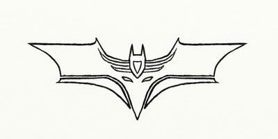
So, below are two logos from VERY well-known franchises, namely:
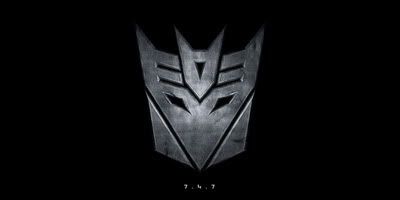
Transformers: Revenge of The Fallen, the sign of the Decepticons, or the simplified version of the Fallen's face;
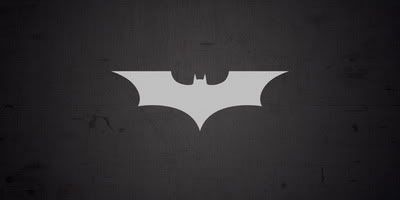
The Batman logo used since Batman: Begins, the best one so far in my opinion;
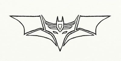
So, the idea to merge these guys came unexpectedly in my head. First, I saw the similarities between the Decepticon head top and the batman cowl, then I thought that spreading the first logo into wings would neatly mimic the batman one, and that's when I decided to draw it.
Naturally the first thing I did was to google it, then search on Deviantart to see if anyone has come up with the idea before. Finding no results, I moved on to sketching. A LOT of sketching, mainly in my notebooks when I had free time. The major problem was that one of the logos was eventually becoming a bit shifted and not true to the original, and the flaw soon became unavoidable. The sacrifice was the decepticon face, since the batman logo seemed more of a perfect form to me.
All the further detail, like wing breaking, eye changes and such came in drawing progress. Here's the result so far:
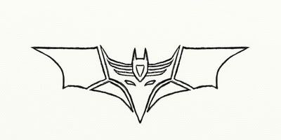
EDIT: Made a quick change, redirected the upper corners of the lower wings so that they are parallell to the con's ears. Makes the transformer look more organic and whole. I' keeping the original for you to comment the differences. New version:
Ok first things first, regardless of the more or less straight lines, I decided to do this in Artrage like my other pics. It looks more hand-drawn and effective this way, but that's just my opinion. After much labor, I simply decided to do one half, then duplicate and flip it (basically a cheat against realism, but I was reaaally "lazied" out).
What I'm still pondering about is the necessity to break the upper wings from the sides of the decepticon head. I didn't want them separately at first, but the idea seemed better if the decepticon's pointy ears were to stand out.
Anyway, this all is just W.I.P, no clear lines, no corrections, nothing yet. Hell, I might even re-do it in Flash or something, to make it more accurate (and decent for a wallpaper!). The version above is downscaled, the original will be 1600x1200. The project is simply named "deceptibat" , pardon me for the lack of imagination.
I sincerely ask not to duplicate or use this pic in any way, with the exception that you'll link to this page. However, do whatever you want with it once its finished :P
Comments please!
P.S. Sideswipe is frozen, sorry guys. This one just seems more interesting. The outlines I posted a while ago are right here, check them out.
EDIT2: And since SGTiD1NG0 here was upset with the aforementioned being somewhat "cancelled", I post this more recent pic for assuring him that sometimes I do re-work old things :P
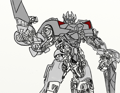
Well it has been like this for a while now. And the coloring sucks, I know, don't mention it please....
As for the changes, well, I flipped the right hand (had a hell of a time re-aligning the fingers), which led to the utter removal of the back doors, since they clashed with the arm (resulting in an unclear mess). I guess the original pic isn't needed anymore, nothing to compare really. This one is practically a standalone project now.
Oh, and full size is right here in my new album if anyone's interested.
Log in to comment