Gamespot Ice 2.0 Theme (Now with More Themes)
This topic is locked from further discussion.

Tell me about it. It took forever to add the links into my sig.yer I know, it sucks :( sadly it's the only reliable way around it until GS finally let us use the words style and class in xhtml normally again though..still better than not being able to use them altogether though I guess...just copy and paste the relevant part so that you don't have to keep adding them back in if you plan on doing multiple edits...or just copy&paste amp;amp; to speed up replacing the removed bits :P As for the slow update..I'm not changing my sig for a while anyway..I want them to fix the damned horizontal rules 1st, mine are suppose to be thicker, and coloured...they're barely visible :|
Edit: And the new forums take forever to update sigs. >=(bededog
[QUOTE="fastesttruck"] TFG you mean your tring to re make an old layout for us to use or just the colors? the_foreign_guy
Just the colors of the olden GS, aka 2001 era. Making a layout would be too difficult, as coding can get messed up.
heh, neat idea..good job there's archive sites to help get a good idea as to the precise colours otherwise that could take forever to get right :P heh, I have 4 custom GS themes now: ice, blood, forest, and my own custom dark one with a bit of blood red (with ever so slightly brighter red border) for emphasis that I'm using atm :P I think that'll do me well for a while..at least I don't have to put up with GS's standard choice of colours now ^^
TFG what would be needed to to re make a lay out? Would there be any way to rip it out of the Union lay out real fast before its gone?fastesttruck
Tons of coding, saving old images like the buttons and stuff, and other things. It probably possible, but it'll take too much time and effort and there might be problems since the codes been overhauled as well.
robbristow
I just thought of just using tinyurl It'll save us from having to edit the code. I wish I thought of this sooner.
TFG what would be needed to to re make a lay out? Would there be any way to rip it out of the Union lay out real fast before its gone?fastesttruckfastest way is to view the source and pick out the relevant parts as far as I'm aware (very long winded)..it'd be a pain regardless though, and the current union appearance isn't the 2001 one anyway (2001 GS)
I just thought of just using tinyurl It'll save us from having to edit the code. I wish I thought of this sooner. the_foreign_guylol, good point, funny how the obvious solution is rarely ever seen until after the more complicated solution...lol.

What about removing some of the useless crap like the Unions list? would that be any easier? fastesttruck
****ing this.
Hey, does GameSpot have a modding community akin to GameFAQs's Blood Money and GameFOX, or is this pretty much the extent of it? :/
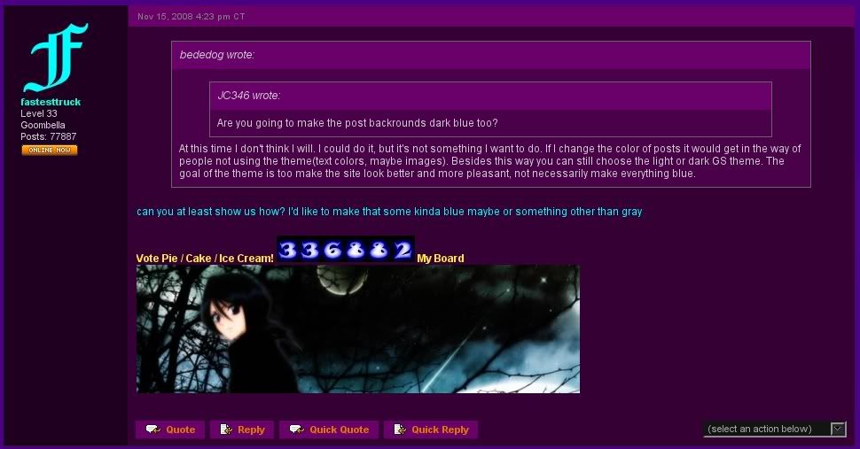
Are you going to make the post backrounds dark blue too?JC346At this time I don't think I will. I could do it, but it's not something I want to do. If I change the color of posts it would get in the way of people not using the theme(text colors, maybe images). Besides this way you can still choose the light or dark GS theme. The goal of the theme is too make the site look better and more pleasant, not necessarily make everything blue.
Updated OP to fix links. Now the links go to tinyurl first to save headache from html errors.
Also, I put a link to bededog's guide on how to customize the Ice theme to your heart's content.
Edit: Also added a FAQ section.
[QUOTE="JC346"]Are you going to make the post backrounds dark blue too?bededogAt this time I don't think I will. I could do it, but it's not something I want to do. If I change the color of posts it would get in the way of people not using the theme(text colors, maybe images). Besides this way you can still choose the light or dark GS theme. The goal of the theme is too make the site look better and more pleasant, not necessarily make everything blue. can you at least show us how? I'd like to make that some kinda blue maybe or something other than gray
[QUOTE="bededog"][QUOTE="JC346"]Are you going to make the post backrounds dark blue too?fastesttruckAt this time I don't think I will. I could do it, but it's not something I want to do. If I change the color of posts it would get in the way of people not using the theme(text colors, maybe images). Besides this way you can still choose the light or dark GS theme. The goal of the theme is too make the site look better and more pleasant, not necessarily make everything blue. can you at least show us how? I'd like to make that some kinda blue maybe or something other than gray Okay, I'm been messing around with it a bit and here's what I got(using the Plum theme :P):
Here is the purple theme I was talking about. :P Gamespot Plumbededog
IMO, the black bg I provided looks better and more modern than wood.

Okay so I'm also changing the topics list as well. I'm making the Stickied topics slightly more darker then the regular topics. Question is, is this too subtle, should I make the difference in color a bit bigger?bededog
That looks very nice. It reminds me of the 2004/2005 look, only the blue was a little darker. But that looks great.

Okay so I'm also changing the topics list as well. I'm making the Stickied topics slightly more darker then the regular topics. Question is, is this too subtle, should I make the difference in color a bit bigger? bededogThe color behind the OT guidelines topic looks great, but the color behind the Ice 2.0 thread blends in too much with the regular topics. It'd be nice if you make that a tiny bit darker.

Okay so I'm also changing the topics list as well. I'm making the Stickied topics slightly more darker then the regular topics. Question is, is this too subtle, should I make the difference in color a bit bigger?
You should make the stickied topics both the dark blue color. See how that looks.
[QUOTE="bededog"]Okay so I'm also changing the topics list as well. I'm making the Stickied topics slightly more darker then the regular topics. Question is, is this too subtle, should I make the difference in color a bit bigger?
You should make the stickied topics both the dark blue color. See how that looks.
Some good thinkin' there, it turned out a lot better then before:
robbristow I know Unions aren't the real old lay out. I don't care of that one TBH. Seems like its more than its worth tho. What about removing some of the useless crap like the Unions list? would that be any easier? fastesttruckyou could always get the div value for that module and hide (setting 'display: none' is the easiest way I believe) all the parts of it I guess...but then other things in that column would either move up to fill the space, or you'd be left with a blank space (the former is more likely, as display: none basically removes the element altogether)...I can't even guarantee that would work though as stylish can't necessarily do that, and I'm not particularly familiar with it..though changing colours and images with it is certainly quite easy. An alternative I guess would be to change everything in the module to a blank image..but that would require far more code and leave a blank space where the module is.
^looking good; my custom dark one looks good with the greys anyway, but the ice one in particular looks a lot better with the custom coloured post bg[QUOTE="fastesttruck"] robbristow I know Unions aren't the real old lay out. I don't care of that one TBH. Seems like its more than its worth tho. What about removing some of the useless crap like the Unions list? would that be any easier? robbristowyou could always get the div value for that module and hide (setting 'display: none' is the easiest way I believe) all the parts of it I guess...but then other things in that column would either move up to fill the space, or you'd be left with a blank space (the former is more likely, as display: none basically removes the element altogether)...I can't even guarantee that would work though as stylish can't necessarily do that, and I'm not particularly familiar with it..though changing colours and images with it is certainly quite easy. An alternative I guess would be to change everything in the module to a blank image..but that would require far more code and leave a blank space where the module is.I believe you can use any CSS with Stylish. The display: none worked just fine:
 Although I had to change the size of the forum topics GS had it as a fixed width.
How do I get that light blue background for the ice theme back? I'm not really digging this black look.Renegade_FuryI forgot I still had it on the dark wood background. Go to manage themes in Stylish and choose Gamespot Ice 2.0. This should bring up a window with the code of the style. Find the section that says '/* Changes the background image of the site */' In the url just under that replace the bg_wood.jpg with gsGutter.jpg
[QUOTE="Renegade_Fury"]How do I get that light blue background for the ice theme back? I'm not really digging this black look.bededogI forgot I still had it on the dark wood background. Go to manage themes in Stylish and choose Gamespot Ice 2.0. This should bring up a window with the code of the style. Find the section that says '/* Changes the background image of the site */' In the url just under that replace the bg_wood.jpg with gsGutter.jpg
Alright, I got it to work. Once again thanks for the awesome work! :)
Please Log In to post.
Log in to comment