Gamespot Ice 2.0 Theme (Now with More Themes)
This topic is locked from further discussion.
[QUOTE="viper1991"]There is something wrong with mine now. In the individual game boards there is no sidebar on the right so the topics all stretch across to the right.bededogThanks for telling me about that. I found a fix and I'll update the themes in a second. :)
Ok, thanks that's fixed it.
 I have adblock so I didn't see that the ads were messing with the theme. I'm not sure what I'm going to do to fix it though. The easiest option would be to hide the ad,,, but I don't think GS would like that. :P
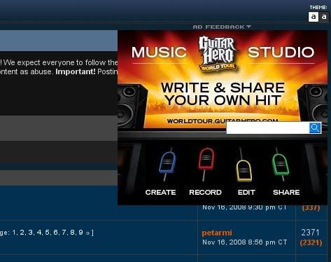
I just wanted to know, are you guys getting something like this?
I have had that pop up many times. I just ignore it. It only covers up 1 name on the forum.:)

I just wanted to know, are you guys getting something like this?lol, I'd just hide it anyway if it was messing up the theme :P personally I have adblock anyway though so it doesn't really matter to me. Good to know that display works with stylish..I'm pretty sure you could redesign an entire website style including the layout in that case...though it would be quite a lot of work for a site like GS...not something I plan to get involved in XD I already have a black XP and FF3 theme, and a selection of GS colour schemes now..that's enough for me for a while, I can put up with the new layout for the most part...though I'm probably gonna swap the (quick) reply/quote button orders around, back to what they used to be, at some point...
I just wanted to know, are you guys getting something like this?
this was what I was talking about yesterday night. Every theme does this. And I dont have adblock.
how do I stop a bg image from repeating and consume the entire page almost like how GS does with ads on the main site page? I apply the image into the script and remove background-repeat: repeat !important; , it doesnt repeat but it doesnt consume the entire page. What code do I have to type?Tjeremiah1988If you basically want to stretch the image rather than tile/repeat it then that's a little complicated as there's no way to do so (properly) in the current CSS as far as I'm aware (though there's a decent chance it'll be added whenever CSS3 is complete - it's still an ideas/design stage atm)...there is a way to essentially fake such a thing, but it generally involves using both css and xhtml...which may not even work in stylish, as it seems to be CSS remodelling only...you're welcome to try and make it work with stylish of course..but I doubt it'll work out well if you're not familiar with CSS.
[QUOTE="Tjeremiah1988"]how do I stop a bg image from repeating and consume the entire page almost like how GS does with ads on the main site page? I apply the image into the script and remove background-repeat: repeat !important; , it doesnt repeat but it doesnt consume the entire page. What code do I have to type?robbristowIf you basically want to stretch the image rather than tile/repeat it then that's a little complicated as there's no way to do so (properly) in the current CSS as far as I'm aware (though there's a decent chance it'll be added whenever CSS3 is complete - it's still an ideas/design stage atm)...there is a way to essentially fake such a thing, but it generally involves using both css and xhtml...which may not even work in stylish, as it seems to be CSS remodelling only...you're welcome to try and make it work with stylish of course..but I doubt it'll work out well if you're not familiar with CSS.
thanks for the info.
How do I change the plum on top to a different color and font?
Thanks!!
I just downloaded the latest update but I am not liking it as much as I was before, there is no way to go back to the Ice 2.0 I was using before is there? :(
EDIT: I am trying to edit out the code that I don't want myself, but to no avail. Basically, I want the grey topic backgrounds back, just with everything else in the sweet ice look, and I also want the stuff on the side of the board's page back e.g. Friends online etc. Can anybody tell me how to edit it out? I must be doing something wrong and I can't see what it is.
If you go through the code looking at each of the comments then you basically just need to delete each part (might as well delete the comment too), including the div parts and the entire section(s) in {}s immediately under that comment (just highlight from the start of the comment (incl. the /*) to the end of the data section for that part (i.e., until the next comment starts) and delete all that for the parts you want rid of, the comments do seem to be sufficiently precise, at least in the Ice 2.0 version, so they should give you enough info. to be able to delete the right sections; the preview button helps when trying to figure out what each part is if you have any trouble with it: the part that talks about distinquishing part of the page from others is one that you want, and the authors part near it is another I believe, as for the stuff on the side of the board, that's all the sections mentioning hiding things and stretching the boards to fill the empty space near the end of the code.)...might take you a little while to do, but it's not that big a job really thanks to all the comments in conjunction with the preview button making it fairly easy to figure out what is what in the code.I just downloaded the latest update but I am not liking it as much as I was before, there is no way to go back to the Ice 2.0 I was using before is there? :(
EDIT: I am trying to edit out the code that I don't want myself, but to no avail. Basically, I want the grey topic backgrounds back, just with everything else in the sweet ice look, and I also want the stuff on the side of the board's page back e.g. Friends online etc. Can anybody tell me how to edit it out? I must be doing something wrong and I can't see what it is.
Caddy06_88

If you go through the code looking at each of the comments then you basically just need to delete each part (might as well delete the comment too), including the div parts and the entire section(s) in {}s immediately under that comment (just highlight from the start of the comment (incl. the /*) to the end of the data section for that part (i.e., until the next comment starts) and delete all that for the parts you want rid of, the comments do seem to be sufficiently precise, at least in the Ice 2.0 version, so they should give you enough info. to be able to delete the right sections; the preview button helps when trying to figure out what each part is if you have any trouble with it: the part that talks about distinquishing part of the page from others is one that you want, and the authors part near it is another I believe, as for the stuff on the side of the board, that's all the sections mentioning hiding things and stretching the boards to fill the empty space near the end of the code.)...might take you a little while to do, but it's not that big a job really thanks to all the comments in conjunction with the preview button making it fairly easy to figure out what is what in the code.robbristow
That is what I was doing earlier, but I must have been doing something a little wrong somewhere and it wasn't going through. Anyway, I know how have the grey background back for topics and posts, but the rest of the site is in ice, which I love. I think I might go on to tweak a few things here and there, but I really do love this whole thing. Thanks for helping :)

Caddy: Download this txt file and copy and paste the code. I can't write it here because of html errors.
Download here.
Also I might put the stuff on the right of the page back. You don't really gain anything when you stretch the forums out like it is now.
[QUOTE="bededog"]First you want the forums to be different colors, now you don't. Make up your minds!ff7fan2I personally love it...reminds me of the old blue forums.I didn't think I would like the blue colored forums at first but now I just can't go back to the black and gray colors. Hell, I'm even warming up to Gamespot Blood...

[QUOTE="bededog"]First you want the forums to be different colors, now you don't. Make up your minds!ff7fan2I personally love it...reminds me of the old blue forums. Same here. I haven't updated in a bit, so right now the right toolbar with the friends list, ect. is gone (which I like; makes the topic list wider). The game specific forum is also wider, which I also like. So I'm very happy with this look and probably won't be changing.
You guys are impossible to please! First you want the forums to be different colors, now you don't. Make up your minds! >=(
Also I might put the stuff on the right of the page back. You don't really gain anything when you stretch the forums out like it is now. bededog
this is what happens when you try to please everyone :P. Why you think companies ignore the majority?
[QUOTE="ff7fan2"][QUOTE="bededog"]First you want the forums to be different colors, now you don't. Make up your minds!bededogI personally love it...reminds me of the old blue forums.I didn't think I would like the blue colored forums at first but now I just can't go back to the black and gray colors. Hell, I'm even warming up to Gamespot Blood...My current one is now based on the blood one lol; mine doesn't have quite as much red as blood, but the general scheme is the same, just with a few fine tunings to my liking :P...and I prefer the parts on the right being gone and the forums stretch, it looks better, and if you really want to access them it's easy enough to just temporarily disable the style briefly. I think it's fine as it is, people get the code when they download them so really they can customise little bits like that themselves, even if they need a bit of guidance. No need to try and cater to everyone's needs, you'll be editing and re-editing the code all year if you try to do that :P Btw, just noticed for the search icon only the one just above the forums is changed, the one in the site footer isn't; simple fix of course: the extra part is: form.search * button.submit into the affected fields, so that you don't have to go through the source to find that out :P would be nice to change the xml button as well, though you'd probably have to change both the white text colour and the orange bg of it for that one so that it's still reasonably easy to tell that it is xml that is written on it lol.

That could be it, but it works fine again now. 12 pages.horgen123strange little glitch..I had a similar issue with the editor being on when I had it turned off briefly a couple days ago too, seems the prefs are extra slow to update/play up a little on the odd occasion atm..doesn't seem to be a major issue for the most part though at least.
[QUOTE="horgen123"]That could be it, but it works fine again now. 12 pages.robbristowstrange little glitch..I had a similar issue with the editor being on when I had it turned off briefly a couple days ago too, seems the prefs are extra slow to update/play up a little on the odd occasion atm..doesn't seem to be a major issue for the most part though at least.Yeah. But it seems to be one time glitch for me. It works fine now luckily. Also I haven't changed the prefs in a long time here. Back on topic - I am quite happy with these colour changes. Not only looking good, but also easy to change :D
[QUOTE="bededog"]I've updated the themes. Polls are now colored and user sigs are now centered again.horgen123Finally. Sigs looked kinda weird for me being slightly to the left for me... Good work :)Yes, it was really annoying me as well. Why did GS do that anyway? >=(
[QUOTE="horgen123"][QUOTE="bededog"]I've updated the themes. Polls are now colored and user sigs are now centered again.bededogFinally. Sigs looked kinda weird for me being slightly to the left for me... Good work :)Yes, it was really annoying me as well. Why did GS do that anyway? >=(Much better :D I know why they did it though: apparently it caused bugs on the shared boards as the post area is still the same size as before there; so basically they reduced the sig area back to what it used to be (you could have sigs the full length of the post area for a while), leaving the sig area that's smaller than the post area right aligned rather than thinking to centre align it...this is certainly a great solution, means we can have them centred if we want while others that actually want their sig left aligned can have theirs properly left aligned..still, would be nice if GS did a fix to it, as like this everyone else not using the custom themes still sees all sigs to the left side :? The search icon thing: The Ice one has the bottom icon affected (newly updated or old I'm not sure, I don't use that one much now - prefer blood, and my own one :P), but not blood/forest (I don't know about plum, I don't have that one)... Altogether: Good Work :D

Please Log In to post.
Log in to comment