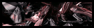
It's rather boring. The C4D's feel like they're there for the sake of being there. It feels rather empty, and boring. I don't like it, to be honest.Nothing really worthy of not, other than it's for a competition in liquid designs. Rate pls. .(i think) 4 c4ds.-kaz3-
Sig/Avay/Banner...Rate/Request/Discussion Thread.... "Dyn-o-mite" Edit
This topic is locked from further discussion.
Looks a lot like a mishmash of a lot of ideas that either didn't materialize correctly or you half-finished and just forgot about. The render just feels like an obstruction in relatively chaotic ambience (huh?), and on the right, the orange thing you have going on looks sloppy. The white outline of it looks cooler. I really think this sig, should it be replicated with cooler or more neutral colors, would definitely look better.Rate this!!
Napster06


[QUOTE="-kaz3-"][QUOTE="Kritical_Strike"]It seems to lack depth. The render is too sharp, and kind of grainy, and the background looks flat. The red electricity looks good though. 5/10[QUOTE="SolidSnake35"][QUOTE="Kritical_Strike"]Can someone rate my siggy please? Kritical_Strike
Whoa, I usually take any critisism without complaining, but I'm gonna have to make an exception here. Now, depth is when there is a clear foreground and background, and distance between the two. See how the background is out of focus (blurry)? And how the focal is in focus (sharp)? That's creating the illusion that there is clear distance between the foreground and background. Also I don't see how an army of helgast spreading into the distance (more depth) is "flat".
You're probably right on the sharpness though. It might be a difference in moniters, because it looks just right to me...
Sorry about being a bit defensive, but I can't just sit here quietly when I hear BS, now is today's lesson on depth sufficient? CLASS DISMISSED.
Depth is not limited to something so simple. If that were the case, then all artworks without a clear distinction is flat? Hardly. I feel depth is more of the feeling of the unknown, like theres a lot more to the image than meets the eye. When i look at your sig...i see...lightning, that's it. (BTW, i suggest you use blending modes to erase the background of those lighning, increase the contrast of the original image, and use blending modes such as lighten, it works like a charm). Anyhoo, the background does look flat seeing as it's just the blurred background. Oh and what solidsnake said is true...its too abrupt, try using variable amounts of blurring based on an estimation of distance, Despite all of that, it's better than..i'd say....8 out of 10 sigs i see in this thread. Edit: BS? Hardly, it's mostly true what he said, and I'd say most experienced artists would agree depth isn't as shallow as you described it to be. (Sorry if i sound like a prick im not trying to be one :|)I used a purely technical definition of depth, so don't try to pull that abstract thing on me.
I was correcting his claim that my sig "lacked depth", even he admitted that he worded it wrong, I didn't disagree with anything else he said. So, in essence, his claim of my piece lacking depth really is BS, so I responded (as for the varying amounts of blurr in the background, that's exactly what I did, the buildings in the background are far more blurred than the helgast soldiers, perhaps I should make it more obvious). As for the lightning background, I intentionally left it in, and it's not all I added in. I spent a lot of time perfecting the lighting on my focal, something your current sig isn't doing (ok that was uncalled for, couldn't help it).
BUT, I like your other advice, I'll take it into account and make some adjustments. As for there "only being lightning", I'm probably not going to add anything...I spent quite a while trying to figure out what else I could add, to no avail. So, thanks for the advice again.
Some people have grown tired of the obligatory bright lights on sigs after seeing it for like 2 years straight.....so yeah. :)
I remember being in this thread like nearly everyday...being greeted by conformest, gg12, and geodisicdome's endless 1/10s to a random new guy's sigs... All that seems to be so long ago (and quite frankly, it is). IDK, this place just seems so different now. Just reminiscing.-kaz3-It was a lot like a roll call thread wasn't it?
I remember being in this thread like nearly everyday...being greeted by conformest, gg12, and geodisicdome's endless 1/10s to a random new guy's sigs... All that seems to be so long ago (and quite frankly, it is). IDK, this place just seems so different now. Just reminiscing.-kaz3-Enlighten us...
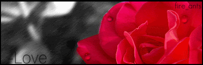
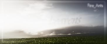
[QUOTE="Fire_Ants"]Rate some of mah stuffs:
ciaxhieu
totally hawt. i mean idk but just looking at it feels good, would be cool if u added a little shine effect
Yeah, that was the result of messing around with some twists. I like how it turned out, I've had comments ranging from "It's Choclatey" to "Reminds me of Ice Cream" :?


[QUOTE="-kaz3-"]I remember being in this thread like nearly everyday...being greeted by conformest, gg12, and geodisicdome's endless 1/10s to a random new guy's sigs... All that seems to be so long ago (and quite frankly, it is). IDK, this place just seems so different now. Just reminiscing.OborozukiyoIt was a lot like a roll call thread wasn't it?
No. Just a small group of cynics against a crowd of (sig-making) newbies. There are a few more fairly experienced now, and that's good I guess.
[QUOTE="Oborozukiyo"][QUOTE="-kaz3-"]I remember being in this thread like nearly everyday...being greeted by conformest, gg12, and geodisicdome's endless 1/10s to a random new guy's sigs... All that seems to be so long ago (and quite frankly, it is). IDK, this place just seems so different now. Just reminiscing.-kaz3-It was a lot like a roll call thread wasn't it?
No. Just a small group of cynics against a crowd of (sig-making) newbies. There are a few more fairly experienced now, and that's good I guess.dd if you are still here can you resize an image for me >__>

Are they good for a beginner like me?
Rate minezeroxin
Rate your what? gamercard?
I'm so artistically challenged so if any of you could help me out with a banner and a blog header for my profile that would be cool. I've seen a lot of awesome work in this thread. princesszeldaWell... What would you like in your blog header? And I have a friend who makes banners, request one from him here.
[QUOTE="princesszelda"]I'm so artistically challenged so if any of you could help me out with a banner and a blog header for my profile that would be cool. I've seen a lot of awesome work in this thread. jaydoughWell... What would you like in your blog header? And I have a friend who makes banners, request one from him here.
Thanks I posted a request there. I'm looking for a banner and blog header that contains images from Bioshock, Kingdom Hearts, Zeda and Mario.
Well... What would you like in your blog header? And I have a friend who makes banners, request one from him here.[QUOTE="jaydough"][QUOTE="princesszelda"]I'm so artistically challenged so if any of you could help me out with a banner and a blog header for my profile that would be cool. I've seen a lot of awesome work in this thread. princesszelda
Thanks I posted a request there. I'm looking for a banner and blog header that contains images from Bioshock, Kingdom Hearts, Zeda and Mario.
Okay, I finished the blog header, and I sent Nitemaredragon a pm with your request. :)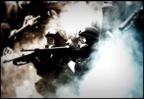
What did the original look like?Anyone wanna rate this pic I edited?
Fire_Ants
[QUOTE="jaydough"][QUOTE="Fire_Ants"]What did the original look like?Anyone wanna rate this pic I edited?
Fire_Ants
http://www.lysistrataproject.org/assets/riotpolice_miami.jpg
There ya go
Oh wow.. How'd you do that?can some one make me a avatar?
pm me if u can since im not always on to check this thread
[QUOTE="Fire_Ants"][QUOTE="jaydough"][QUOTE="Fire_Ants"]What did the original look like?Anyone wanna rate this pic I edited?
jaydough
http://www.lysistrataproject.org/assets/riotpolice_miami.jpg
There ya go
Oh wow.. How'd you do that? I hope you don't mind. First you start off by changing the color scheme. Try gradient maps on hue or huest saturation adjustment layers. Blur the background. Increase contrast. Darken outer edges with burn tool/gradientmap/brightness contrast adjustment layer That's about it, i think.

[QUOTE="jaydough"][QUOTE="Fire_Ants"][QUOTE="jaydough"][QUOTE="Fire_Ants"]What did the original look like?Anyone wanna rate this pic I edited?
-kaz3-
http://www.lysistrataproject.org/assets/riotpolice_miami.jpg
There ya go
Oh wow.. How'd you do that? I hope you don't mind. First you start off by changing the color scheme. Try gradient maps on hue or huest saturation adjustment layers. Blur the background. Increase contrast. Darken outer edges with burn tool/gradientmap/brightness contrast adjustment layer That's about it, i think.Well, since I dont use photoshop, thats probably what you do in PS. Thanks for taking the time to explain it :P

New|sig|plz|rate|K|thx|bai

New sig, drew it myself. Please rate! :Dthe_foreign_guyWhy?:cry: First Trev, now you...
Just reposting because I really want this banner.Can somebody make me a banner that says Dargiboo on it and has this Flo Rida image http://www.artistdirect.com/Images/artd/amg/music/bio/4208278_florida_200x200.jpg or a different one that is similar?
Dargiboo
I have a new signature, but I'm thinking it might be too small. Opinions?Dracargen
t looks stretched, but i gotta say, skillet rocks!
[QUOTE="Dargiboo"]Just reposting because I really want this banner. Who is the person in the banner? I might be able to make it, although, I am a GIMP newb.Can somebody make me a banner that says Dargiboo on it and has this Flo Rida image http://www.artistdirect.com/Images/artd/amg/music/bio/4208278_florida_200x200.jpg or a different one that is similar?
Dargiboo
need a sig
size: 350 x120
pic: http://www.wallpapergarage.com/library/EVLR34/EVLR34_1280x1024_1.jpg
i only want the car in the sig
with my name on it somehwhere in a cool font
background: make it white with red and orange stripes, if it doesnt look good, do what background you want, dont worry i trust you:P
thanks to anyone who makes this
I remember being in this thread like nearly everyday...being greeted by conformest, gg12, and geodisicdome's endless 1/10s to a random new guy's sigs... All that seems to be so long ago (and quite frankly, it is). IDK, this place just seems so different now. Just reminiscing.-kaz3-
I remember those days. And Clone too. Don't forget Clone.
need a sigsize: 350 x120pic: i only want the car in the sigwith my name on it somehwhere in a cool fontbackground: make it white with red and orange stripes, if it doesnt look good, do what background you want, dont worry i trust you:Pthanks to anyone who makes thisSaL_92I could possibly make it for you, if you had the make and model so I can find a render.
[QUOTE="Dargiboo"][QUOTE="Dargiboo"]Just reposting because I really want this banner.Who is the person in the banner? I might be able to make it, although, I am a GIMP newb.Can somebody make me a banner that says Dargiboo on it and has this Flo Rida image http://www.artistdirect.com/Images/artd/amg/music/bio/4208278_florida_200x200.jpg or a different one that is similar?
jaydough
It's Flo Rida, he made the song Low with T-Pain. It's my favorite song and has been the top selling song on iTunes for about three months if not more. I would LOVE it if you could make one. I don't care about the quality a lot though. As long as it's like the album cover of his EP on iTunes or something like it (his EP is the picture on the link). I'll check this thread just about daily unless you want to communicate by PMing. I don't really know how requests work so just tell me what we're doing or if you can't make it thanks anyway.
[QUOTE="jaydough"][QUOTE="Dargiboo"][QUOTE="Dargiboo"]Just reposting because I really want this banner.Who is the person in the banner? I might be able to make it, although, I am a GIMP newb.Can somebody make me a banner that says Dargiboo on it and has this Flo Rida image http://www.artistdirect.com/Images/artd/amg/music/bio/4208278_florida_200x200.jpg or a different one that is similar?
Dargiboo
It's Flo Rida, he made the song Low with T-Pain. It's my favorite song and has been the top selling song on iTunes for about three months if not more. I would LOVE it if you could make one. I don't care about the quality a lot though. As long as it's like the album cover of his EP on iTunes or something like it (his EP is the picture on the link). I'll check this thread just about daily unless you want to communicate by PMing. I don't really know how requests work so just tell me what we're doing or if you can't make it thanks anyway.
Alright, I found a good render for it. I'll PM you when it's done. :)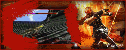
[QUOTE="SaL_92"]need a sigsize: 350 x120pic: i only want the car in the sigwith my name on it somehwhere in a cool fontbackground: make it white with red and orange stripes, if it doesnt look good, do what background you want, dont worry i trust you:Pthanks to anyone who makes thisjaydoughI could possibly make it for you, if you had the make and model so I can find a render. the car is a nissan skyline gtr r34. someone has made the sig for me, but if you think you can do better please do it. because i dont like this one all that much, and ive decided that i want the background to be blue to match the car.
Hey guys, just to let you guys know my name in 95% of all the forums i go to i'm named Omar MSP.so since i'm a newb i forget how to change my sig but here's one i made.
boricua86
It's prettty good but the quality on the image (not the gif) is kinda bad though. Nice choice of gif too.
also, I can't wait for Ninja Gaiden 2 :D
[QUOTE="jaydough"][QUOTE="SaL_92"]need a sigsize: 350 x120pic: i only want the car in the sigwith my name on it somehwhere in a cool fontbackground: make it white with red and orange stripes, if it doesnt look good, do what background you want, dont worry i trust you:Pthanks to anyone who makes thisSaL_92I could possibly make it for you, if you had the make and model so I can find a render. the car is a nissan skyline gtr r34. someone has made the sig for me, but if you think you can do better please do it. because i dont like this one all that much, and ive decided that i want the background to be blue to match the car. Okay, it doesn't seem all that hard, if I can find a render
Please Log In to post.
Log in to comment