Sig/Avay/Banner...Rate/Request/Discussion Thread.... "Dyn-o-mite" Edit
This topic is locked from further discussion.
As always, the focal is not well defined. The lighting has no direction and the color of the c4d does not match with Berial. I do like how you blended in the C4d though. It's just that no one point on this sig draws the viewer's eye, it's all over the place! ..focal? Ever heard of multiple focals? Stuff don't have to have one big bright spot right smack in the middle, you know. Agreeably, the right side is a bit bright maybe, but all over the place? I think not. As always? How many of my works have you seen anyway? You talk about flow as well? Ahem, flow once more is not singularly directional. So you don't like my composition, eh. We should battle some time. for fun ;)[QUOTE="-kaz3-"]
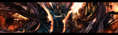
just bored. for a sig competition. c4d/1 dmc4 render._Dispair_
[QUOTE="-kaz3-"]The one in color is fine, but the black and white one is extremely boring. BW versions are normally put for those who ***** about the colors. But yes i see what you mean. I definitely prefer the first.
 edit: ah eff this. I'll make a new one instead. A fairly old LP. http://kaz-3.deviantart.com/art/Look-Away-72843606
 Rate and comment, please. ^_^HawtCredit for the c4ds go to Kaz, and Kaz... I also stole your border style. I hope you don't mind. :oops:SolidSnake35
[QUOTE="_Dispair_"]As always, the focal is not well defined. The lighting has no direction and the color of the c4d does not match with Berial. I do like how you blended in the C4d though. It's just that no one point on this sig draws the viewer's eye, it's all over the place! ..focal? Ever heard of multiple focals? Stuff don't have to have one big bright spot right smack in the middle, you know. Agreeably, the right side is a bit bright maybe, but all over the place? I think not. As always? How many of my works have you seen anyway? You talk about flow as well? Ahem, flow once more is not singularly directional. So you don't like my composition, eh. We should battle some time. for fun ;)[QUOTE="-kaz3-"]
Dude, there is no flow. One c4d comes in one way, and another one comes in at a totally unrelated direction. When I look at it, my eye is not drawn to any one thing on the sig, it's just...there. Berial's face should be the focal, I know what multiple focals is but this is not a good example.
And I've seen many of your works, kaz, I've been around here longer than this account has. Doesn't my current look familiar?
(and yes we should battle, owning you would be very satisfying, nothing personal of course :D)

Rate and comment, please. ^_^
I much prefer your current EW sig.

[QUOTE="_Dispair_"]No flow + bad compo = fail Please excuse my blunt honesty :(SolidSnake35No, I won't. Don't bother next time because that was as useful as a chocolate teapot. :)
You've been doing sigs for a while now, Snake. I think you should be able to interpret what I said into some useful advice. Please don't tell me I have to define compo and flow to you :|
And who wouldn't want a chocolate teapot? It's chocolate, you must be outta your freakin' mind dude.
No, I won't. Don't bother next time because that was as useful as a chocolate teapot. :)[QUOTE="SolidSnake35"][QUOTE="_Dispair_"]No flow + bad compo = fail Please excuse my blunt honesty :(_Dispair_
You've been doing sigs for a while now, Snake. I think you should be able to interpret what I said into some useful advice. Please don't tell me I have to define compo and flow to you :|
And who wouldn't want a chocolate teapot? It's chocolate, you must be outta your freakin' mind dude.
the composition is basically the same as your current sig.
[QUOTE="_Dispair_"]No, I won't. Don't bother next time because that was as useful as a chocolate teapot. :)[QUOTE="SolidSnake35"][QUOTE="_Dispair_"]No flow + bad compo = fail Please excuse my blunt honesty :(Brutal_Elitegs
You've been doing sigs for a while now, Snake. I think you should be able to interpret what I said into some useful advice. Please don't tell me I have to define compo and flow to you :|
And who wouldn't want a chocolate teapot? It's chocolate, you must be outta your freakin' mind dude.
the composition is basically the same as your current sig.
I don't see any notable similarities, elaborate.No, I won't. Don't bother next time because that was as useful as a chocolate teapot. :)[QUOTE="SolidSnake35"][QUOTE="_Dispair_"]No flow + bad compo = fail Please excuse my blunt honesty :(_Dispair_
You've been doing sigs for a while now, Snake. I think you should be able to interpret what I said into some useful advice. Please don't tell me I have to define compo and flow to you :|
And who wouldn't want a chocolate teapot? It's chocolate, you must be outta your freakin' mind dude.
I think you'll have to. I don't know how I can relate that to what I've done wrong.[QUOTE="Brutal_Elitegs"][QUOTE="_Dispair_"]No, I won't. Don't bother next time because that was as useful as a chocolate teapot. :)[QUOTE="SolidSnake35"][QUOTE="_Dispair_"]No flow + bad compo = fail Please excuse my blunt honesty :(_Dispair_
You've been doing sigs for a while now, Snake. I think you should be able to interpret what I said into some useful advice. Please don't tell me I have to define compo and flow to you :|
And who wouldn't want a chocolate teapot? It's chocolate, you must be outta your freakin' mind dude.
the composition is basically the same as your current sig.
I don't see any notable similarities, elaborate.The main entity of the sig (the helghast? and EW) are both smack in the middle looking to the right.
[QUOTE="_Dispair_"][QUOTE="Brutal_Elitegs"][QUOTE="_Dispair_"]No, I won't. Don't bother next time because that was as useful as a chocolate teapot. :)[QUOTE="SolidSnake35"][QUOTE="_Dispair_"]No flow + bad compo = fail Please excuse my blunt honesty :(Brutal_Elitegs
You've been doing sigs for a while now, Snake. I think you should be able to interpret what I said into some useful advice. Please don't tell me I have to define compo and flow to you :|
And who wouldn't want a chocolate teapot? It's chocolate, you must be outta your freakin' mind dude.
the composition is basically the same as your current sig.
I don't see any notable similarities, elaborate.The main entity of the sig (the helghast? and EW) are both smack in the middle looking to the right.
You've neglected the objects and effects surrounding the focal. I'm afraid you've failed.
[QUOTE="Brutal_Elitegs"][QUOTE="_Dispair_"][QUOTE="Brutal_Elitegs"][QUOTE="_Dispair_"]No, I won't. Don't bother next time because that was as useful as a chocolate teapot. :)[QUOTE="SolidSnake35"][QUOTE="_Dispair_"]No flow + bad compo = fail Please excuse my blunt honesty :(_Dispair_
You've been doing sigs for a while now, Snake. I think you should be able to interpret what I said into some useful advice. Please don't tell me I have to define compo and flow to you :|
And who wouldn't want a chocolate teapot? It's chocolate, you must be outta your freakin' mind dude.
the composition is basically the same as your current sig.
I don't see any notable similarities, elaborate.The main entity of the sig (the helghast? and EW) are both smack in the middle looking to the right.
You've neglected the objects and effects surrounding the focal. I'm afraid you've failed.
All the effects are subsidiary to the main character, and you know it.
[QUOTE="_Dispair_"][QUOTE="Brutal_Elitegs"][QUOTE="_Dispair_"][QUOTE="Brutal_Elitegs"][QUOTE="_Dispair_"]No, I won't. Don't bother next time because that was as useful as a chocolate teapot. :)[QUOTE="SolidSnake35"][QUOTE="_Dispair_"]No flow + bad compo = fail Please excuse my blunt honesty :(Brutal_Elitegs
You've been doing sigs for a while now, Snake. I think you should be able to interpret what I said into some useful advice. Please don't tell me I have to define compo and flow to you :|
And who wouldn't want a chocolate teapot? It's chocolate, you must be outta your freakin' mind dude.
the composition is basically the same as your current sig.
I don't see any notable similarities, elaborate.The main entity of the sig (the helghast? and EW) are both smack in the middle looking to the right.
You've neglected the objects and effects surrounding the focal. I'm afraid you've failed.
All the effects are subsidiary to the main character, and you know it.
Mmmm
I'm aware that in the world of sig-making, composition, or compo consists of the focal and the objects/effects around it. Flow is the relation of these effects/objects to the focal. If you use a different definition of "composition" that's not my problem.
diagram 1
I'll cover the flow first. This is very simple, the left side is obviously "flowing" out away from the focal. The left side isn't doing anything, it is CHAOS. It's ugly.
diagram 2
Why is all the selected area blurry? It's not adding any depth, infact it's confusing the eye of the viewer. Is it meant to be smoke? Then why are there random chunks taken out of it?
I think my use of the word "compo" has confused you, I may of misused it. What I meant to say was, the effects around the focal are meaningless and ugly. There's no flow on the right side, and the color is more bland than cornflakes without sugar.
I'm no master, so don't start pointing out the flaws in my current, I know it's flawed, heck, what sig ISN'T flawed? I'm just specifically pointing out what I think is wrong with your sig.
(sorry I had to draw on your piece btw)
Why is all the selected area blurry? _Dispair_Because I suck at blending renders into the background. -_- What about this? I don't know if it's good or not... what's more important to me is whether I'm improving or not.

[QUOTE="_Dispair_"]Why is all the selected area blurry? SolidSnake35Because I suck at blending renders into the background. -_- What about this? I don't know if it's good or not... what's more important to me is whether I'm improving or not.
Now that...I love. :D Sharpen the focal a tad
diagram 1
I'll cover the flow first. This is very simple, the left side is obviously "flowing" out away from the focal. The left side isn't doing anything, it is CHAOS. It's ugly.
diagram 2
Why is all the selected area blurry? It's not adding any depth, infact it's confusing the eye of the viewer. Is it meant to be smoke? Then why are there random chunks taken out of it?
I think my use of the word "compo" has confused you, I may of misused it. What I meant to say was, the effects around the focal are meaningless and ugly. There's no flow on the right side, and the color is more bland than cornflakes without sugar.
I'm no master, so don't start pointing out the flaws in my current, I know it's flawed, heck, what sig ISN'T flawed? I'm just specifically pointing out what I think is wrong with your sig.
(sorry I had to draw on your piece btw)
_Dispair_
That's fair. I may have been a bit quick to point out that both have basically the same composition because that's not entirely true. Your sig has more flow and is better compositionally wise mainly because of those curved lines that are easy on the eye and you have given more focal to the main character with the lightsource behind the helghast and darkened the edges. I was just pointing out that the main entity of both sigs is smack in the middle. You would agree that all of these aren't compositionally the same?
Now that...I love. :D Sharpen the focal a tad_Dispair_Heh, thanks. Just so I know, what's good about this one? >.>
[QUOTE="_Dispair_"]diagram 1
I'll cover the flow first. This is very simple, the left side is obviously "flowing" out away from the focal. The left side isn't doing anything, it is CHAOS. It's ugly.
diagram 2
Why is all the selected area blurry? It's not adding any depth, infact it's confusing the eye of the viewer. Is it meant to be smoke? Then why are there random chunks taken out of it?
I think my use of the word "compo" has confused you, I may of misused it. What I meant to say was, the effects around the focal are meaningless and ugly. There's no flow on the right side, and the color is more bland than cornflakes without sugar.
I'm no master, so don't start pointing out the flaws in my current, I know it's flawed, heck, what sig ISN'T flawed? I'm just specifically pointing out what I think is wrong with your sig.
(sorry I had to draw on your piece btw)
Brutal_Elitegs
That's fair. I may have been a bit quick to point out that both have basically the same composition because that's not entirely true. Your sig has more flow and is better compositionally wise mainly because of those curved lines that are easy on the eye and you have given more focal to the main character with the lightsource behind the helghast and darkened the edges. I was just pointing out that the main entity of both sigs is smack in the middle. You would agree that all of these aren't compositionally the same?
I would say that they aren't the same. I get what you meant by 'composition' now.
[QUOTE="_Dispair_"]Now that...I love. :D Sharpen the focal a tadSolidSnake35Heh, thanks. Just so I know, what's good about this one? >.>
The lightning (which is very well done) compliments her very well. I have no idea how you did that. Also the lighting is well balanced and relates well to Ms. Watson.
That's the gist of it.

[QUOTE="BeardFamous"]My sig is plain, but I like it!!! :D_Dispair_
Whoa. I suggest you remove it, that could get you banned
You serious?? there is no nudity.
[QUOTE="_Dispair_"][QUOTE="BeardFamous"]My sig is plain, but I like it!!! :DBeardFamous
Whoa. I suggest you remove it, that could get you banned
You serious?? there is no nudity.
But it's extremely close and I'm sure people have gotten modded for much, much less.
[QUOTE="-kaz3-"][QUOTE="_Dispair_"]As always, the focal is not well defined. The lighting has no direction and the color of the c4d does not match with Berial. I do like how you blended in the C4d though. It's just that no one point on this sig draws the viewer's eye, it's all over the place! ..focal? Ever heard of multiple focals? Stuff don't have to have one big bright spot right smack in the middle, you know. Agreeably, the right side is a bit bright maybe, but all over the place? I think not. As always? How many of my works have you seen anyway? You talk about flow as well? Ahem, flow once more is not singularly directional. So you don't like my composition, eh. We should battle some time. for fun ;) Dude, there is no flow. One c4d comes in one way, and another one comes in at a totally unrelated direction. When I look at it, my eye is not drawn to any one thing on the sig, it's just...there. Berial's face should be the focal, I know what multiple focals is but this is not a good example.And I've seen many of your works, kaz, I've been around here longer than this account has. Doesn't my current look familiar?(and yes we should battle, owning you would be very satisfying, nothing personal of course :D) You talk the talk. But I have no idea WHO THE **** YOU ARE. Well, maybe I do, but there probably wrong anyway. Your current?...yeah I saw it in LD...wasn't it your account as well? You style is not really similar to any I've seen in thos thread. So please, enlighten me. Oh and the battle. Lets host it in LD ;) Nothing personal if I bruy your sorry butt into the ground:P edit: Oh NVM. I saw your URL...[QUOTE="-kaz3-"]
Where do you guys learn from, I especially like the weather type effects that Solidsnake uses, can someone tell me how I can improve on my photoshopping? I can google tutorials all I like, but you guys have gotten those skills..what should I be looking at?kruesaderI've just been experimenting for a couple of years. I know that sounds a lot, but I only open PS infrequently though. If you just keep looking at tutorials and taking skills from each one, you'll get better in no time. I think it's more important to just experiment with things, and take ideas from here and there to help you along. What is it that you're having trouble with? Anything in particular?
Where do you guys learn from, I especially like the weather type effects that Solidsnake uses, can someone tell me how I can improve on my photoshopping? I can google tutorials all I like, but you guys have gotten those skills..what should I be looking at?kruesader
Develop your own style.. Just start doing stuff that you like and everything starts to become better.. But it depends on what you want to do... I'm really into photo manipulation so when I have sometime I normally sit around 3-6 hours on a piece but you can also do webdesign and advertising.. the last two require way different techniques.. just try everything out and then move on to what you like to do best...
I'm not on a really high level of photoshop just around beginner.. getting to what I'm now takes around 1.5-2 years..
Oh and I can upload a couple of my PSD if anybody wants..
You talk the talk. But I have no idea WHO THE **** YOU ARE. Well, maybe I do, but there probably wrong anyway. Your current?...yeah I saw it in LD...wasn't it your account as well? You style is not really similar to any I've seen in thos thread. So please, enlighten me. Oh and the battle. Lets host it in LD ;) Nothing personal if I bruy your sorry butt into the ground:P edit: Oh NVM. I saw your URL...-kaz3-
Yeah the link in my sig kinda gives me away. Still wanna battle?
[QUOTE="SSCyborg"]
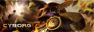
old sig is old
which looks better that or current? (both are extremely old, need to work on a new one.)
SSCyborg
Halp meh chooose.
I like your current one slightly more. It has better text and colours. ^_^ Oh and can someone rate my current one, please? I'm on a sig making rampage at the moment. >.>I like yours right now, so I would give it 9/10. It could have some more colors, but overall it is really good.
Could someone rate my current signature? I'm new with Photoshop, so any comments would be appreciated :D.
Nah, I wasnt asking for help with anything in particular (yet :P), just wondering if I was going on the right track to get better.kruesaderGot anything to show besides your current one?
[QUOTE="kruesader"]Nah, I wasnt asking for help with anything in particular (yet :P), just wondering if I was going on the right track to get better.SolidSnake35Got anything to show besides your current one?
Nothing really, Ill show you something I make when i get round to it and get some feedback.
Please Log In to post.
Log in to comment