Sig/Avay/Banner...Rate/Request/Discussion Thread.... "Dyn-o-mite" Edit
This topic is locked from further discussion.
http://www.adamgeyer.com/Gallery/Monsters/monsters_gallery.htm
the eviler, the better. much appreciated. 
the person who gets where my sig is from get s a cookie....gorilazandgamesYu-Gi-Oh Abridged.
I made this one last night. I dunno what is it with me and the color green lately.:P

Edit: Made it just a bit smaller.

I made this one last night. I dunno what is it with me and the color green lately.:P Edit: Made it just a bit smaller.guardian2angel1Looks nice. I'm not keen on the light parts near the left and right border, but the matrix effect is cool. ^_^
Please rate me, thank you12233345/10 for your self portrait, and the same for your sig. It could do with some work. Also, I'm not a fan of two sigs in one sig area. >_> Rate mine, please. ^.^
Rate mine, please. ^.^SolidSnake35
I like that one. Personally i would've liked if the lower right side was just a bit more brighter, but that's nothing major. Other than that i think it looks very purdy. It actually reminds me of one of your earlier Alba signatures.:)
I give it this many. *holds up ten fingers*
[QUOTE="SolidSnake35"]Rate mine, please. ^.^guardian2angel1
I like that one. Personally i would've liked if the lower right side was just a bit more brighter, but that's nothing major. Other than that i think it looks very purdy. It actually reminds me of one of your earlier Alba signatures.:)
I give it this many. *holds up ten fingers*
I see what you mean about the brightness, and I agree, it does look like my old Alba one. :P Thanks. ^_^[QUOTE="SolidSnake35"]Rate mine, please. ^.^guardian2angel1
I like that one. Personally i would've liked if the lower right side was just a bit more brighter, but that's nothing major. Other than that i think it looks very purdy. It actually reminds me of one of your earlier Alba signatures.:)
I give it this many. *holds up ten fingers*
Guardian, how did you get your sig like that, wouldnt the rest of the rectangle show up against my black GS background, or is that clear space
Guardian, how did you get your sig like that, wouldnt the rest of the rectangle show up against my black GS background, or is that clear spacekruesader
I opened a new canvas, and put another layer on it. After forming that layer into the shape i wanted, i deleted the background so it would show up clear.
[QUOTE="kruesader"]Guardian, how did you get your sig like that, wouldnt the rest of the rectangle show up against my black GS background, or is that clear spaceguardian2angel1
I opened a new canvas, and put another layer on it. After forming that layer into the shape i wanted, i deleted the background so it would show up clear.
oh ok, thanks alot!
Is there an easier way to add a black/line border around a rectangular layer then manually drawing it or using inner shadow?
This is a rough draft trying to make a border using inner shadow.

Im also not sure what to do with the background in this pic, some texture or form to it would be nice, but i dont really have many ideas.
[QUOTE="gorilazandgames"]the person who gets where my sig is from get s a cookie....slorg_kingYu-Gi-Oh Abridged. you win. :)
Is there an easier way to add a black/line border around a rectangular layer then manually drawing it or using inner shadow?
This is a rough draft trying to make a border using inner shadow.
Im also not sure what to do with the background in this pic, some texture or form to it would be nice, but i dont really have many ideas.
kruesader
Enorms tip of the day time:
1. double click on the rectangular layer in the layers panel on the right this should open the ''layer ****' window.. alright then you go all the way down to stroke and select your settings.. this will give you a nice line around your object..
or you can do it this way if you want to get a line around your whole canvas: go to your background layer then press CTRL + A this will select your whole canvas (you can see this when there are like walking little lines on your screen).. go to EDIT in your menu bar and then scroll down to ''stroke''..
YAY YOU MADE BORDERS IN PHOTOSHOP NOW YOU ARE ON YOUR WAY TO BECOME A MASTER.. =^_^=
[QUOTE="kruesader"]Is there an easier way to add a black/line border around a rectangular layer then manually drawing it or using inner shadow?
This is a rough draft trying to make a border using inner shadow.
Im also not sure what to do with the background in this pic, some texture or form to it would be nice, but i dont really have many ideas.
enormousaxie
Enorms tip of the day time:
1. double click on the rectangular layer in the layers panel on the right this should open the ''layer ****' window.. alright then you go all the way down to stroke and select your settings.. this will give you a nice line around your object..
or you can do it this way if you want to get a line around your whole canvas: go to your background layer then press CTRL + A this will select your whole canvas (you can see this when there are like walking little lines on your screen).. go to EDIT in your menu bar and then scroll down to ''stroke''..
YAY YOU MADE BORDERS IN PHOTOSHOP NOW YOU ARE ON YOUR WAY TO BECOME A MASTER.. =^_^=
Thank you very much! My PS skill just went up.
[QUOTE="enormousaxie"][QUOTE="kruesader"]Is there an easier way to add a black/line border around a rectangular layer then manually drawing it or using inner shadow?
This is a rough draft trying to make a border using inner shadow.
Im also not sure what to do with the background in this pic, some texture or form to it would be nice, but i dont really have many ideas.
kruesader
Enorms tip of the day time:
1. double click on the rectangular layer in the layers panel on the right this should open the ''layer ****' window.. alright then you go all the way down to stroke and select your settings.. this will give you a nice line around your object..
or you can do it this way if you want to get a line around your whole canvas: go to your background layer then press CTRL + A this will select your whole canvas (you can see this when there are like walking little lines on your screen).. go to EDIT in your menu bar and then scroll down to ''stroke''..
YAY YOU MADE BORDERS IN PHOTOSHOP NOW YOU ARE ON YOUR WAY TO BECOME A MASTER.. =^_^=
Thank you very much! My PS skill just went up.
No problem at all mate.. :-)
I am having a slight bit of trouble getting the clear background like in guardians sig, i started with a clear canvas and put the images over, there is definitely clear space behind it, but it comes out white in the .jpeg, anything i could be doing wrongkruesaderyup this can be fixed by not saving in JPEG (fills all the open spots in with wite) but by saving it as a .png or a .gif (.png is best)
You can do this by going up to the menu and clicking the file tab then scrolling down to ''Save for Web & Devices'' and selecting the save option you want to use.. :-)
yup this can be fixed by not saving in JPEG (fills all the open spots in with wite) but by saving it as a .png or a .gif (.png is best)[QUOTE="kruesader"]I am having a slight bit of trouble getting the clear background like in guardians sig, i started with a clear canvas and put the images over, there is definitely clear space behind it, but it comes out white in the .jpeg, anything i could be doing wrongenormousaxie
You can do this by going up to the menu and clicking the file tab then scrolling down to ''Save for Web & Devices'' and selecting the save option you want to use.. :-)
Thanks again,
any suggestions for spicing up my sig that i can do with ms paint(kids these days and their fancy photoshop)?LoG-SacramentMake it smaller to start with. Add a thick black border, as it'll add 'something' to it and it's also achievable.
[QUOTE="LoG-Sacrament"]any suggestions for spicing up my sig that i can do with ms paint(kids these days and their fancy photoshop)?SolidSnake35Make it smaller to start with. Add a thick black border, as it'll add 'something' to it and it's also achievable.
thar. i added a half border. i couldnt shorten it without losing most of the ears(damn you, ms paint).
Make it smaller to start with. Add a thick black border, as it'll add 'something' to it and it's also achievable.[QUOTE="SolidSnake35"][QUOTE="LoG-Sacrament"]any suggestions for spicing up my sig that i can do with ms paint(kids these days and their fancy photoshop)?LoG-Sacrament
thar. i added a half border. i couldnt shorten it without losing most of the ears(damn you, ms paint).
That's much better. 8)Hey guys here is version 1 of a frontpage slideshow for a project I'm working on.. It's not finished yet but looks decent enough to post it here.. I'll code version 2 in a couple of days and upload it on my server.. :-)

I Have Not made a sig in a long time...I think it shows. LOL. Rate anyways

enourmouse: good job. keep working.
bbd: I think it's kind of bright on the right side. ease the tone down.
PLease take a look at my new banner!
[QUOTE="LoG-Sacrament"]Make it smaller to start with. Add a thick black border, as it'll add 'something' to it and it's also achievable.[QUOTE="SolidSnake35"][QUOTE="LoG-Sacrament"]any suggestions for spicing up my sig that i can do with ms paint(kids these days and their fancy photoshop)?SolidSnake35
thar. i added a half border. i couldnt shorten it without losing most of the ears(damn you, ms paint).
That's much better. 8)ty. behold the power of ms paint
I Have Not made a sig in a long time...I think it shows. LOL. Rate anywaysbig_boy_down23It would look a lot better if it wasn't so over contrasted and bright. Not bad though.
[QUOTE="big_boy_down23"]It's terrible. Bland color scheme, no blending, contrast sucks, the sig is grainy.You win at being the most picky.I Have Not made a sig in a long time...I think it shows. LOL. Rate anyways
Cerussite
[QUOTE="SolidSnake35"][QUOTE="LoG-Sacrament"]Make it smaller to start with. Add a thick black border, as it'll add 'something' to it and it's also achievable.[QUOTE="SolidSnake35"][QUOTE="LoG-Sacrament"]any suggestions for spicing up my sig that i can do with ms paint(kids these days and their fancy photoshop)?LoG-Sacrament
thar. i added a half border. i couldnt shorten it without losing most of the ears(damn you, ms paint).
That's much better. 8)ty. behold the power of ms paint
you can always get gimp for free ...
[QUOTE="big_boy_down23"]It's terrible. Bland color scheme, no blending, contrast sucks, the sig is grainy. I said it wasn't bad. You dare to contradict me? :evil:I Have Not made a sig in a long time...I think it shows. LOL. Rate anyways
Cerussite
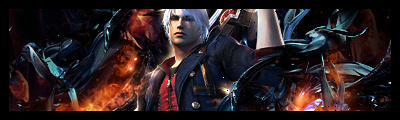 New one. Looks a bit too sharp, and I don't really like the glow on the left side of Dante (seems out of place). Still, I'm just nit-picking. It's good, of course, like always.
 [QUOTE="Cerussite"][QUOTE="big_boy_down23"]It's terrible. Bland color scheme, no blending, contrast sucks, the sig is grainy. I said it wasn't bad. You dare to contradict me? :evil:Yes. You dare contradict me?I Have Not made a sig in a long time...I think it shows. LOL. Rate anyways
SolidSnake35
[QUOTE="SolidSnake35"][QUOTE="Cerussite"][QUOTE="big_boy_down23"]It's terrible. Bland color scheme, no blending, contrast sucks, the sig is grainy. I said it wasn't bad. You dare to contradict me? :evil:Yes. You dare contradict me? Yep, on the basis of being kind. ^_^I Have Not made a sig in a long time...I think it shows. LOL. Rate anyways
Cerussite
Here's a new one i made yesterday. It's pleasantly pinkish.

 Meh...
 Meh...slorg_kingMeh? It's awesome. Really, it is.... It's probably one of your best, in my opinion. I love the colours and the lighting is really good too.
Here's a new one i made yesterday. It's pleasantly pinkish.guardian2angel1I quite like it, but I'd say that's purply grey not pink, except for the faint parts of the background. :P
I quite like it, but I'd say that's purply grey not pink, except for the faint parts of the background. :PSolidSnake35
I guess it does look more purply grey. :o
What an odd color.:P
Please Log In to post.
Log in to comment