this is my first attempt at a sig.

This topic is locked from further discussion.
this is my first attempt at a sig.
[QUOTE="slorg_king"]Meh...SolidSnake35Meh? It's awesome. Really, it is.... It's probably one of your best, in my opinion. I love the colours and the lighting is really good too.
Here's a new one i made yesterday. It's pleasantly pinkish.guardian2angel1I quite like it, but I'd say that's purply grey not pink, except for the faint parts of the background. :P
You seem to have, how should I say this....low standards?
[QUOTE="FrostyPhantasm"]this is my first attempt at a sig.
_Dispair_
It's alright for your first attempt, it's too big (obviously). You did some good blending on the render.
I like it alot, also it shouldnt be too hard to squeeze down into a 400x150 size or so,
[QUOTE="_Dispair_"][QUOTE="FrostyPhantasm"]this is my first attempt at a sig.
kruesader
It's alright for your first attempt, it's too big (obviously). You did some good blending on the render.
I like it alot, also it shouldnt be too hard to squeeze down into a 400x150 size or so,
 made it smaller
[QUOTE="kruesader"][QUOTE="_Dispair_"][QUOTE="FrostyPhantasm"]this is my first attempt at a sig.
FrostyPhantasm
It's alright for your first attempt, it's too big (obviously). You did some good blending on the render.
I like it alot, also it shouldnt be too hard to squeeze down into a 400x150 size or so,
made it smallerThats nice, the background texture is just right
Testing: 

Meh? It's awesome. Really, it is.... It's probably one of your best, in my opinion. I love the colours and the lighting is really good too.[QUOTE="SolidSnake35"][QUOTE="slorg_king"]Meh..._Dispair_
Here's a new one i made yesterday. It's pleasantly pinkish.guardian2angel1I quite like it, but I'd say that's purply grey not pink, except for the faint parts of the background. :P
You seem to have, how should I say this....low standards?
Not at all. I just think it's better to be nice about things. People have always been that way with me, even when I first started, so I feel I should treat people as they do me.
Heres my 2nd try.FrostyPhantasmPretty good again. Just try using smaller text, and making the render look as though it's a part of the background. By that I mean trying things like brushing over the render and making a background that's not just one colour.
[QUOTE="FrostyPhantasm"]Heres my 2nd try.SolidSnake35Pretty good again. Just try using smaller text, and making the render look as though it's a part of the background. By that I mean trying things like brushing over the render and making a background that's not just one colour.What kind of brushing would you recommend to do so? and for the multicolored backround, you mean try to use more different colors that are used on the render itself?
[QUOTE="SolidSnake35"][QUOTE="FrostyPhantasm"]Heres my 2nd try.FrostyPhantasmPretty good again. Just try using smaller text, and making the render look as though it's a part of the background. By that I mean trying things like brushing over the render and making a background that's not just one colour.What kind of brushing would you recommend to do so? and for the multicolored backround, you mean try to use more different colors that are used on the render itself?
[QUOTE="FrostyPhantasm"][QUOTE="SolidSnake35"][QUOTE="FrostyPhantasm"]Heres my 2nd try.SolidSnake35Pretty good again. Just try using smaller text, and making the render look as though it's a part of the background. By that I mean trying things like brushing over the render and making a background that's not just one colour.What kind of brushing would you recommend to do so? and for the multicolored backround, you mean try to use more different colors that are used on the render itself?
 Any better?
Any better?FrostyPhantasmConsiderably. The background is less 'bold' now so it all flows together nicely.
[QUOTE="FrostyPhantasm"] Any better?SolidSnake35Considerably. The background is less 'bold' now so it all flows together nicely.Thanks for the help, soon i shall be a pro! :lol:
[QUOTE="SolidSnake35"][QUOTE="FrostyPhantasm"] Any better?FrostyPhantasmConsiderably. The background is less 'bold' now so it all flows together nicely.Thanks for the help, soon i shall be a pro! :lol:

Rate my avatar.king23_
7.9/10 :D
Someone rate mine, too.
Rate my avatar.king23_
Whats with teh "Geovid"?
 New sig... I went easy on the colors?:O
My latest.
My latestFrostyPhantasmNice. It's very similar to your last one though. I recommend messing around with lighting effects for your next one. It can really make a big difference.
[QUOTE="FrostyPhantasm"]My latestSolidSnake35Nice. It's very similar to your last one though. I recommend messing around with lighting effects for your next one. It can really make a big difference.What would you recommend for a newbie on lighting effects?
I know this a pretty noobish question but how do you download new text? I need to know to make my sigs better.JC346I get fonts from www.dafont.com. Once you have the file, you need to save it with all the others. It's been a while since I did it on Windows, but I think you put it under program files > common files > adobe > photoshop. I'm sure you'll find it. If you use Mac OS, put it under library > fonts.
[QUOTE="SolidSnake35"][QUOTE="FrostyPhantasm"]My latestFrostyPhantasmNice. It's very similar to your last one though. I recommend messing around with lighting effects for your next one. It can really make a big difference.What would you recommend for a newbie on lighting effects?
So you mean something similar to this effect?

So you mean something similar to this effect?FrostyPhantasmMmm, yeah, kind of. :P Also, it's much easier to do these things on a smaller canvas. That's why I make my sigs no larger than 300x150.
[QUOTE="FrostyPhantasm"]So you mean something similar to this effect?SolidSnake35Mmm, yeah, kind of. :P Also, it's much easier to do these things on a smaller canvas. That's why I make my sigs no larger than 300x150.Yeah but their so...small

Mmm, yeah, kind of. :P Also, it's much easier to do these things on a smaller canvas. That's why I make my sigs no larger than 300x150.Yeah but their so...small Oh well. That one is your best yet by the way, but the text is a bit of an eyesore.[QUOTE="SolidSnake35"][QUOTE="FrostyPhantasm"]So you mean something similar to this effect?FrostyPhantasm
Whats the size of the avatars here?FrostyPhantasm80x80
[QUOTE="FrostyPhantasm"]Mmm, yeah, kind of. :P Also, it's much easier to do these things on a smaller canvas. That's why I make my sigs no larger than 300x150.Yeah but their so...small Oh well. That one is your best yet by the way, but the text is a bit of an eyesore.[QUOTE="SolidSnake35"][QUOTE="FrostyPhantasm"]So you mean something similar to this effect?SolidSnake35
Whats the size of the avatars here?FrostyPhantasm80x80 My new avatar and sig :lol:
![]()

I love your sigs.
[QUOTE="3abden"]it has been a while since I posted a sig here..
spyke412
That's beatiful.
I just shat brix. Seriously.:|[QUOTE="megahaloman64"]How do you like the joke in my sig?kruesader
Its the oldest joke known to man. -1/>9000
Your the oldest joke known to man, OWND!
Please Log In to post.
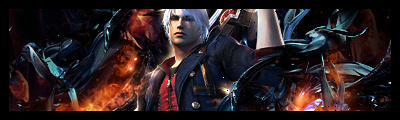 New one. Looks a bit too sharp, and I don't really like the glow on the left side of Dante (seems out of place). Still, I'm just nit-picking. It's good, of course, like always. Ah...unintentional, the outer glow :P

Log in to comment