[QUOTE="GeneralShowzer"]
[QUOTE="AdrianWerner"]Beautiful ownage :DWasdie
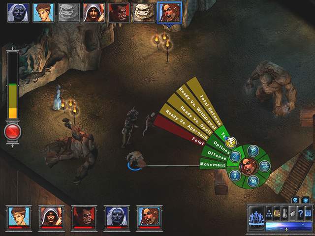
I don't really feel owned, because those menus are nothing alike. The Witcher only has five spells, two swords, and two stances. Wheel pop up screens are obvious sign of consolization. This is completely different stuff.:|
Are we serious? So BF2 was consolized because of the radial menu? All of the Sims games were consolized because of the radial menu.
Please do yourself a favor and look into the physiology behind UI development. It's one of the most difficult parts of developing software.
This constant accusation of every game under the sun of being "consozlied" because they are taking a UI scheme that is both extremely easy to understand and very versatile across multiple platforms is unbelievable wrong. Burying crap behind hundreds of drop-down menus, menus that take up huge chunks of the screen, hotkey bars that flood the screen with tons of icons, and all of that crap is remnants of a time where PC developers were still developing more streamlined UIs to increase usability amoung users.
You have no idea how many people are turned off by software when there are tons of menus and buttons they need to worry about. Drop down menus and tons of menu screens are one of the major reasons that PC gaming has always been considered only for the most nerdy and hardcore gamers. These games have high learning curves at it is and a clunky UI that's only easy to understand by people who have been playing games like it for years, only scares away new people. Also clunky interfaces detract from the whole experiance. Having to navigate on-screen drop down menus or memorize tons of hotkeys (especially when you need to have sequences of commands) makes the experiance both hard to learn and very choppy. Of course one could argue how we are all noobs and we should beable to learn complicated menus and hotkeys, but that argument goes completely against software development philosophy. If it can be easier, you make it easier. Keep it simple stupid, a simple phrase that guides modern software development.
This has little to do with consolization. This is our advancements in UI development. Radial menus are very easy to navigate with a mouse. Radial menus also play to people's physiological behavior and forming patterns. Not only are you aided by text, but now you'll have icons, colors, and directions.
For example a drop down menu requires you to know the exact position downwards from you mouse. Stacking multiple options in a single direction requires extra reading and usually has a higher learning curve. Menus are never sorted by color as then they are difficult to read. You're only option of using drop-down menus is text and hotkey combinations. With a radial menu you now have several different muscle reflexes and modes of identification that can be used. For example icons instead of text are much easier for the brain to identify. So a radial menu with icons above text are much smoother. Next you have color coding. The brain more easily identifies with colors than just text. You mix icons + color and you have more ways the brain can easily identify stuff.
However the most important part of the radial menu is the direction. Instead of always down, you're muscles will start to gain the habits of moving in different directions for different commands you want. With the radial menu in BF2 it became second nature to use the request ammo, health, or any of that stuff. You didn't even have to look at the text at all to know which one you are picking. This focuses the eyes on the game instead of the menu which streamlines the experience so that the game doesn't feel interrupted by menu commands.
The radial menu plays to human physiology much better. We are creatures of habit. Radial menus play to building habits much more quickly in our brain. They are also much easier for newer players to see what's available without every confusing them with extra info they don't need.
These radial menus have been in tons of programs and video games on the PC, even hardware sees forms of these radial menus. Remember the hit that was the iPod? It used a radial menu for the basic commands like pause, play, forward, backwards... they were extremely easy to pick up on and stay because your brain built habits based upon direction and not exact positioning.
This idea of streamlining UIs is not due to consolization. Every part of software development is about usability. Games also need to consider UI as part of their gameplay. A clunky interface can take the focus off of the game. Obviously this is no good. Older games are constantly plagued by that, especially the older RPGs. They don't flow well because of more clunky interfaces. We've all played older games that are fun yet are a pain to navigate.
Except the UI is not streamlined?It's made worse by "In your face" wheel, where you can chose spells, while the spells in TW1, were just small icons on the left on your screen you can select with your mouse. It's not more simple, it's dumb and more time-wasting. Have you played The Witcher? Now even the mouse is gone, you can't prompt up the mouse pointer while not in menus.
It looks like the Mass Effect 360.
You know how i know that this is console design?
The developer flat out came out and said "It's designed with consoles in mind"


Log in to comment